> For clean Markdown content of this page, append .md to this URL. For the complete documentation index, see https://buildwithfern.com/learn/llms.txt.
# Header and footer
> Replace Fern's default header or footer with your own server-rendered React components for better SEO and performance.
#### Enterprise feature
This feature is available only for the [Enterprise plan](https://buildwithfern.com/pricing). To get started, reach out to [support@buildwithfern.com](mailto:support@buildwithfern.com).
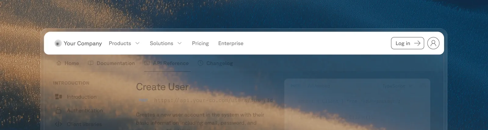
Replace Fern's default header or footer with your own React components. Components are server-side rendered for better SEO and performance, with no layout shifts.
## Replace the header or footer
### Create your component
Your component file must have a default export returning a React component. Tailwind CSS classes are available, including the `dark:` prefix for dark mode styles:
**`components/CustomHeader.tsx`**
```tsx components/CustomHeader.tsx
export default function CustomHeader() {
return (
Plant Store
);
}
```
**`components/CustomFooter.tsx`**
```tsx components/CustomFooter.tsx
export default function CustomFooter() {
return (
);
}
```
### Add the component paths to `docs.yml`
**`docs.yml`**
```yaml docs.yml
header: ./components/CustomHeader.tsx
footer: ./components/CustomFooter.tsx
```
### Specify your components directory in `docs.yml`
Add your components directory to `docs.yml` so that the Fern CLI can scan your components directory and upload them to the server.
**`docs.yml`**
```yml docs.yml
experimental:
mdx-components:
- ./components
```
## Enhance your components
Your custom components can use Fern's built-in UI primitives, React hooks, or both.
#### Reuse built-in Fern components
Instead of building every element from scratch, you can reuse Fern's built-in primitives like search, navigation, and theme switching. Custom header and footer components receive a `Fern` prop containing these built-in UI components:
**`components/CustomHeader.tsx`**
```tsx components/CustomHeader.tsx
export default function CustomHeader({ Fern }) {
return (
);
}
```
The following components are available on the `Fern` prop:
| Component | Description |
| --------------------------- | ------------------------------------------------------------------------------------------------------------------------------------------------------------------------------------------------------------------------------------ |
| `` | Your site [logo](/learn/docs/configuration/site-level-settings#logo-configuration) as configured in `docs.yml`. Links to the homepage. You can target this component with `document.querySelector('#fern-header [data-fern-logo]')`. |
| `` | The [search](/learn/docs/customization/search) bar, including the AI search trigger if enabled. |
| `` | Dropdown to switch between [products](/learn/docs/configuration/products). |
| `` | Dropdown to switch between [versions](/learn/docs/configuration/versions). |
| `` | Dropdown to switch the active [SDK language](/learn/docs/configuration/site-level-settings#default-language). |
| `` | The [navigation links](/learn/docs/configuration/site-level-settings#navbar-links-configuration) configured under `navbar-links` in `docs.yml`. |
| `` | The login/signup button for [authenticated docs](/learn/docs/authentication/overview). |
| `` | Toggle between [light and dark mode](/learn/docs/configuration/site-level-settings#theme-configuration). |
| `` | Fern's built-in mobile sidebar toggle button. Shows a hamburger/close icon and opens the dismissible sidebar. Only visible on mobile viewports. |
#### Use React hooks
Whether you build from scratch or use built-in Fern components, your custom header and footer components support standard React hooks. For example, you can use `useState` to build a drop-down menu that opens on click:
**`components/CustomHeader.tsx`**
```tsx components/CustomHeader.tsx
import { useState } from "react";
export default function CustomHeader() {
const [isOpen, setIsOpen] = useState(false);
return (
Plant Store
);
}
```
#### Mobile sidebar toggle
Use `` to render Fern's built-in mobile sidebar toggle button in your custom header. This opens the same dismissible sidebar that the default header uses, including any navigation links, version/product switchers, and search.
**`components/CustomHeader.tsx`**
```tsx components/CustomHeader.tsx
export default function CustomHeader({ Fern }) {
return (
);
}
```
The button automatically shows a hamburger icon when the sidebar is closed and a close icon when open. It's only visible on mobile viewports (`< 1024px`).
#### Custom mobile menu
If you need a fully custom mobile navigation instead of Fern's built-in sidebar, you can disable the default mobile sidebar and build your own panel using React state and Tailwind classes.
The example below demonstrates how to:
1. Use a `useEffect` hook to inject a style that hides Fern's default mobile swipe panel
2. Render a hamburger button (visible only on mobile) that toggles a custom side panel
**`components/CustomHeader.tsx`**
```tsx components/CustomHeader.tsx
import { useEffect, useState } from "react";
export default function CustomHeader({ Fern }) {
const [menuOpen, setMenuOpen] = useState(false);
// Hide Fern's default mobile swipe panel
useEffect(() => {
const style = document.createElement("style");
style.textContent = `
#fern-sidebar[data-viewport="mobile"],
#fern-sidebar-overlay {
display: none !important;
}
`;
document.head.appendChild(style);
return () => {
style.remove();
};
}, []);
return (
{/* Desktop navigation */}
{/* Mobile menu button - visible only on small screens */}
{/* Custom mobile side panel */}
{/* Overlay when mobile menu is open */}
{menuOpen && (
setMenuOpen(false)}
/>
)}
);
}
```
The `useEffect` hook injects a CSS rule targeting `#fern-sidebar[data-viewport="mobile"]` and `#fern-sidebar-overlay` to hide Fern's default mobile sidebar. This prevents the built-in swipe-to-open gesture from displaying Fern's sidebar, so your custom panel is the only mobile navigation.
> Replace Fern's default header or footer with your own server-rendered React components for better SEO and performance.