# Fern Docs > A website builder for beautiful agent and developer-friendly docs.
{/* Dashed Pattern - Left Side */} {/* Dashed Pattern - Right Side */}

Get started

Build a docs site quickly by importing your existing syling and specs.

Quickstart
Quickstart Arrow right light Arrow right light

Set up a documentation site in under 5 minutes.
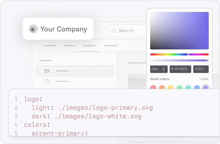
Configure with ease
Configure with ease Arrow right light Arrow right light

Use one simple file to generate documentation that fits your brand.

Features

Build your own components, enable Ask Fern, generate API references, and easily update your docs.
Flexible component library
Flexible component library Arrow right light Arrow right light

Use pre-built or custom React components for a polished look.
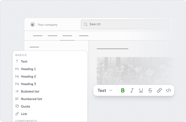
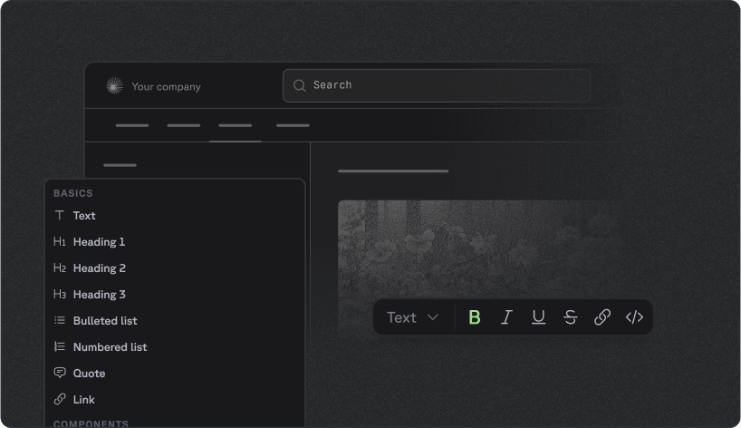
Visual Editor
Visual Editor Arrow right light Arrow right light

Modify your documentation without touching code and publish to your GitHub.
Visual Editor
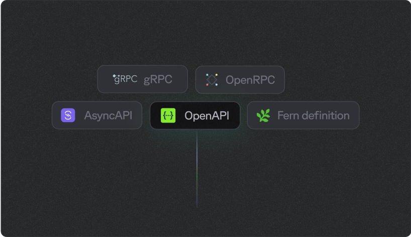
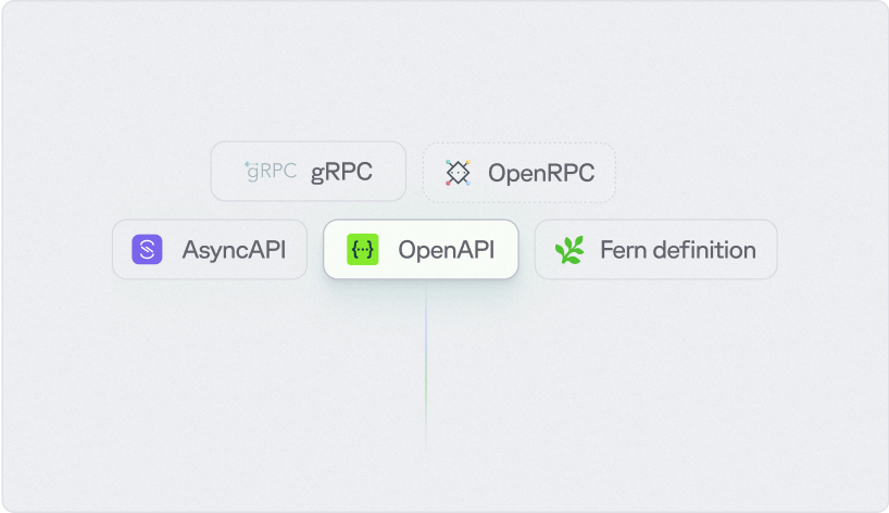
Bring your own API Spec Arrow right light Arrow right light

Use OpenAPI, AsyncAPI, gRPC, OpenRPC, and the Fern spec.
Visual Editor
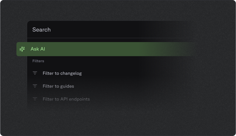
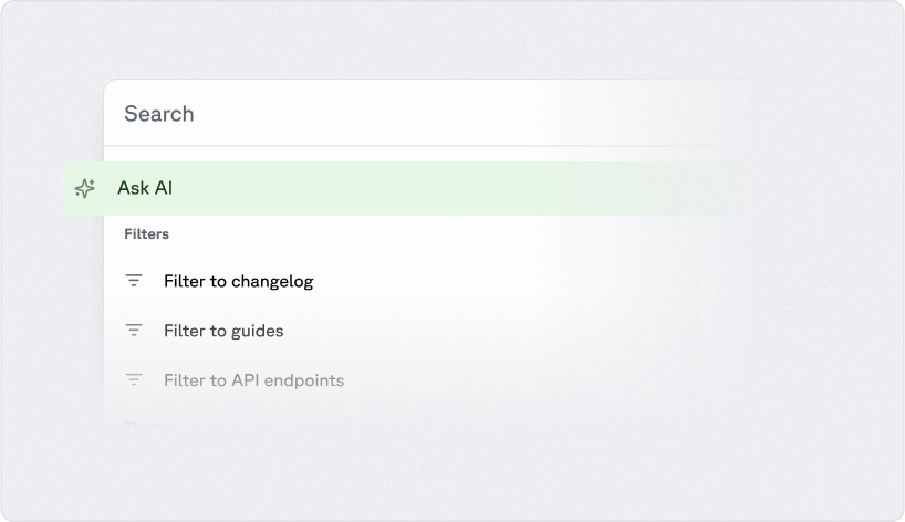
Ask Fern Arrow right light Arrow right light

A personalized chatbot that can answer questions about your documentation.

Self-host your docs
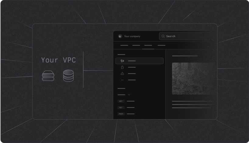
Self-host your docs Arrow right light Arrow right light

Deploy on your own infrastructure to meet security or compliance requirements.
Fern's MCP Server
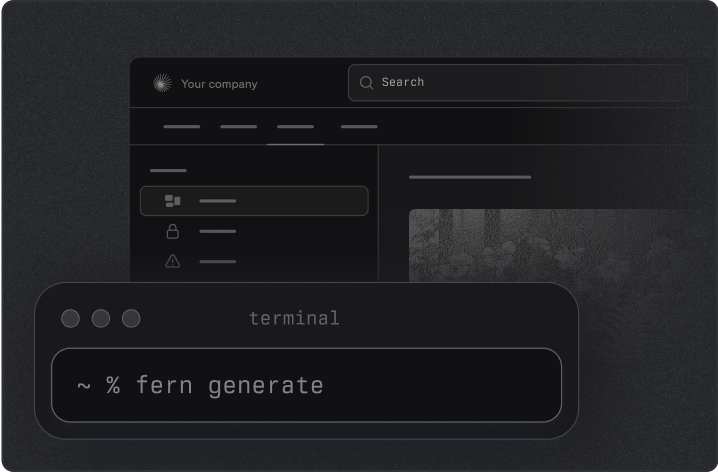
Fern's MCP Server Arrow right light Arrow right light

Add Fern's MCP server to your AI workflows.

# How Fern Docs work > Learn how Fern transforms your API specifications and documentation into a unified developer experience Fern combines your API specifications, static Markdown files (like how-to guides and tutorials), media assets (images, videos, etc.), and custom settings defined in your `docs.yml` file to generate a beautiful, interactive hosted documentation site. This process is built around two major workflows: **editing** and **deploying** your documentation. This diagram shows the technical infrastructure that powers the documentation generation process. ```mermaid flowchart TD %% Input sources at the top subgraph inputs ["Input Sources"] API["API Specs"] DOCS["Docs.yml"] MDX["MDX files"] MEDIA["Media content"] end %% Generation process GENERATE[["fern generate
--docs"]] %% AWS VPC section subgraph vpc ["Fern AWS VPC"] direction LR MICROSERVICE["Fern Docs
microservice"] DATABASE[("Database")] S3[("S3")] end %% External services SERVICES["External Services
(UpStash, Algolia, PostHog,
TurboPuffer, AI Inference)"] %% Vercel hosting subgraph vercel ["Vercel"] direction LR STATIC["Static site"] EXPLORER["API explorer"] EDGE["Vercel Edge
(Middleware)"] end %% External connections as hexagons CLOUDFLARE{{"Cloudflare (CORS)"}} WORKOS{{"WorkOS"}} CUSTOMER{{"Customer API"}} USER(("User")) %% Vertical flow connections API --> GENERATE DOCS --> GENERATE MDX --> GENERATE MEDIA --> GENERATE GENERATE --> MICROSERVICE MICROSERVICE --> SERVICES SERVICES <--> STATIC STATIC --> CLOUDFLARE EXPLORER <--> CLOUDFLARE EDGE <--> WORKOS CLOUDFLARE --> CUSTOMER EDGE <--> USER %% Internal connections MICROSERVICE -.-> DATABASE MICROSERVICE -.-> S3 ```
## Content workflows You can update your documentation in two ways: * **Direct editing**: Open a pull request directly in the [GitHub repository that contains your docs](/learn/docs/getting-started/project-structure) (including your `docs.yml` configuration and Markdown files). * **Visual Editor**: Use Fern's [Visual Editor](/learn/docs/writing-content/visual-editor) to modify your docs without touching code. The Fern GitHub App fetches the current state from your docs repository and passes it to the Visual Editor. When you submit changes, the Fern GitHub App automatically opens a pull request for review. After the update goes through your review process, an approver can merge it. ## Deployment workflows When a pull request is merged into your docs repository, an automated pipeline transforms your content into a live documentation site and syncs it with your API changes in three main stages: ### Trigger GitHub Action and fetch API specs The merged PR triggers a Fern GitHub Action. The action retrieves your API specification from a separate repository using secure token authentication. The GitHub Action only has access to the specific docs repository from which it's running. ### Generate and process content [The Fern CLI](/learn/cli-api-reference/cli-reference/overview) runs `fern generate --docs` to merge your API specs with documentation content. Behind the scenes, this process involves several key components: * **Input processing**: The system combines your API specification files, `docs.yml` configuration file, `.mdx` files, and media content. * **Core infrastructure**: The generation process runs on Fern's AWS VPC infrastructure, where the Fern Docs microservice acts as the central orchestrator. This microservice coordinates content processing while connecting to a database for storing indexed content and S3 for asset storage. * **Content indexing**: During generation, Fern automatically indexes your documentation content to enable search functionality across your entire site. This indexing integrates with external services: [Algolia](/learn/docs/customization/search) for advanced search capabilities, UpStash for caching, PostHog for analytics, TurboPuffer for vector storage, and AI inference services (Bedrock, Claude) for intelligent content processing. ### Deploy to hosting platform The processed content is deployed to Vercel as a documentation site with an embedded [API explorer](/learn/docs/api-references/api-explorer/overview) that allows users to test endpoints directly within the documentation. Vercel Edge middleware handles the underlying routing, authentication, and performance optimization. The deployed documentation site integrates with external systems like Cloudflare for CORS management and WorkOS for enterprise authentication. This diagram shows how content flows from editing to deployment. ```mermaid flowchart TD FVE[Fern Visual Editor] U[User] DR[Docs Repo] CLI[Fern CLI] Decision{Make a PR or edit in Visual Editor?} Spec((API Spec Repo)) GA[GitHub Actions] U ==> Decision Decision == Make edit ==> FVE Decision == Open and Merge PR ==> DR FVE <== Fetches state and opens PR ==> DR DR == ① Merged PR triggers deployment flow ==> GA Spec <-. ② Fetches and merges API spec .-> GA GA == ③ Triggers doc regeneration ==> CLI CLI == ④ Deploys updated docs ==> Server[Fern Docs Server] ``` # Quickstart > Start building beautiful documentation in under 5 minutes Docs cascade With Fern, you can build beautiful developer documentation that matches your brand. Fern supports writing pages (written in Markdown) and generating API Reference documentation (from an OpenAPI Specification). In this guide, we'll show you how to get started with Fern in under 5 minutes. ### Initialize your `fern` folder All the configurations for your docs live in the `fern` folder. Inside, you'll find a `docs.yml` file that contains all the settings for your documentation. Get started by cloning the [starter template](https://github.com/fern-api/docs-starter). ```bash title="SSH" git clone git@github.com:fern-api/docs-starter.git ``` ```bash title="HTTPS" git clone https://github.com/fern-api/docs-starter.git ``` Next, please update the template settings to use your organization. Please edit the details `fern.config.json` and `docs.yml` with your organization name. ```json {2} { "organization": "{{YOUR_ORGANIZATION}}", "version": "0.x.x" } ``` ```yml {2} instances: - url: {{YOUR_ORGANIZATION}}.docs.buildwithfern.com ``` Finally, navigate to the docs directory (where the `fern` folder is located) and execute the following command to generate your documentation: ```bash fern generate --docs ``` If you prefer, you can use our CLI to create a new project. Install the CLI by running ```bash npm install -g fern-api ``` Then run ```bash fern init --docs ``` You will see a new `fern` folder in your project with the following structure: ```bash fern ├─ docs.yml └─ fern.config.json ``` Finally, navigate to the docs directory (where the `fern` folder is located) and execute the following command to generate your documentation: ```bash fern generate --docs ``` ### Update your docs We provide a white-glove migration service as part of our Enterprise plan. Interested? Request it [here](https://buildwithfern.com/contact). Add content with MDX files. ```markdown --- title: "Page Title" description: "Subtitle (optional)" --- Hello world! ``` Fern supports [GitHub flavored Markdown (GFM)](https://github.github.com/gfm/) within MDX files, no plugin required. In order for the Markdown page to show up, you'll need to reference them from your `docs.yml` file. You can reference the Markdown page within a section or as a standalone page. ```yml navigation: - page: Hello World path: docs/pages/hello-world.mdx - section: Overview contents: - page: QuickStart path: docs/pages/hello-world.mdx ``` Add an API Reference by adding an OpenAPI Specification to your project. ```bash fern init --openapi /path/to/openapi.yml ``` This will create an `openapi.yml` file in your project. You can reference this file in your `docs.yml` file by adding an api block. ```yml navigation: - api: "API Reference" ``` All of the branding for your docs can be configured in the `docs.yml` file. For example, to set the logos, colors, and fonts for your docs, you can add the following to your `docs.yml` file: ```yml colors: accent-primary: dark: "#f0c193" light: "#af5f1b" logo: dark: docs/assets/logo-dark.svg light: docs/assets/logo-light.svg height: 40 href: https://buildwithfern.com/ favicon: docs/assets/favicon.svg ``` ### Preview your docs You can preview your docs locally for testing purposes by following the instructions [here](/docs/preview-publish/previewing-changes-locally). `PR previews` offer a way to preview changes from pull requests (PRs) before merging code to a production branch. Learn more [here](/docs/preview-publish/previewing-changes-in-a-pr). ### Publish to production When you are ready for your docs to be publicly accessible, you can publish them using the Fern CLI. [Read more.](/learn/docs/preview-publish/publishing-your-docs) Fern supports hosting your docs website on a custom domain or on a custom subpath (e.g. `https://example.com/docs`). Please reach out to the Fern team at [support@buildwithfern.com](mailto:support@buildwithfern.com) to configure this. Fern supports integrations with a variety of providers such as PostHog, Segment, Intercom, Google Tag Manager, etc. Find out more on this [page](/learn/docs/integrations/overview). [View examples of documentation websites](https://buildwithfern.com/customers) that have been published using Fern. # Project Structure > An overview of the file and folder structure of a Fern Docs project This page provides an overview of the file and folder structure of a Fern Docs project. The following structure is recommended for organizing your documentation content, but is customizable to fit your needs. ## Top-level folders ```bash fern ├─ pages ├─ assets ├─ docs.yml ├─ openapi └─ fern.config.json ``` A Fern Docs project has the following top-level folders: * `pages`: Contains the Markdown (MDX) files that make up your documentation. * `assets`: Contains any images or videos used in your documentation. * `docs.yml`: The configuration file that defines the navigation, theme, and hosting details of your documentation. * `openapi`: Contains the OpenAPI Specification file (if you have an API Reference section in your documentation). * `fern.config.json`: The configuration file specifying your organization name and CLI version. ## Pages folder The `pages` folder contains the Markdown (MDX) files that make up your documentation. Each MDX file represents a page in your documentation. ```bash pages ├─ introduction │ ├─ quickstart.mdx │ ├─ project-structure.mdx │ └─ showcase.mdx ├─ building-your-docs │ ├─ navigation │ ├─ sections.mdx │ ├─ tabs.mdx │ └─ versions.mdx └─ └─ configuration.mdx ``` The `pages` folder is organized into subfolders based on the sections of your documentation. Each subfolder contains the MDX files for the pages in that section. ## Assets folder The `assets` folder contains any images or videos used in your documentation. You can reference these assets in your MDX files using relative paths. ```bash assets ├─ favicon.ico ├─ product-screenshot.svg ├─ demo-video.mp4 ├─ logo-dark-mode.png └─ logo-light-mode.png ``` ## `docs.yml` The `docs.yml` file is the heart of your Fern documentation site. This configuration file controls your documentation's navigation structure, visual design, site functionality, and hosting settings. For complete configuration options, see the [docs.yml reference](/docs/configuration/what-is-docs-yml). ```yml instances: - url: fern.docs.buildwithfern.com/learn custom-domain: buildwithfern.com/learn navigation: - section: Introduction layout: - page: QuickStart path: pages/introduction/quickstart.mdx - page: Project Structure path: pages/introduction/project-structure.mdx - page: Showcase path: pages/introduction/showcase.mdx navbar-links: - type: filled text: Book a demo url: https://buildwithfern.com/contact logo: light: ./images/logo-primary.svg dark: ./images/logo-white.svg colors: accent-primary: dark: "#ADFF8C" light: "#209d63" favicon: ./images/favicon.ico title: Fern's Documentation ``` ## API Definitions The `openapi` folder contains the OpenAPI Specification file for your API Reference section. Fern will read either a YAML or JSON file from this folder to generate the API Reference documentation. If you don't have an API Reference section, you can skip this folder. In addition to your specification file, you can optionally [add an overrides file](/api-definitions/overview/overrides) for additional customizations. ```bash openapi ├─ openapi.yaml # OR openapi.json └─ overrides.yaml ``` To see this in practice, check out [Fluidstack's Fern configuration](https://github.com/fluidstackio/fern-config/tree/main/fern/openapi). The `definition` folder contains the Fern Definition YAML files used to generate the API Reference section. If you don't have an API Reference section, you can skip this folder. In addition to your specification file, you can optionally [add an overrides file](/api-definitions/overview/overrides) for additional customizations. ```bash definition ├─ pets.yaml ├─ owners.yaml ├─ stores.yaml ├─ overrides.yaml └─ api.yaml ``` To see this in practice, check out [Cartesia's Fern configuration](https://github.com/cartesia-ai/docs/tree/main/fern/apis/version-2025-04-16/definition). If you have multiple APIs, you can organize them into separate folders within the `apis` folder. Each API should have its own API definition and [(optional) overrides file](/api-definitions/overview/overrides). For example: ```bash apis ├─ admin │ ├─ openapi.json │ └─ overrides.yaml ├─ user │ ├─ openapi.yaml │ └─ overrides.yaml ``` To see this in practice, check out [Vapi's Fern configuration](https://github.com/VapiAI/docs/tree/main/fern/apis). If you're using Fern for both API Reference documentation and SDKs, you'll use both `docs.yml` (the Docs configuration file) and `generators.yml` ([the SDK configuration file](/sdks/overview/project-structure#generatorsyml)) to configure [how SDK code snippets appear](/docs/api-references/sdk-snippets) in your API reference documentation. If you're only using Fern for API Reference docs, not SDKs, your `generators.yml` should simply link to your spec: ```yaml title="generators.yml" api: specs: - openapi: ../openapi/openapi.json ``` ## `fern.config.json` The `fern.config.json` file specifies your organization name and the version of the Fern CLI used to generate the documentation. You can customize this file to reflect your organization's details. ```json { "organization": "my-organization", "version": "0.77.5" } ``` # June 5, 2025 ## Introducing The Product Switcher Organize your docs by product so developers can find what they need quickly. Perfect for companies with multiple APIs, each with their own references, guides, versions, and changelogs. Features: * **Optimized for Search** with SEO-friendly structure. * **Keyword and AI Search** functionality works both within and across products. * **Customizable** to your products with versions and unique icons to reflect your brand identity. ![A dropdown of the available products](file:87cb36ef-0180-41e6-822a-57d3c8e2b7f2) To add products to your docs, visit the [product switcher docs](/learn/docs/building-and-customizing-your-docs/product-switching) page to get started. # May 23, 2025 ## Table of contents customization We've added a `max-toc-depth` frontmatter option to control the depth of the table of contents. Use this to limit the heading ranks included in the table of contents. You can read more about this feature in the [frontmatter documentation](/learn/docs/configuration/page-level-settings#max-depth). # May 22, 2025 ## Improvements to 404 Pages We now have themed 404 pages for your docs, using your theme colors, fonts, and buttons. We also maintain the best-effort navigation state on this page using the 404 page URL, so that users can easily navigate back to your docs. ![404 Page](file:838ae8d6-8c83-423a-85b6-c6c62ace1e64) # May 20, 2025 * feat: improvements to local preview mode, including support for custom javascript and bug fixes for reloading performance issues. * minor bugfixes and improvements to AI search # May 13, 2025 * feat: allow response and request in playground to be selectable # May 2, 2025 * feat(cli): using `fern docs dev` on the latest CLI will now better reflect the docs in production * feat(search): the search UX now uses infinite scroll and allows for searching based on breadcrumb paths * fix(ai): small bug fixes to the AI chat experience # April 29, 2025 * fix(seo): `og` and `twitter` defined in the `docs.yml` config are now respected * fix(auth): authenticated previews have been restored * fix(docs): frontmatter titles are now preferred over `

` tags within the MDX file * fix(search): canonical URLs now differentiate between endpoints that share the same method and endpoint name but are defined in APIs of different names # April 28, 2025 * chore(local): beta local development mode now refreshes on file changes # April 27, 2025 * fix(openrpc): openrpc playground params are now an array * chore(local): beta local development bundle size is decreased by 75%, and now allows users with any machine type to run locally. additionally, custom javascript is now excluded to address bug reports. # February 4, 2025 ## Introducing Global Language Sync: Code Language Preferences That Follow You Starting today, when you select a programming language in any `` or ``, that preference will automatically sync across all documentation pages. This means no more manually switching languages as you navigate through different sections of our docs. Whether you're viewing implementation examples, debugging guides, or API references, your preferred language follows you. Language preference is kept in client-side local storage. This behavior is automatically enabled for all ``. To add language preferences to a ``, you can add the `language` property. Check out language sync in the example below: This is content specific to TypeScript. This is content specific to Python. This is content specific to Java. ```typescript console.log("Hello, world!"); ``` ```python print("Hello, world!") ``` ```java System.out.println("Hello, world!"); ``` ```typescript console.log("This content is synced!"); ``` ```python print("This content is synced!"); ``` ```java System.out.println("This content is synced!"); ``` ````md This is content specific to TypeScript. This is content specific to Python. This is content specific to Java. ```typescript console.log("Hello, world!"); ``` ```python print("Hello, world!") ``` ```java System.out.println("Hello, world!"); ``` ```typescript console.log("This content is synced!"); ``` ```python print("This content is synced!"); ``` ```java System.out.println("This content is synced!"); ``` ```` # January 21, 2025 ## Improvements to the Accordion Component The accordion component has been upgraded so that you can now use your in-browser `cmd+f` search to look for text that is otherwise hidden. * Improved accessibility for all of our customers who are leveraging the `` component * Improved SEO indexing of content (more html is now generated on the server-side instead of client-side) Try searching for **burst** on this page: [https://dev.hume.ai/docs/expression-measurement/faq](https://dev.hume.ai/docs/expression-measurement/faq) ## Support for embedding local assets We've added support for embedding local assets in your docs. This is useful for displaying PDFs, images, videos, and other assets into your docs. To embed an asset, you can use the `embed` tag. ```mdx ``` Read more [here](https://buildwithfern.com/learn/docs/content/write-markdown#embedding-local-assets) # January 14, 2025 ## Support for /llms.txt API Docs should be for LLMs and Agents too, not just people! We're excited to announce compatibility with the `/llms.txt` [emerging standard](https://llmstxt.org/), making your documentation accessible and optimized for AI developer tools such as Cursor, Github Copilot, ChatGPT, Perplexity, and Anthropic's Claude. Both `/llms.txt` and `/llms-full.txt` are designed to be token-efficient, ensuring faster processing and cost-effective LLM interactions without sacrificing valuable info. If you use Fern Docs, this feature is auto-enabled like /robots.txt and /sitemap.xml. [Learn more](https://buildwithfern.com/learn/docs/seo/llms-txt) ![LLMs.txt Splash Image](file:0ec0a802-d0be-4e3c-8641-b46b907027a4) Check out ElevenLabs: *loads in \< 1 sec* *loads in 5+ sec* # December 30, 2024 ## Audio Streaming in API Explorer Added support for streaming audio directly within the API Explorer. This feature enables testing audio endpoints without leaving the documentation. Check it out live in ElevenLabs' [API Explorer](https://elevenlabs.io/docs/api-reference/text-to-speech/convert?playground=/docs/api-reference/text-to-speech/convert-as-stream) to let users test text-to-speech endpoints and hear the results instantly. ## Form Data Optimization Enhanced handling of URL parameters and form data in edge functions. Documentation playground now handles complex data structures more efficiently. ```typescript const formConfig = { encoding: 'application/x-www-form-urlencoded', arrayFormat: 'brackets', allowNullables: true, sanitize: true, maxDepth: 5 } ``` # November 27, 2024 ## Auto-Populate Credentials in API Explorer Save developers the hassle of finding and copying their API key. When authenticated, their API credentials will be automatically filled into the API Playground. This way, they can make their first API call even faster. ![API Explorer Splash Image](file:37eebe28-dafe-4f06-8c87-141b5187788e) Check it out live in [Webflow's API Explorer](https://developers.webflow.com/data/reference/sites/list?playground=/data/reference/sites/list). ## Card Component System Enhanced documentation card components for better visual organization. Information can now be presented in a more structured and appealing way. ```typescript interface CardProps { title: string; description: string; icon?: IconName; variant?: 'default' | 'bordered' | 'filled'; actions?: CardAction[]; } interface CardAction { label: string; href?: string; onClick?: () => void; } ``` # October 31, 2024 ## JWT API Key Integration Implemented automatic API key extraction from JWT tokens in the documentation playground. Users can now test authenticated endpoints more easily with automatic credential handling. ## Query Parameter Enhancement Improved handling of query parameters in documentation middleware. Complex query parameters are now properly handled and displayed in the documentation. # September 24, 2024 # September 2024 ## Environment Testing Interface Created an editable playground environment system for testing API endpoints. Users can now switch between different API environments seamlessly within the documentation. ```yaml openapi.yml servers: - url: https://api.example.com x-fern-server-name: Production - url: https://sandbox.example.com x-fern-server-name: Sandbox ``` # August 20, 2024 # August 2024 ## Anchor Link System Redesigned anchor link handling for improved navigation within documentation pages. Links now account for fixed headers and maintain proper scroll position when opened. ## WCAG Contrast Improvements Enhanced color contrast throughout the documentation platform for better accessibility. All text and interactive elements now meet WCAG AA standards by default and warnings are shown for any elements that do not meet WCAG AA standards. ## API Page Center Updates Improved center element positioning and updates for API documentation pages. Content now flows more naturally and maintains position during navigation. ## Streaming Toggle Enhancement Improved visibility and behavior of streaming response toggles in API playground. Users can now better control and monitor streaming responses. # July 30, 2024 # July 2024 ## Meta Image System Implemented comprehensive meta image support for better social sharing. Documentation pages now display properly when shared on social media platforms. ```yaml og:image: /assets/og-image.png og:type: documentation twitter:card: summary_large_image twitter:image: /assets/twitter-card.png ``` # June 25, 2024 # June 2024 ## RSS Feed Integration Added support for RSS feeds to keep users updated on documentation changes. Teams can now offer automated notifications for their documentation. ## JSON-LD Enhancement Implemented structured data support through JSON-LD for improved SEO. Documentation pages now provide richer information to search engines and social platforms. ```json { "@context": "https://schema.org", "@type": "TechArticle", "headline": "API Authentication Guide", "datePublished": "2024-06-15", "technicalAudience": "Software Developers" } ``` ## Image Zoom Controls Added configurable image zoom functionality with custom triggers and behaviors. Users can now better examine diagrams and technical illustrations in documentation. ```mdx page.mdx --- no-image-zoom: true --- ``` ## Syntax Extension Support Added support for additional syntax highlighting languages including BAML and Jinja. Documentation can now properly display a wider range of code examples. ```html

Available Products

{% if products %}
    {% for product in products %}
  • {{ product.name }}

    ${{ product.price }}

    {{ product.description }}

    {% if product.in_stock %}

    Status: In Stock

    {% else %}

    Status: Out of Stock

    {% endif %}
  • {% endfor %}
{% else %}

No products are available at the moment.

{% endif %} ``` # May 22, 2024 ## Advanced Redirects Implemented a powerful redirects system supporting pattern matching and parameter preservation. Teams can now manage documentation URL structure while maintaining backwards compatibility. ```yaml redirects: - source: /v1/api/* destination: /v2/api/:splat permanent: true - source: /guides/:name destination: /tutorials/:name ``` ## API Authorization Handling Enhanced API authorization handling in the documentation platform. Developers can now test authenticated endpoints more easily with improved token management. # April 20, 2024 ## Sidebar Navigation Enhancement Improved sidebar padding and visual hierarchy with refined spacing and typography. The documentation navigation now provides clearer visual structure and better readability. ## Base Path Configuration Added flexible base path configuration for documentation routing. Organizations can now host documentation under custom paths while maintaining proper navigation. ```yaml docs.yml instances: - url: your-site.docs.buildwithfern.com custom-domain: your-site.com/docs ``` # March 24, 2024 # March 2024 ## Virtualized Syntax Highlighting Implemented performance-optimized code rendering that handles large code blocks efficiently without impacting page performance. Long code samples now load instantly and scroll smoothly. ## Mobile Search Experience Redesigned the mobile search interface with a sticky search bar and improved results display. Users can now easily search documentation on mobile devices with a native-feeling interface. ## Scrollbar Refinement Enhanced scrollbar design and behavior across all documentation sections for a more polished look and feel. Scrollbars now adapt to both light and dark themes while maintaining usability. # February 22, 2024 ## WebSocket Support in API Playground Added real-time WebSocket testing capabilities to the API playground, enabling developers to test streaming and real-time endpoints directly in the documentation. WebSocket connections can now be established, tested, and debugged without leaving the docs. ## Enhanced Code Highlighting Implemented a new code highlighting system using Shiki for improved syntax highlighting accuracy and performance. The system now supports more languages and provides better dark mode compatibility. ## Feedback System Introduced a new feedback collection system using Radix UI components for improved accessibility. Users can now provide structured feedback about documentation quality and usefulness directly within the interface. ## Layout Configuration System Implemented a flexible layout configuration system that allows for custom header, footer, and sidebar arrangements. Documentation can now be customized to match your brand and preferences. ```yaml layout: page-width: full tabs-placement: header searchbar-placement: header ``` ## Custom Styling Support Added support for custom CSS and scripts, enabling deep customization of documentation appearance and behavior. Organizations can now apply their branding consistently across their documentation. ```yaml docs.yml css: ./assets/styles.css ``` ```css styles.css /* Custom styles */ .custom-class { background-color: #f0f0f0; } ``` # January 24, 2024 ## API Playground Launch Enable interactive API testing directly in the documentation. * Added full API request testing capability * Improved error handling and status code display * Added support for recursive property rendering ## Enhanced Dark Mode Multiple improvements to dark mode readability for syntax highlighting, dropdowns, and search results. ```css /* Dark mode improvements */ [data-theme='dark'] { --syntax-bg: #1a1a1a; --dropdown-bg: #2d2d2d; --search-highlight: #ffd700; } ``` ## Mobile-Friendly Navigation Comprehensive updates to mobile navigation experience with collapsible and scrolling. ## Search Enhancements Multiple improvements to the search experience. * Default and configurable keyboard shortcuts (`Cmd+A`, `/`) for search * Improved search box sizing * Added auto-focus functionality ## Performance Optimization Several performance improvements across the platform. * Moved FontAwesome to CDN * Improved search dialog loading * Optimized static props loading * Added polyfill DOM parser for server-side TOC rendering # Docs.yml > Learn how to configure your Fern documentation site with the docs.yml file. Customize colors, typography, layout, analytics and more. ### YAML Schema Validation To enable intelligent YAML validation and autocompletion in your editor, add this line at the top of your `docs.yml` file: ```yaml docs.yml # yaml-language-server: $schema=https://schema.buildwithfern.dev/docs-yml.json ``` This enables real-time schema validation and autocompletion based on our [complete schema](https://github.com/fern-api/fern/blob/09555d587294fd3dc77ceb35f21e8976a5a2b7a2/fern/apis/docs-yml/definition/docs.yml#L110). ## Core configuration Every Fern documentation website requires a `docs.yml` file that contains the core configuration settings. Here are the essential top-level properties you can configure: ```yaml docs.yml # yaml-language-server: $schema=https://schema.buildwithfern.dev/docs-yml.json title: Stripe API Documentation favicon: assets/stripe-favicon.ico default-language: typescript # Default code sample language logo: href: https://stripe.com dark: assets/stripe-logo-dark.svg light: assets/stripe-logo-light.svg colors: accent-primary: light: "#635BFF" # Stripe's primary purple dark: "#9B90FF" # Lighter purple for dark mode background: light: "#FFFFFF" dark: "#0A2540" navbar-links: - type: filled text: "Dashboard" href: "https://dashboard.stripe.com" - type: minimal text: "Support" href: "https://support.stripe.com" ``` A string that is used as the tab bar title. Learn more about the [`logo` configuration](/learn/docs/getting-started/global-configuration#logo-configuration). Relative filepath to the favicon. Configure the `primaryAccent` and `background` colors. Learn more about the [`colors` configuration](/learn/docs/getting-started/global-configuration#colors-configuration). An array of paths you want to configure to permanently redirect to another path. Learn more about the [`redirects` configuration](/learn/docs/getting-started/global-configuration#redirects-configuration). Array of names and urls of links you want to include as a call to action. Learn more about the [`navbar-links` configuration](/learn/docs/getting-started/global-configuration#navbar-links-configuration). Set a custom background image to be displayed behind every page. Learn more about the [`background-image` configuration](/learn/docs/getting-started/global-configuration#background-image-configuration). Customize the fonts used in your documentation website. Learn more about the [`typography` configuration](/learn/docs/getting-started/global-configuration#typography-configuration). Customize the layout of your documentation website. Learn more about the [`layout` configuration](/learn/docs/getting-started/global-configuration#layout-configuration). Creates a landing page for your documentation website. Learn more about the [`landing-page` configuration](/learn/docs/getting-started/global-configuration#landing-page-configuration). Sets the default language displayed by code snippets in the API Reference. Options include: `typescript`, `python`, `java`, `go`, `ruby`, `csharp`, `curl` Configure SEO metadata for your documentation website. Learn more about the [`metadata` configuration](/learn/docs/getting-started/global-configuration#seo-metadata-configuration). ## Instances configuration An `instance` is the backend of a distinct docs website. Each instance is published to a unique domain using the `--instance` flag. It is most common to use instances to configure staging and production docs which publish to separate URLs. ```yaml docs.yml instances: - url: plantstore.docs.buildwithfern.com custom-domain: docs.plantstore.com ``` Configure one or more documentation websites. The URL where your Fern documentation is deployed. Must contain the suffix `docs.buildwithfern.com`. The custom domain where your documentation is hosted. Learn more about [setting up a custom domain](/learn/docs/preview-publish/setting-up-your-domain). If specified, adds an "Edit this page" link to the bottom of each page that links to the given public GitHub repository. Learn more about the [`edit-this-page` configuration](#github-configuration). ## Colors configuration ```yaml docs.yml colors: accent-primary: light: "#418326" # Primary brand color for light mode dark: "#ADFF8C" # Primary brand color for dark mode background: light: "#ffffff" dark: "#0d0e11" border: light: "#e5e7eb" dark: "#1f2937" sidebar-background: light: "#f9fafb" dark: "#111827" header-background: light: "#ffffff" dark: "#0d0e11" card-background: light: "#f3f4f6" dark: "#1f2937" ``` The primary brand color used for interactive elements like links, buttons, and highlighted text. Configure separate colors for light and dark modes to ensure proper contrast and visibility. The main background color for all documentation pages. Choose colors that provide good contrast with text and complement your brand colors. Dark mode colors should reduce eye strain. Used for dividing lines, borders around elements, and visual separators. Choose subtle colors that create clear boundaries without being too prominent. Background color for the navigation sidebar. When specified, includes a 1px border on the right side. If omitted, the sidebar uses a transparent background without a border. Background color for the top navigation header. When specified, includes a 1px solid border on the bottom. If omitted, the header uses a transparent background with a subtle gradient border. Background color for cards, code blocks, and other contained elements. Should be slightly different from the main background to create visual hierarchy while maintaining readability. ## Logo configuration ```yaml docs.yml logo: href: https://example.com dark: assets/images/logo-dark.svg light: assets/images/logo-light.svg ``` The URL that users will be directed to when clicking the logo. Typically your company's homepage or app. Path to your dark mode logo file, relative to the docs root. SVG format is recommended for optimal quality. Example: `assets/images/logo-dark.svg` Path to your light mode logo file, relative to the docs root. SVG format is recommended for optimal quality. Example: `assets/images/logo-light.svg` ## Redirects configuration The `redirects` object allows you to redirect traffic from one path to another. You can redirect exact paths or use dynamic patterns with [`regex`](https://www.npmjs.com/package/path-to-regexp) parameters like `:slug`. If your docs are hosted on a subpath (like `buildwithfern.com/learn`), include the subpath in both the source and destination paths. ```yml redirects: # Exact path redirects - source: "/old-path" destination: "/new-path" - source: "/old-folder/path" destination: "/new-folder/path" permanent: true # Regex-based redirects - source: "/old-folder/:slug" # <- /old-folder/foo, /old-folder/bar, etc. destination: "/new-folder/:slug" - source: "/old-folder/:slug*" # <- /incorrect, /incorrect/foo/bar/baz, etc. destination: "/new-folder/:slug*" ``` Parameters suffixed with an asterisk (`*`) match zero or more path segments, capturing everything that follows in the URL. Use this when redirecting entire folder structures while preserving nested paths. The path that you want to redirect from. The path that you want to redirect to. Toggle between **permanent** and **temporary** redirect (default `false`). When true, the status code is 308. When false, the status code is 307. ## NavBar links configuration ```yaml docs.yml navbar-links: - type: minimal text: Contact support href: https://example.com/support - type: filled text: Login href: https://example.com/login rounded: false - type: github value: https://github.com/example-company/fern ``` One of `outlined`, `minimal`, `filled`, or `github`. This value controls the styling of the button. The URL once you click on the button. Example: [https://buildwithfern.com/contact](https://buildwithfern.com/contact) The URL to a GitHub repository. Similar to `href`, but specifically for GitHub repository links. This field is used when `type` is set to `github`. Example: [https://github.com/example-company/fern](https://github.com/example-company/fern) Text inside the button. When `true`, the border radius of the button will be fully rounded. The [Font Awesome icon](https://fontawesome.com/icons) to be used in the button. This icon will appear to the **left** of the text content. Pro and Brand Icons from Font Awesome are supported. The [Font Awesome icon](https://fontawesome.com/icons) to be used in the button. This icon will appear to the **right** of the text content. Pro and Brand Icons from Font Awesome are supported. By default, the `rightIcon` for a `filled` button is set to `arrow-right`. ## Background image configuration ```yaml docs.yml background-image: light: ./path/to/bg-light.svg dark: ./path/to/bg-dark.svg ``` Relative filepath to the light-mode background image. Relative filepath to the dark-mode background image. ## Typography configuration ```yaml docs.yml typography: # Font for headings and titles headingsFont: name: Inter-Bold paths: - path: ./fonts/Inter-Bold.woff2 weight: 700 style: normal # Font for body text bodyFont: name: Inter-Regular path: fonts/Inter-Regular.woff2 style: normal # Font for code snippets codeFont: name: JetBrains-Mono path: ./fonts/JetBrains-Mono-Regular.woff2 ``` The font used for all body text including paragraphs, lists, and general content. For optimal performance, use WOFF2 format. The font used for headings, titles, and other prominent text elements. Can be the same as your body font if you prefer a unified look. Supports multiple weights for different heading levels. The font used for code blocks and inline code. Monospace fonts are recommended for better code readability. Popular choices include JetBrains Mono, Fira Code, and Source Code Pro. ### Font configuration ```yaml typography: bodyFont: name: Inter-Regular path: fonts/Inter-Regular.woff2 style: normal ``` ```yaml typography: headingsFont: name: Inter-Variable paths: - path: ./fonts/Inter-Variable.woff2 weight: 400 700 # Supports range of weights style: normal ``` ```yaml typography: headingsFont: name: Inter paths: - path: ./fonts/Inter-Regular.woff2 weight: 400 style: normal - path: ./fonts/Inter-Bold.woff2 weight: 700 style: normal - path: ./fonts/Inter-Italic.woff2 weight: 400 style: italic ``` The name of the font. Defaults to a generated name that will be used to reference your custom font in the eventually injected CSS. The path to your font file, relative to your docs folder. Use this when you have a single font file. For multiple font files (like separate files for bold, italic etc), use `paths` instead. The weight of the font. Can be a number (400, 700) or a range for variable fonts (400 700). Common values: 400 (normal), 700 (bold). The font style, either "normal" or "italic". Defaults to "normal" if not specified. A list of font files for particular weights. Each element in the list includes a `path`, `weight`, and `style` property. ## Layout configuration ```yaml docs.yml layout: header-height: 70px page-width: 1344px content-width: 672px sidebar-width: 336px searchbar-placement: header tabs-placement: header content-alignment: left hide-nav-links: true hide-feedback: true ``` Sets the height of the header. Defaults to `4rem` (`64px`). Valid options are `{number}rem` or `{number}px`. Sets the maximum width of the docs layout, including the sidebar and content. Defaults to `88rem` (`1408px`). Valid options are `{number}rem`, `{number}px`, or `full`. Sets the maximum width of the Markdown article content. Defaults to `44rem` (`704px`). Valid options are `{number}rem` or `{number}px`. Sets the width of the sidebar in desktop mode. Defaults to `18rem` (`288px`). Valid options are `{number}rem` or `{number}px`. Sets the placement of the searchbar. Can be one of `header`, `sidebar` or `header-tabs` (places the searchbar in the header but on the tabs row). Defaults to `sidebar`. This setting is ignored when `disable-header` is set to true. Set the placement of the tabs. Can be one of `header` or `sidebar`. Defaults to `sidebar`. This setting is ignored when `disable-header` is set to true. Set the alignment of the Markdown content. Can be one of `center` or `left`. Defaults to `center`. If set to true, the header will not be rendered. Instead, the logo will be rendered as part of the sidebar, and a 1px border will separate the sidebar from the content. If set to true, the navigation links (previous, next) at the bottom of the page will not be rendered. This can be overridden on a per-page basis using the [frontmatter](/learn/docs/configuration/page-level-settings#navigation-links). If set to true, the feedback form will not be rendered. This can be overridden on a per-page basis using the [frontmatter](/learn/docs/configuration/page-level-settings#on-page-feedback). ## GitHub configuration ```yaml instances: - url: plantstore.docs.buildwithfern.com edit-this-page: github: owner: fern repo: plant-store-docs branch: main ``` ```yaml # Configure edit-this-page per instance instances: - url: plantstore.docs.buildwithfern.com custom-domain: docs.plantstore.com edit-this-page: github: owner: fern repo: plant-store-docs branch: production - url: plantstore-staging.docs.buildwithfern.com edit-this-page: github: owner: fern repo: plant-store-docs branch: staging ``` The GitHub repository must be **public** for the "Edit this page" feature to work correctly. The GitHub organization that owns the documentation repository. The name of the GitHub repository containing your fern folder. The branch of the repository you would like the GitHub editor to open a PR to. Default is `main`. ## Landing page configuration ```yaml docs.yml landing-page: page: Page Title path: path/to/landing-page.mdx slug: /welcome ``` The name of the landing page. Relative filepath to the desired landing page Markdown file. The slug of the landing page. Defaults to the page name. The slug can also be overridden in the frontmatter of the landing page Markdown file. See [Vapi's landing page live](https://docs.vapi.ai/) and the associated [Markdown file](https://github.com/VapiAI/docs/blob/main/fern/quickstart/introduction.mdx?plain=1). ## SEO metadata configuration [Use the `keywords` property in a page's frontmatter](/docs/configuration/page-level-settings#seo-metadata). ```yaml docs.yml metadata: # Core platform identity og:site_name: "Square Developer Documentation" og:title: "Square Developer Platform | Payments, Commerce & Banking APIs" og:description: "Build with Square's suite of APIs and SDKs. Accept payments, manage inventory, create loyalty programs, and access financial services. Complete documentation for developers building the future of commerce." og:url: "https://developer.squareup.com/docs" # Social sharing assets og:image: "https://developer.squareup.com/images/docs-social-card.png" og:image:width: 1200 og:image:height: 630 og:locale: "en_US" og:logo: "https://developer.squareup.com/images/square-logo.png" # Twitter (I mean X) optimization twitter:title: "Square Developer Platform Documentation" twitter:description: "Integrate payments, point-of-sale, inventory, and financial services into your applications with Square's developer platform. Get started with our APIs, SDKs, and comprehensive guides." twitter:handle: "@SquareDev" twitter:image: "https://developer.squareup.com/images/twitter-card.png" twitter:site: "@Square" twitter:card: "summary_large_image" ``` The name of your website for Open Graph tags. The title shown in social media previews. The description shown in social media previews. The canonical URL of your documentation. The image shown in social media previews. Recommended size is 1200x630 pixels. The width of your Open Graph image in pixels. The height of your Open Graph image in pixels. The locale of your content (e.g., "en\_US"). URL to your company logo. The title shown in Twitter Card previews. The description shown in Twitter Card previews. Your company's Twitter handle. The image shown in Twitter Card previews. The Twitter handle for your website. The Twitter Card type. Options are `summary`, `summary_large_image`, `app`, or `player`. ## Analytics configuration ```yaml docs.yml analytics: ga4: measurement-id: "G-XXXXXXXXXX" gtm: container-id: "GTM-XXXXXX" posthog: api-key: "phc_xxxxxxxxxxxx" ``` Your Google Analytics 4 measurement ID. Must start with "G-". Your Google Tag Manager container ID. Must start with "GTM-". Configuration for PostHog Analytics integration. Your PostHog project API key. Defaults to the api-host of "[https://us.i.posthog.com](https://us.i.posthog.com)". # Configure your site navigation > Set up the navigation for your documentation site built with Fern Docs using the docs.yml file, including tabs, sections, pages, and more. ## Use `docs.yml` Every Fern Docs website has a special configuration file called `docs.yml`. Use this file to configure the navigation for your documentation site. ### Example Configuration Here's a complete example of a `docs.yml` file: ```yaml # yaml-language-server: $schema=https://schema.buildwithfern.dev/docs-yml.json navigation: - section: Home contents: - page: Introduction path: ./intro.mdx - page: Authentication path: ./auth.mdx - api: API Reference navbar-links: - type: secondary text: Contact support url: https://example.com/support - type: primary text: Login url: https://example.com/login ``` ## Sections, contents, and pages The navigation organizes your documentation in the left-side nav bar. You can create sections for grouping related content. Each `section` has a name and a list of `contents`. The sections appear in the left-side nav bar in the order that they are listed in `docs.yml`. In `contents`, list your pages with names and corresponding file paths. The supported file types for pages are `.md` or `.mdx`. A basic navigation configuration with two sections is shown below. The first section is called `Introduction` and contains a single page called `My Page`. The second section is called **API Reference**. This is a special type of section that's automatically generated by Fern, and you do not need to add any pages to it by hand. For more information, see the [Generate API Reference](/learn/docs/api-references/generate-api-ref) page. ```yaml Example navigation config navigation: - section: Introduction contents: - page: My Page path: ./pages/my-page.mdx - api: API Reference ``` If you want to add another page to an existing section, create an `.md` or `.mdx` file. Then in `docs.yml`, create a new `page` in the `contents` list for that section, providing the path to the `.md` or `.mdx` file you created. Example: ```yaml Example navigation config navigation: - section: Introduction contents: - page: My Page path: ./pages/my-page.mdx - page: Another Page path: ./pages/another-page.mdx - api: API Reference ``` To add another section, add another `section` to the `navigation`. Example: ```yaml Example navigation config with additional section navigation: - section: Introduction contents: - page: My Page path: ./pages/my-page.mdx - api: API Reference - section: Help Center contents: - page: Contact Us path: contact-us.mdx ``` ### Hiding content To hide a page or an entire section of your docs, add `hidden: true`. A hidden page or section will still be discoverable using the exact URL, but it will be excluded from search and will not be indexed. ```yaml Example navigation config with additional section {7, 10} navigation: - section: Introduction contents: - page: My Page path: ./pages/my-page.mdx - page: Hidden Page hidden: true path: ./pages/my-hidden-page.mdx - section: Hidden Sections hidden: true contents: - page: Another Hidden Page path: ./pages/also-hidden.mdx ``` ### Section and page availability You can set availability for individual pages or entire sections. When you set availability for a section, all pages within that section inherit the same availability unless explicitly overridden at the page level. Options are: `stable`, `generally-available`, `in-development`, `pre-release`, `deprecated`, or `beta`. ```yaml Availability {3, 11, 14} navigation: - section: Developer Resources availability: generally-available contents: - page: Code Examples # Inherits generally-available path: ./pages/code-examples.mdx - page: CLI Tools # Inherits generally-available path: ./pages/cli-tools.mdx - page: Testing Framework path: ./pages/testing-framework.mdx availability: beta # Overrides section-level availability - page: Performance Monitoring path: ./pages/performance-monitoring.mdx availability: in-development # Overrides section-level availability ``` If you have different versions of your docs, section and page availability should be set in [the `.yml` files that define the navigational structure for each version](/learn/docs/configuration/versions#define-your-versions). ## Section overviews To add an overview page to a section, add a `path` property to the section. ```yaml Example section with an overview {7} navigation: - section: Introduction contents: - page: My Page path: ./pages/my-page.mdx - section: Guides path: ./pages/guide-overview.mdx contents: - page: Simple Guide path: ./pages/guides/simple.mdx - page: Complex Guide path: ./pages/guides/complex.mdx ``` ## Nested sections If you'd like a section to toggle into more sections and pages, you can nest sections within sections. Here's an example: ```yaml Example navigation config with nested sections navigation: - tab: guides layout: - section: Learn contents: - section: Key Concepts contents: - page: Embeddings path: ./docs/pages/embeddings.mdx - page: Prompt Engineering path: ./docs/pages/prompts.mdx - section: Generation contents: - page: Command Nightly path: ./docs/pages/command.mdx - page: Likelihood path: ./docs/pages/likelihood.mdx ``` ![Result of above docs.yml example](https://fern-image-hosting.s3.amazonaws.com/fern/nested-sections.png) ## Collapsed sections You can set sections to be collapsed by default when the page loads by adding `collapsed: true` to a section. This helps keep the navigation tidy when you have many sections or want to highlight the most important sections by keeping others collapsed. ```yaml {7} Example config with collapsed section navigation: - section: Getting Started contents: - page: Introduction path: ./pages/intro.mdx - section: Advanced Topics collapsed: true contents: - page: Custom CSS path: ./pages/advanced/css.mdx - page: Analytics path: ./pages/advanced/analytics.mdx ``` ## Sidebar icons For icons to appear next to sections and pages, add the `icon` key. The value should be a valid [Font Awesome icon](https://fontawesome.com/icons) name. Pro and Brand Icons from Font Awesome are supported. ```yaml Example navigation config with icons navigation: - section: Home icon: fa-regular fa-home contents: - page: My Page icon: fa-regular fa-file path: ./pages/my-page.mdx - api: API Reference icon: fa-regular fa-puzzle ``` ## Links You can add a link to an external page within your sidebar navigation with the following configuration: ```yaml title="docs.yml" navigation: - section: Home contents: - page: Introduction path: ./intro.mdx - link: Our YouTube Channel href: https://www.youtube.com/ ``` An external link within navigation ## Tabs Within the navigation, you can add `tabs`. Tabs are used to group sections together. The example below shows tabs for `Help Center`, `API Reference`, and an external link to `Github`. Each tab has a `title` and `icon`. [Browse the icons available](https://fontawesome.com/icons) from Font Awesome. Pro and Brand Icons are supported. ```yaml tabs: api: display-name: API Reference icon: puzzle help: display-name: Help Center icon: home github: display-name: GitHub icon: brands github href: https://github.com/fern-api/fern navigation: - tab: api layout: - section: Introduction contents: - page: My Page path: my-page.mdx - api: API Reference - tab: help layout: - section: Help Center contents: - page: Contact Us path: contact-us.mdx - tab: github ``` Here's an example of what the Tabs implementation looks like: Tabs displayed in the sidebar (default) Tabs display in the left sidebar by default. To display them horizontally, set `tabs-placement` to `header` in your [layout configuration](/docs/configuration/what-is-docs-yml#layout-configuration). ```yaml layout: tabs-placement: header ``` ## Versions If you have multiple versions of your documentation, you can introduce a dropdown version selector by specifying the `versions`. For more information, check out our [documentation on versioning](/learn/docs/building-your-docs/versioning). ## Product switching If you have multiple products in your documentation, you can introduce a dropdown product selector by creating separate product configuration files. Each product can contain its own distinct versions, tabs, sections, pages, and API references, though products can also share content. ```yaml {2-3, 7-8} products: - display-name: Product A path: ./products/product-a.yml icon: fa-solid fa-leaf # optional slug: product-a # optional subtitle: Product A subtitle # optional - display-name: Product B path: ./products/product-b/latest.yml # <-- default showing latest image: ./images/product-b.png # optional slug: product-b # optional subtitle: Product B subtitle # optional ``` For more information about setting up this up, check out our [documentation on product switching](/learn/docs/configuration/products). # Versioning > Allow users to navigate between different versions of your docs. ![A dropdown of the available versions](file:6a217a02-b50d-4a6e-9126-5dc2de3c955d) Each version of your docs can contain its own distinct tabs, sections, pages, and API references. Versions can share content, as well. ## Add versions to your docs Create a `versions` folder inside of your `fern` folder. To specify the contents of each version, add a `.yml` file to the `versions` folder to define the navigational structure of that version. Make sure to include the `navigation` and `tabs` properties, if applicable. ```bash {7-11} fern/ ├─ fern.config.json ├─ generators.yml ├─ docs.yml ├─ pages/ ├─ ... └─ versions/ ├─ latest/pages/... ├─ latest.yml ├─ v2/pages/... └─ v2.yml ``` Version-specific `yml` files: ```yaml navigation: - section: Introduction contents: - page: My Page path: ./latest/pages/my-page.mdx # relative path to the file - page: Shared Resource path: ../shared-pages/shared-resource.mdx - api: API Reference ``` ```yaml tabs: api: title: API Reference icon: puzzle help: title: Help Center icon: home navigation: - tab: api contents: - section: Introduction contents: - page: My Page path: ./v2/pages/my-page.mdx # relative path to the file - page: Shared Resource path: ../shared-pages/shared-resource.mdx - api: API Reference - tab: help contents: - section: Help Center contents: - page: Contact Us path: contact-us.mdx ``` You can also have multiple products, some versioned and some unversioned. For more information on setting up multiple products, follow our [product switching docs](/docs/configuration/products) . Define a version in the top-level `docs.yml` by adding an item to the `versions` list and specifying the `display-name` and `path`. ```yaml versions: - display-name: Latest # shown in the dropdown path: ./versions/latest.yml # relative path to the version file - display-name: V2 path: ./versions/v2.yml ``` You can optionally set the availability status for each version. Options are `deprecated`, `ga`, `stable`, and `beta`. Version availability is distinct from [section and page availability](/learn/docs/configuration/navigation#section-and-page-availability), with different options. If you want to set section and page availability, do so in your version-specific `yml` files. ```yaml {4} versions: - display-name: Latest path: ./versions/latest.yml availability: beta - display-name: v2 path: ./versions/v2.yml availability: stable ``` If your `docs.yml` file includes a `navigation` field or a `tabs` field, be sure to remove. Those fields should now belong in the version-specific `.yml` files. ## Customize version selector styling You can directly customize the appearance of the version selector by targeting the `fern-version-selector` CSS class. ### Common styling adjustments **Adjusting positioning:** Use `transform: translateY(Npx)` to adjust the vertical positioning of the selectors. This ensures that the selectors match the line height of your logo for better visual alignment. **Enhancing visual prominence:** You can modify the border radius and add borders to make the selectors more prominent and better integrated with your site's design aesthetic. ```css .fern-version-selector { transform: translateY(1px); border-radius: 1000px; border: 1px solid var(--border); } ``` ### Customize the dropdown The dropdown menu for the version selector can be customized using the `fern-version-selector-radio-group` CSS class. Example of a styled version selector # Product switching > Allow users to seamlessly navigate between different products you offer.
Webflow
View Webflow's Product Switcher
Each product can contain its own distinct versions, tabs, sections, pages, and API references. Products can share content as well. ## Add products to your docs Create a `products` folder inside of your `fern` folder. To specify a product's contents and navigational structure, add a `.yml` file to the `products` folder for each product. Make sure to include the `navigation` and `tabs` properties, if applicable. ```bash {4, 7-8} fern/ ├─ fern.config.json ├─ generators.yml ├─ docs.yml # Site-level contents and navigation └─ products/ ├─ ... ├─ product-a.yml # Contents and navigation for Product A └─ product-b.yml # Contents and navigation for Product B ``` ```yaml navigation: - section: Introduction contents: - page: Shared Resource path: ../pages/shared-resource.mdx - api: API Reference ``` ```yaml tabs: api: title: API Reference icon: puzzle help: title: Help Center icon: home navigation: - tab: api contents: - section: Introduction contents: - page: My Page path: ./latest/pages/my-page.mdx # relative path to the file - page: Shared Resource path: ../pages/shared-resource.mdx - api: API Reference - tab: help contents: - section: Help Center contents: - page: Contact Us path: contact-us.mdx ``` To define a product, add an item to the `products` list in `docs.yml`, specifying the `display-name` and `path`. The optional parameters are: `image`, `icon`, `subtitle`, `slug`, and `versions`. If you provide both an `image` and an `icon` , the `image` will take precedence. The below example is a `docs.yml` configuration for a site with two products, Product A and Product B. ```yaml {2-3, 8-9} products: - display-name: Product A path: ./products/product-a.yml icon: fa-solid fa-leaf # optional slug: product-a # optional subtitle: Product A subtitle # optional - display-name: Product B path: ./products/product-b/versions/latest/latest.yml # <-- default showing latest image: ./images/product-b.png # optional slug: product-b # optional subtitle: Product B subtitle # optional ``` If your `docs.yml` file includes a `navigation` field or a `tabs` field, be sure to remove. Those fields should now belong in the product-specific `.yml` files. ### Add versioning to your products (optional) You can optionally add versions to your products. Versioned and unversioned products can live next to each other in your site. For standalone versioning without products, see our [Versioning guide](/docs/configuration/versions) . In the below example, Product A is **unversioned** and Product B is **versioned**: ```bash {8, 10-17} fern/ ├─ fern.config.json ├─ generators.yml ├─ docs.yml ├─ pages/ ├─ ... └─ products/ ├── product-a.yml # basic unversioned product └── product-b/ # versioned product ├─ product-b.yml └─ versions/ ├─ latest/ │ ├─ latest.yml │ └─ pages/... └─ v2/ ├─ v2.yml └─ pages/... ``` Create a `versions` folder inside of folder of the product you want to version. Each version of a single product has its own `yml` file. To specify the contents of each version, add a `.yml` file to the `versions` folder to define the navigational structure of that version. Make sure to include the `navigation` and `tabs` properties, if applicable. Version-specific `yml` files: ```yaml navigation: - section: Introduction contents: - page: My Page path: ./latest/pages/my-page.mdx # relative path to the file - page: Shared Resource path: ../shared-pages/shared-resource.mdx - api: API Reference ``` ```yaml tabs: api: title: API Reference icon: puzzle help: title: Help Center icon: home navigation: - tab: api contents: - section: Introduction contents: - page: My Page path: ./v2/pages/my-page.mdx # relative path to the file - page: Shared Resource path: ../shared-pages/shared-resource.mdx - api: API Reference - tab: help contents: - section: Help Center contents: - page: Contact Us path: contact-us.mdx ``` Define a version in the top-level `docs.yml` by adding an item to the `versions` list and specifying the `display-name` and `path`. The top-level `doc.yml` configuration for a Fern Docs website containing two products, one unversioned and one versioned, might look something like this: ```yaml {2, 8, 12-16} products: - display-name: Product A # unversioned path: ./products/product-a.yml icon: fa-solid fa-leaf # optional slug: product-a # optional subtitle: Product A subtitle # optional - display-name: Product B # versioned path: ./products/product-b/versions/latest/latest.yml # <-- default showing latest image: ./images/product-b.png # optional slug: product-b # optional subtitle: Product B subtitle # optional versions: - display-name: Latest path: ./products/product-b/versions/latest/latest.yml # relative path to the version file - display-name: V2 path: ./products/product-b/versions/v2/v2.yml # relative path to the version file ``` You can optionally set the availability status for each version. Options are `deprecated`, `ga`, `stable`, and `beta`. Version availability is distinct from [section and page availability](/learn/docs/configuration/navigation#section-and-page-availability), with different options. If you want to set section and page availability, do so in your version-specific `yml` files. ```yaml {4} versions: - display-name: Latest path: ./products/product-b/versions/latest/latest.yml availability: beta - display-name: V2 path: ./products/product-b/versions/v2/v2.yml availability: stable ``` If your product-specific `.yml` files for **versioned products** includes a `navigation` field or a `tabs` field, be sure to remove. Those fields should now belong in the version-specific `.yml` files. ## Customize selector styling You can directly customize the appearance of the product and version selectors by targeting their CSS classes: * `fern-product-selector` - Controls the styling of the product selector * `fern-version-selector` - Controls the styling of the version selector Example of a styled product selector ### Common styling adjustments **Adjusting positioning:** Use `transform: translateY(Npx)` to adjust the vertical positioning of the selectors. This ensures that the selectors match the line height of your logo for better visual alignment. **Enhancing visual prominence:** You can modify the border radius and add borders to make the selectors more prominent and better integrated with your site's design aesthetic. ```css .fern-product-selector { transform: translateY(2px); border-radius: 8px; border: 1px solid var(--border); } .fern-version-selector { transform: translateY(1px); border-radius: 1000px; border: 1px solid var(--border); } ``` ### Customize dropdown styling The dropdown menus for product and version selectors can be customized using these specific CSS classes: * `fern-product-selector-radio-group` - Controls the styling of the product dropdown * `fern-version-selector-radio-group` - Controls the styling of the version dropdown Example of a styled product selector ### Common Styling Adjustments **Enable a grid layout for the dropdown:** ```css .fern-product-selector-radio-group { display: grid; grid-template-columns: repeat(2, 1fr); gap: 8px; } ``` Example of a styled version selector # Customize content using frontmatter > Use frontmatter to set a variety of page properties and metadata. You can optionally use frontmatter to set each page's title, full slug override, meta description, a URL to suggest edits to the page, and its OpenGraph image. You can also use frontmatter to disable certain page elements like the table of contents and on-page feedback. Frontmatter must be added to the top of a `.md` or `.mdx` file, before the rest of the content. Use sets of three dashes to indicate the beginning and end of your frontmatter, as shown: ```mdx --- title: Customize content using frontmatter subtitle: Set titles, add meta descriptions, and more slug: frontmatter description: Use frontmatter to set the page title, subtitle, slug, meta description, its OpenGraph image, and a URL to suggest edits. keywords: frontmatter, seo, customization, metadata og:sitename: Your Company Inc. og:title: SEO Metadata Title --- ``` ## Title Sets the page's [`` element](https://web.dev/learn/html/document-structure#document_title). This appears in browser tabs, bookmarks, and search results. </ParamField> The page title can be set in two ways: 1. In the page's frontmatter: ```mdx title="welcome.mdx" --- title: Welcome to our docs --- ``` 2. From the page name in docs.yml (used if no frontmatter title is set): ```yaml title="docs.yml" title: Fern | Documentation # Site-wide title suffix navigation: - page: Welcome # This becomes the page title path: ./pages/welcome.mdx ``` The final title will include the site-wide suffix. For example: * With frontmatter: "Welcome to our docs - Fern | Documentation" * Without frontmatter: "Welcome - Fern | Documentation" ## Subtitle <ParamField path="subtitle" type="string" required={false}> Renders as a subtitle on the page. If `description` is not set, `subtitle` is also used as the meta description tag. </ParamField> For example, scroll to the top of this page you're visiting now and you'll see the subtitle "Set titles, add meta descriptions, and more". ## Slug <ParamField path="slug" type="string" required={false}> Overrides the full URL path for the page, starting from the root of your docs site. This takes precedence over any slug defined in docs.yml. </ParamField> For example, if you set `slug: email` in frontmatter, the page will be available at `/email` regardless of its location in the navigation structure. There are two ways to set a page's URL slug: 1. Using `slug` in docs.yml, which is relative to the page's location in the navigation: <CodeBlock title="docs.yml"> ```yaml navigation: - tab: overview layout: - section: Support contents: - page: Email Us path: ./pages/email-us.mdx slug: email # Results in /overview/support/email ``` </CodeBlock> 2. Using `slug` in frontmatter, which overrides everything and sets the absolute path from the root: <CodeBlock title="email-us.mdx"> ```mdx --- slug: email # Results in /email (ignores navigation structure) --- ``` </CodeBlock> The key difference is: * A slug in docs.yml is relative to the page's location in the navigation structure * A slug in frontmatter is absolute and ignores the navigation structure completely ## Meta description <ParamField path="description" type="string" required={false}> Set the [meta description](https://web.dev/learn/html/metadata#description) for a page. Like the page title, the meta description is important for SEO. It impacts the text that search engines display about your page in search results snippets. It can also influence search engine indexing and ranking. For more information, see [Google's guidelines for meta descriptions](https://developers.google.com/search/docs/appearance/snippet#meta-descriptions). </ParamField> <CodeBlock title="Example meta description"> ```mdx --- title: API Authentication description: Learn how to authenticate your API requests using API keys, OAuth 2.0, or JWT tokens. Includes code examples in multiple languages and security best practices. --- ``` </CodeBlock> ## Edit this page <ParamField path="edit-this-page-url" type="string" required={false}> Provide the absolute link to the source `.md` or `.mdx` file in GitHub. Fern uses it to add an `Edit this page` link to the page, which users of your documentation can use to suggest corrections or additions. You can also configure this globally instead of page-by-page - see [global configuration](/learn/docs/getting-started/global-configuration#edit-this-page). </ParamField> <CodeBlock title="Example edit-this-page-url"> ```mdx --- title: API Reference edit-this-page-url: https://github.com/your-org/docs/blob/main/content/api-reference.mdx --- ``` </CodeBlock> <Frame> <img src="file:7b9563c4-8db3-48f2-b03f-33907dc5abaa" alt="Edit this page feature" /> </Frame> ## Meta image <ParamField path="image" type="string" required={false}> Configure the OpenGraph image metadata for a page using an absolute URL to an image hosted online. This image appears when your documentation links are shared on social media platforms, using the [OpenGraph](https://ogp.me/) metadata protocol. For more information, see the [web.dev explanation of OpenGraph](https://web.dev/learn/html/metadata#open_graph). </ParamField> ## Table of contents ### Hide table of contents <ParamField path="hide-toc" type="boolean" required={false} default={false}> Controls the conditional rendering of the table of contents feature on the right-side of the page. Set to `true` to disable this feature. </ParamField> <CodeBlock title="Example hide-toc"> ```mdx --- title: Landing Page hide-toc: true --- ``` </CodeBlock> <Frame> <img src="file:4a117cd1-6df4-4df4-a36c-84e378ac36cc" alt="Table of contents feature" /> </Frame> When the table of contents is hidden, Fern will center the contents of the page by default. To control the layout of the page, see the [layout documentation](#layout). ### Max depth <ParamField path="max-toc-depth" type="number" required={false}> Sets the maximum depth of the table of contents. For example, a value of `3` will only show `<h1>`, `<h2>`, and `<h3>` headings in the table of contents. </ParamField> <CodeBlock title="Example max-toc-depth"> ```mdx --- title: Sample Page max-toc-depth: 3 --- ``` </CodeBlock> <Frame> <img src="file:ab017a70-c306-4802-aa54-8dca0b990fd6" alt="Table of contents max depth" /> </Frame> ## Navigation links <ParamField path="hide-nav-links" type="boolean" required={false} default={false}> Controls the conditional rendering of the navigation links (previous, next) at the bottom of the page. Set to true to disable this feature. This can be set globally in the [global configuration](/learn/docs/configuration/what-is-docs-yml#layout-configuration). </ParamField> <CodeBlock title="Example hide-nav-links"> ```mdx --- title: Standalone Guide hide-nav-links: true --- ``` </CodeBlock> <Frame> <img src="file:0256b29b-eff2-48d5-8535-a033fb04c744" alt="Navigation links feature" /> </Frame> ## On-page feedback <ParamField path="hide-feedback" type="boolean" required={false} default={false}> Controls the conditional rendering of the on-page feedback form at the bottom of the page. Set to true to disable this feature. This can be set globally in the [global configuration](/learn/docs/configuration/what-is-docs-yml#layout-configuration). </ParamField> <CodeBlock title="Example hide-feedback"> ```mdx --- title: API Status Page hide-feedback: true --- ``` </CodeBlock> <Frame> <img src="file:6f8e2294-8b2f-425b-9d9f-ff2fccca17f5" alt="Leave feedback feature" /> </Frame> ## Page logo <ParamField path="logo" type="object" required={false}> Override the site-wide logo for a page. Specify different logos for light and dark modes using absolute URLs. </ParamField> <CodeBlock title="index.mdx logo example"> ```mdx --- logo: light: https://link-to-image.com/image-light-mode.png dark: https://link-to-image.com/image-dark-mode.png --- ``` </CodeBlock> <Info> Currently, relative paths are *not* supported for this field. </Info> ## Layout <ParamField path="layout" type="string" required={false} default="guide"> Sets the page layout. Available options: * `overview`: A spacious, full-width layout without a table of contents. Perfect for landing pages, section overviews, and content that benefits from maximum horizontal space. Navigation sidebar remains visible. * `guide`: The default documentation layout featuring a table of contents on the right side. Ideal for tutorials, how-to guides, and any content that benefits from easy navigation through sections. * `reference`: A full-width layout optimized for an API or SDK reference. Removes the table of contents so you can add another column, such as code examples. Navigation sidebar remains visible. * `page`: A distraction-free, full-screen layout that hides both the table of contents and navigation sidebar. Best for standalone content that benefits from focused reading experiences. * `custom`: A blank canvas layout that removes all default styling constraints. Hides both the table of contents and navigation sidebar, allowing complete control over the page layout. </ParamField> ## SEO metadata <Note title="Looking to set metadata across the entire site?"> [Use the metadata field in the `docs.yml` file](/learn/docs/configuration/what-is-docs-yml#seo-metadata-configuration). </Note> <CodeBlock title="plantstore-quickstart.mdx"> ```mdx --- title: PlantStore API Quick Start headline: "Get Started with PlantStore API | Developer Documentation" keywords: plants, garden, nursery canonical-url: https://docs.plantstore.dev/welcome og:site_name: PlantStore Developer Documentation og:title: "PlantStore API Quick Start Guide" og:description: "Learn how to integrate with PlantStore's API to manage plant inventory, process orders, and track shipments. Complete with code examples." og:image: https://plantstore.dev/images/api-docs-banner.png og:image:width: 1200 og:image:height: 630 twitter:card: summary_large_image twitter:site: "@PlantStoreAPI" noindex: false nofollow: false --- ``` </CodeBlock> <AccordionGroup> <Accordion title="Document properties"> <ParamField path="headline" type="string" required={false}> When set, the `<title />` tag in the document head will use this value rather than the `title` property. This property changes the title that search engines see when crawling this page, and can be used to address Duplicate Title issues in your SEO report. </ParamField> <ParamField path="canonical-url" type="string" required={false}> Overrides the canonical URL for this page. Must be a full URL including the protocol (i.e. `https://buildwithfern.com/learn/docs/content/frontmatter`) </ParamField> <ParamField path="keywords" type="string" required={false}> Comma-separated string of keywords relevant to the page content (i.e. `plants, garden, nursery`). These keywords help search engines understand the page topic and contributes to search rankings. Use specific, relevant terms that users might search for when looking for the page's content. This field accepts only comma-separated strings, not bracketed arrays. </ParamField> </Accordion> <Accordion title="OpenGraph properties"> <ParamField path="og:site_name" type="string" required={false}> The name of your website as it should appear when your content is shared. </ParamField> <ParamField path="og:title" type="string" required={false}> The title of your page as it should appear when your content is shared. </ParamField> <ParamField path="og:description" type="string" required={false}> The description of your page as it should appear when your content is shared. </ParamField> <ParamField path="og:url" type="string" required={false}> The URL of your page. </ParamField> <ParamField path="og:image" type="string" required={false}> The URL or identifier of the image that will be displayed when your content is shared. </ParamField> <ParamField path="og:image:width" type="number" required={false}> The width of the image in pixels. </ParamField> <ParamField path="og:image:height" type="number" required={false}> The height of the image in pixels. </ParamField> <ParamField path="og:locale" type="string" required={false}> The locale of the page, typically in the format `language_TERRITORY` (e.g., `en_US`). </ParamField> <ParamField path="og:logo" type="string" required={false}> The URL or identifier of the logo image of your website that will be displayed when your content is shared. </ParamField> </Accordion> <Accordion title="Twitter properties"> <ParamField path="twitter:title" type="string" required={false}> The title of your page as it should appear in a tweet. </ParamField> <ParamField path="twitter:description" type="string" required={false}> The description of your page as it should appear in a tweet. </ParamField> <ParamField path="twitter:handle" type="string" required={false}> The Twitter handle of the page creator or site. </ParamField> <ParamField path="twitter:image" type="string" required={false}> The URL or identifier of the image that will be displayed in a tweet. </ParamField> <ParamField path="twitter:site" type="string" required={false}> The name of your website as it should appear in a tweet. </ParamField> <ParamField path="twitter:url" type="string" required={false}> The URL of your page. </ParamField> <ParamField path="twitter:card" type="string" required={false}> The type of card to be used for sharing on Twitter. Options: `summary`, `summary_large_image`, `app`, `player` </ParamField> </Accordion> <Accordion title="Indexing properties"> <ParamField path="noindex" type="boolean" required={false} default={false}> If set to `true`, the page will not be indexed by search engines. </ParamField> <ParamField path="nofollow" type="boolean" required={false} default={false}> If set to `true`, a search engine will not follow any links present on the page. </ParamField> </Accordion> </AccordionGroup> # Write docs content using Markdown > Use Markdown and MDX to add content to your Fern documentation site, including Fern's built-in component library. ## Add Markdown or MDX pages Add pages manually to your documentation by creating Markdown (`.md`) or MDX (`.mdx`) files. New to Markdown? See [Markdown Guide: Getting started](https://www.markdownguide.org/getting-started/). <Note> NOTE: Throughout our documentation, we refer to both Markdown and MDX as Markdown. [MDX](https://mdxjs.com/) is a version of Markdown, extended to allow the use of JSX components. </Note> Place your pages inside your `fern/` folder and link to them from your [navigation settings](/learn/docs/building-your-docs/navigation) in the `docs.yml` file. In the example below, the MDX files are inside a folder named `pages/`. <CodeBlock title="Example folder structure"> ```bash fern/ ├─ fern.config.json ├─ docs.yml └─ pages/ ├─ welcome.mdx └─ quickstart.mdx ``` </CodeBlock> <CodeBlock title="docs.yml"> ```yml navigation: - section: Overview contents: - page: Welcome path: ./pages/welcome.mdx - page: Quickstart path: ./pages/quickstart.mdx ``` </CodeBlock> ## Page header Fern automatically generates the `<h1>` page header for each page from `docs.yml`. For example, here's the `docs.yml` entry that maps the page you are reading now: ```yml - page: Write Markdown content path: ./docs/pages/fern-docs/content/write-markdown.mdx ``` The value for `page` is used as the content of the top `<h1>` element of this page. Thus, when adding content to your Markdown pages, begin with `<h2>` instead of `<h1>`. ## Fern components Fern has a built-in component library you can use in Markdown. [Explore the components.](/learn/docs/content/components/overview) ## Links in Markdown ### Link target When clicked, links to relative URLs open in the same tab, whereas links to absolute URLs open in a new browser tab. ### Link format Use a `/` character to begin a relative URL to another page on your docs site. This routes to the `url` defined in your `docs.yml` file, such as `example-docs.buildwithfern.com`. For example, if you want to link to `https://example-docs.buildwithfern.com/overview/introduction`, you can write the link in Markdown as follows: <CodeBlock title="Relative link example"> ```mdx Read the [Introduction](/learn/overview/introduction). ``` </CodeBlock> ## Images You can use locally stored images or URLs to include images in your Markdown pages. Use either [Markdown syntax](https://www.markdownguide.org/basic-syntax/#images-1) or the [`<img>` HTML tag](https://developer.mozilla.org/en-US/docs/Web/HTML/Element/img) to insert the image. <Tabs> <Tab title="Markdown"> ```markdown ![Alt text](./path/to/image.png "Optional title") ``` </Tab> <Tab title="HTML"> ```html <img src="../assets/images/overview.png" width="500px" height="auto" /> ``` </Tab> </Tabs> Common image attributes: | Attribute | Description | | -------------------- | ---------------------------------- | | `src` | URL or path to the image file | | `alt` | Alternative text for accessibility | | `title` | Tooltip text shown on hover | | `width` and `height` | Dimensions of the image in pixels | | `noZoom` | Disables image zoom functionality | <Note> For more details about the HTML image element and its attributes, see the [MDN documentation on the img element](https://developer.mozilla.org/en-US/docs/Web/HTML/Element/img). </Note> ## Embedding local assets You can embed local assets in your Markdown pages using the [`<embed>` component](/learn/docs/content/components/embed). This is useful for displaying PDFs, images, videos, OpenAPI files, and other assets into your docs. For example, to embed a video, use the following Markdown: ```mdx <embed src="./path/to/asset.mp4" type="video/mp4" /> ``` <embed src="file:b7777530-9f1e-4ded-9998-b8bac44b8f14" type="video/mp4" width="640px" height="360px" /> ### Local videos You can embed videos in your documentation using the HTML `<video>` tag. This gives you control over video playback settings like autoplay, looping, and muting. ```html <video src="path/to/your/video.mp4" width="854" height="480" autoplay loop playsinline muted > </video> ``` You can also wrap the video in a container div for additional styling: ```html <div class="card-video"> <video src="path/to/your/video.mp4" width="854" height="480" autoplay loop playsinline muted > </video> </div> ``` Common video attributes: | Attribute | Description | | -------------------- | ---------------------------------------------------------- | | `src` | URL or path to the video file | | `width` and `height` | Dimensions of the video player | | `autoplay` | Video starts playing automatically | | `loop` | Video repeats when finished | | `playsinline` | Video plays inline on mobile devices instead of fullscreen | | `muted` | Video plays without sound | | `controls` | Shows video player controls (play/pause, volume, etc.) | <Note> For more details about the HTML video element and its attributes, see the [MDN documentation on the video element](https://developer.mozilla.org/en-US/docs/Web/HTML/Element/video). </Note> ## Embed YouTube or Loom videos You can embed videos from YouTube, Loom, Vimeo, and other streaming platforms using an `<iframe>` element. <Tabs> <Tab title="YouTube"> ```mdx <iframe width="100%" height="450px" src="https://www.youtube.com/embed/jqBPmGWwt8c?si=3SNDLqnTDqOD-c1P" frameborder="0" allow="accelerometer; autoplay; clipboard-write; encrypted-media; gyroscope; picture-in-picture; web-share" referrerpolicy="strict-origin-when-cross-origin" allowfullscreen ></iframe> ``` </Tab> <Tab title="Loom"> ```mdx <iframe src="https://www.loom.com/embed/2e7f038de6894c69bf9c0d2525b0ad7f?sid=8bb327d2-8ba6-413c-a832-8d80282ad527" width="100%" height="450px" frameborder="0" ></iframe> ``` </Tab> </Tabs> See an example of [how it renders](https://elevenlabs.io/docs/conversational-ai/guides/integrations/zendesk#demo-video) on the corresponding docs page from the ElevenLabs documentation. ## LaTeX Fern supports [LaTeX](https://www.latex-project.org/) math equations. To use LaTeX, wrap your inline math equations in `$`. For example, `$(x^2 + y^2 = z^2)$` will render $x^2 + y^2 = z^2$. For display math equations, wrap the equation in `$$`. For example: ```latex $$ % \f is defined as #1f(#2) using the macro \f\relax{x} = \int_{-\infty}^\infty \f\hat\xi\,e^{2 \pi i \xi x} \,d\xi $$ ``` $$ % \f is defined as #1f(#2) using the macro \f\relax{x} = \int_{-\infty}^\infty \f\hat\xi\,e^{2 \pi i \xi x} \,d\xi $$ ## Diagrams Fern supports creating diagrams within your Markdown using [Mermaid](https://mermaid.js.org/). Mermaid offers a variety of diagrams, including flowcharts, entity-relationship models, and Gantt charts. To include a Mermaid diagram in your Markdown file, create a codeblock marked with `mermaid`. ````markdown ```mermaid erDiagram CUSTOMER ||--o{ PLANT-ORDER : places PLANT-ORDER ||--|{ PLANT-ID : contains CUSTOMER }|..|{ DELIVERY-ADDRESS : uses ``` ```` ```mermaid erDiagram CUSTOMER ||--o{ PLANT-ORDER : places PLANT-ORDER ||--|{ PLANT-ID : contains CUSTOMER }|..|{ DELIVERY-ADDRESS : uses ``` # Components Overview > Enhance your docs with our built-in component library. Use components to create interactive and engaging documentation. Fern provides a library of 15+ built-in-components to make your documentation more interactive and engaging. Components are building blocks that you can add to any MDX page. ## Usage Specify a component in your MDX file while writing content. For example, to add a `Card` component, use the following syntax: ```mdx <Card title='Open Source' icon='brands github' href='https://github.com/fern-api/fern' > Give us a star! Fern's CLI & docs source code is available on GitHub. </Card> ``` This will automatically render a card with the title, icon, and content you specified. <Card title="Open Source" icon="brands github" href="https://github.com/fern-api/fern"> Give us a star! The source code to Fern's CLI is available on GitHub. </Card> ## Bring your own components Want to bring your own UI components, such as a custom header and footer? You can on the Enterprise plan. [Contact us](https://buildwithfern.com/contact) to learn more. ## Requests for new components Have a component in mind that you'd like to see in Fern? Let us know by filing a [GitHub Issue](https://github.com/fern-api/fern/issues/new?assignees=\&labels=\&projects=\&template=feature-request.md\&title=%5BFeature%5D). # Accordions > Expand or collapse to reveal more information The Accordion component allows you to create expandable sections in your documentation. Content within accordions is searchable using browser search (cmd+f) even when collapsed. The component is optimized for SEO with server-side HTML generation, ensuring search engines can properly index all content within accordions. <Tabs> <Tab title="Example"> <Accordion title="Single Accordion"> This is an example of an accordion component. When clicked, it expands to reveal this additional content. </Accordion> </Tab> <Tab title="Markdown"> ```jsx <Accordion title='Single Accordion'> This is an example of an accordion component. When clicked, it expands to reveal this additional content. </Accordion> ``` </Tab> </Tabs> ## Properties <ParamField path="title" type="string" required={true}> The title shown in the accordion header </ParamField> <ParamField path="children" type="string | JSX" required={true}> The content to be displayed when the accordion is expanded. Can include text, markdown, and components. </ParamField> # Accordion Groups > Display expandable/collapsible options that reveal more information with improved search functionality Accordion Groups allow you to organize content into collapsible sections, making it easier for users to navigate through information. With recent updates, our Accordion component now supports improved search functionality using the browser's built-in search feature. <AccordionGroup> <Accordion title="Basic Usage"> Accordion Groups can contain multiple Accordion items. Each item has a title and content that can be expanded or collapsed. ```jsx <AccordionGroup> <Accordion title="Section 1"> Content for section 1 </Accordion> <Accordion title="Section 2"> Content for section 2 </Accordion> </AccordionGroup> ``` </Accordion> <Accordion title="Searchable Content"> The updated Accordion component now uses HTML5 `<details>` and `<summary>` elements, enabling browser search (Cmd+F / Ctrl+F) to find content within collapsed sections. </Accordion> <Accordion title="Accessibility"> Our Accordion component is built with accessibility in mind, supporting keyboard navigation and screen readers. </Accordion> </AccordionGroup> ### Enhanced Search Functionality The recent update to our Accordion component improves content discoverability by allowing users to search through all content, including collapsed sections, using the browser's search function (Cmd+F / Ctrl+F). ### Usage Examples Here are some examples of how to use the Accordion Group component: <Tabs> <Tab title="Example"> <AccordionGroup> <Accordion title="Simple Text Content"> This is a basic example with text content. </Accordion> <Accordion title="With Code Snippets"> You can include code snippets within Accordions: ```javascript function greet(name) { console.log(`Hello, ${name}!`); } ``` </Accordion> <Accordion title="Nested Components"> Accordions can contain other components: <Frame caption="Sample image"> <img src="https://images.pexels.com/photos/1867601/pexels-photo-1867601.jpeg" alt="A sample image" /> </Frame> </Accordion> </AccordionGroup> </Tab> <Tab title="Markdown"> <CodeBlock title="Example Usage"> ````jsx <AccordionGroup> <Accordion title="Text Example"> This is a basic example of an accordion group. </Accordion> <Accordion title="Multimedia Example"> You can embed photos, videos, and other media within accordions for rich interactive content. <embed src="./growing-fern.mp4" type="video/mp4" width="640" height="360" /> </Accordion> <Accordion title="Rich Content Support"> Accordions can contain rich content including code blocks, callouts, and other components. ```ts export function greet(name: string) { return `Hello, ${name}!`; } ``` </Accordion> <Accordion title="Best Practices Using Accordion Groups"> - Use accordion groups when you have multiple related sections - Each accordion should have a clear title - Keep content concise and focused </Accordion> </AccordionGroup> ```` </CodeBlock> </Tab> </Tabs> # Aside > Push any content inside the Aside component to the right of the page in a sticky container The Aside component creates a sticky container that floats content to the right of your page. Use it to showcase code examples, API snippets, or any supplementary content that should stay visible as users scroll. <CodeBlock title="Markdown"> ```jsx <Aside> <EndpointRequestSnippet endpoint='POST /snippets' /> </Aside> ``` </CodeBlock> <Aside> <EndpointRequestSnippet endpoint="POST /snippets" /> </Aside> # Button > Interactive button component with multiple variants and intents The `Button` component provides a flexible way to create interactive buttons with various styles, sizes, and intents. ## Example <Tabs> <Tab title="Example"> <div> <div> <Button intent="primary"> Primary Button </Button> <Button intent="success"> Success Button </Button> <Button intent="warning"> Warning Button </Button> <Button intent="danger"> Danger Button </Button> </div> <div> <Button outlined> Outlined Button </Button> <Button minimal> Minimal Button </Button> </div> <div> <Button small> Small Button </Button> <Button> Normal Button </Button> <Button large> Large Button </Button> </div> <div> <Button icon="download"> Download </Button> <Button rightIcon="arrow-right"> Continue </Button> <Button icon="star" rightIcon="arrow-right"> Favorite </Button> </div> <div> <Button href="/docs"> Link Button </Button> <Button disabled> Disabled Button </Button> </div> </div> </Tab> <Tab title="Markdown"> ```jsx <div className="space-y-4"> <div className="space-x-2"> <Button intent="primary">Primary Button</Button> <Button intent="success">Success Button</Button> <Button intent="warning">Warning Button</Button> <Button intent="danger">Danger Button</Button> </div> <div className="space-x-2"> <Button outlined>Outlined Button</Button> <Button minimal>Minimal Button</Button> </div> <div className="space-x-2"> <Button small>Small Button</Button> <Button>Normal Button</Button> <Button large>Large Button</Button> </div> <div className="space-x-2"> <Button icon="download">Download</Button> <Button rightIcon="arrow-right">Continue</Button> <Button icon="star" rightIcon="arrow-right">Favorite</Button> </div> <div className="space-x-2"> <Button href="/docs">Link Button</Button> <Button disabled>Disabled Button</Button> </div> </div> ``` </Tab> </Tabs> ## Properties ### Basic <ParamField path="intent" type="'none' | 'primary' | 'success' | 'warning' | 'danger'" required={false} default="'none'"> The visual intent of the button </ParamField> <ParamField path="disabled" type="boolean" required={false} default="false"> Whether the button is disabled </ParamField> <ParamField path="small" type="boolean" required={false} default="false"> Whether to use small size </ParamField> <ParamField path="large" type="boolean" required={false} default="false"> Whether to use large size </ParamField> <ParamField path="icon" type="string | ReactNode" required={false}> Icon to display on the left side </ParamField> <ParamField path="href" type="string" required={false}> URL to navigate to (renders as link button) </ParamField> ### Advanced <ParamField path="minimal" type="boolean" required={false} default="false"> Whether to use minimal styling </ParamField> <ParamField path="outlined" type="boolean" required={false} default="false"> Whether to use outlined styling </ParamField> <ParamField path="full" type="boolean" required={false} default="false"> Whether the button should take full width </ParamField> <ParamField path="rounded" type="boolean" required={false} default="false"> Whether to use rounded corners </ParamField> <ParamField path="active" type="boolean" required={false} default="false"> Whether the button is in active state </ParamField> <ParamField path="mono" type="boolean" required={false} default="false"> Whether to use monospace font </ParamField> <ParamField path="rightIcon" type="string | ReactNode" required={false}> Icon to display on the right side </ParamField> <ParamField path="text" type="ReactNode" required={false}> The button text content </ParamField> <ParamField path="className" type="string" required={false}> Additional CSS classes </ParamField> # Callouts > Highlight important information, warnings, or tips in your documentation. Callouts help highlight important information, warnings, or tips in your documentation. They provide visual emphasis through distinct styling and icons to make key messages stand out to readers. ## Callout varieties ### Note callouts <Note> This adds a note in the content </Note> ```jsx <Note>This adds a note in the content</Note> ``` ### Warning callouts <Warning> This raises a warning to watch out for </Warning> ```jsx <Warning>This raises a warning to watch out for</Warning> ``` ### Success callouts <Success> This indicates a successful operation or positive outcome </Success> ```jsx <Success>This indicates a successful operation or positive outcome</Success> ``` ### Error callouts <Error> This indicates a potential error </Error> ```jsx <Error>This indicates a potential error</Error> ``` ### Info callouts <Info> This draws attention to important information </Info> ```jsx <Info>This draws attention to important information</Info> ``` ### Launch callouts <Launch> This celebrates a product launch or other announcement </Launch> ```jsx <Launch>This celebrates an announcement</Launch> ``` ### Tip callouts <Tip> This suggests a helpful tip </Tip> ```jsx <Tip>This suggests a helpful tip</Tip> ``` ### Check callouts <Check> This brings us a checked status </Check> ```jsx <Check>This brings us a checked status</Check> ``` ## Properties Customize your Callouts using the following properties: <ParamField path="intent" type="string" required={true}> The type of callout. Available options: `info`, `warning`, `success`, `error`, `note`, `launch`, `tip`, `check` </ParamField> <ParamField path="title" type="string" required={false}> The title of your Callout </ParamField> <ParamField path="icon" type="string | ReactElement" required={false}> The icon of your Callout. Can be: * A [Font Awesome](https://fontawesome.com/icons) icon name * A React element * If not specified, uses a default icon based on the intent: * info: InfoCircle * warning: Bell * success: CheckCircle * error: WarningTriangle * note: Pin * launch: Rocket * tip: Star * check: Check </ParamField> <br /> <Tabs> <Tab title="Callout"> <Tip title="Example Callout" icon="leaf"> This Callout uses a title and a custom icon. </Tip> </Tab> <Tab title="Markdown"> ```markdown <Tip title="Example Callout" icon="leaf"> This Callout uses a title and a custom icon. </Tip> ``` </Tab> </Tabs> # Cards > Use cards to display content in a box Cards are container components that group related content and actions together. They provide a flexible way to present information with optional elements like icons, titles, and links in a visually distinct box. You can use individual cards or [use the `CardGroup` component](/docs/writing-content/components/card-groups) to arrange multiple cards in a responsive grid layout. <Tabs> <Tab title="Basic card"> <Card title="Python" icon="brands python" href="https://github.com/fern-api/fern/tree/main/generators/python"> The icon field references a Font Awesome icon. </Card> </Tab> <Tab title="Markdown"> ```jsx <Card title="Python" icon="brands python" href="https://github.com/fern-api/fern/tree/main/generators/python" > The icon field references a Font Awesome icon. </Card> ``` </Tab> </Tabs> <Tabs> <Tab title="Card with custom icon"> <Card title="Python" icon={<img src="https://upload.wikimedia.org/wikipedia/commons/c/c3/Python-logo-notext.svg" alt="Python logo"/>} href="https://github.com/fern-api/fern/tree/main/generators/python"> Pass in an image tag to use a custom icon. </Card> </Tab> <Tab title="Markdown"> ```jsx <Card title="Python" icon={<img src="https://upload.wikimedia.org/wikipedia/commons/c/c3/Python-logo-notext.svg" alt="Python logo"/>} href="https://github.com/fern-api/fern/tree/main/generators/python" > Pass in an image tag to use a custom icon. </Card> ``` </Tab> </Tabs> <Tabs> <Tab title="Card with icon in left position"> <Card title="Location" icon="regular globe" iconPosition="left"> You can set the icon position as `left` or `top`. </Card> </Tab> <Tab title="Markdown"> ```jsx <Card title="Location" icon="regular globe" iconPosition="left" > You can set the icon position as `left` or `top`. </Card> ``` </Tab> </Tabs> ## Properties <ParamField path="title" type="string"> The title text to display in the card </ParamField> <ParamField path="icon" type="string | img"> Either a [Font Awesome](https://fontawesome.com/icons) icon class (e.g. 'brands python') or a custom image </ParamField> <ParamField path="href" type="string"> Optional URL that makes the entire card clickable </ParamField> <ParamField path="iconPosition" type="'top' | 'left'" default="top"> The position of icon relative to the text. </ParamField> <ParamField path="color" type="string"> Hex color value for the icon (e.g. `#FF0F00`). Ignored if `lightModeColor` and `darkModeColor` are both set </ParamField> <ParamField path="darkModeColor" type="string"> Hex color value for the icon in dark mode (e.g. `#FF0F00`) </ParamField> <ParamField path="lightModeColor" type="string"> Hex color value for the icon in light mode (e.g. `#FF0F00`) </ParamField> # Card Groups > Show cards side by side in a grid format The `CardGroup` component lets you organize multiple [`Card` components](/docs/writing-content/components/cards) in a responsive grid layout. You can use this component to organize related content like feature lists, navigation options, or step-by-step guides. <Tabs> <Tab title="Example"> <CardGroup cols={2}> <Card title="Python" icon="brands python" href="/sdks/generators/python/quickstart"> Generate a Python SDK and publish to PyPi </Card> <Card title="PHP" icon="brands php" href="/sdks/generators/php/quickstart"> Generate a PHP SDK and publish to Packagist </Card> <Card title="Java SDK" icon="brands java" href="/sdks/generators/java/quickstart"> Generate a Java SDK and publish to Maven Central </Card> <Card title="Go SDK" icon="brands golang" href="/sdks/generators/go/quickstart"> Generate a Go SDK and publish as a module </Card> </CardGroup> </Tab> <Tab title="Markdown"> ```jsx <CardGroup cols={2}> <Card title="Python" icon="brands python" href="/sdks/generators/python/quickstart" > Generate a Python SDK and publish to PyPi </Card> <Card title="PHP" icon="brands php" href="/sdks/generators/php/quickstart" > Generate a PHP SDK and publish to Packagist </Card> <Card title="Java SDK" icon="brands java" href="/sdks/generators/java/quickstart" > Generate a Java SDK and publish to Maven Central </Card> <Card title="Go SDK" icon="brands golang" href="/sdks/generators/go/quickstart" > Generate a Go SDK and publish as a module </Card> </CardGroup> ``` </Tab> </Tabs> ## Properties <ParamField path="cols" type="number" required={false} default="2"> The number of columns to display in the grid </ParamField> # Code Blocks > Learn how to enhance your documentation with customizable code blocks featuring syntax highlighting, line highlighting, focusing, and more. Fern uses [Shiki](https://shiki.matsu.io/) for syntax highlighting in code blocks. It's reliable and performant. Below are examples of how you can configure syntax highlighting in code snippets. ## Basic To create a code snippet, you need to wrap your code in three backticks. You can also specify the language for syntax highlighting after the opening backticks. <Tabs> <Tab title="Example"> ```js console.log("hello world") ``` </Tab> <Tab title="Markdown"> ````mdx ```js console.log("hello world") ``` ```` </Tab> </Tabs> ## Titles You can add a title to your code snippet by adding a title after the language identifier. <Tabs> <Tab title="Example"> ```js Hello World Snippet console.log("hello world") ``` </Tab> <Tab title="Markdown"> ````mdx ```js Hello World Snippet console.log("hello world") ``` ```` <Note> You may also use a `title` prop or `filename` prop to achieve the same result. For example, `title="Hello World Snippet"` or `filename="Hello World Snippet"`. </Note> </Tab> </Tabs> ## Line highlighting You can highlight specific lines in your code snippet by placing a numeric range inside `{}` after the language identifier. <Tabs> <Tab title="Example"> ```js {2-4} console.log("Line 1"); console.log("Line 2"); console.log("Line 3"); console.log("Line 4"); console.log("Line 5"); ``` </Tab> <Tab title="Markdown"> ````markdown ```javascript {2-4} console.log("Line 1"); console.log("Line 2"); console.log("Line 3"); console.log("Line 4"); console.log("Line 5"); ``` ```` <Note> The range is inclusive and can be a single number, a comma-separated list of numbers, or ranges. For example, `{1,3,5-7}` will highlight lines 1, 3, 5, 6, and 7. </Note> </Tab> </Tabs> ## Line focusing Instead of highlighting lines, you can focus on specific lines by adding a comment `[!code focus]` or by adding a `focus` attribute after the language identifier. The `focus` attribute works the same way as the `highlight` attribute. <Tabs> <Tab title="Example"> ```javascript focus={2-4} console.log("Line 1"); console.log("Line 2"); console.log("Line 3"); console.log("Line 4"); console.log("Line 5"); ``` </Tab> <Tab title="Markdown"> ````markdown ```javascript focus={2-4} console.log("Line 1"); console.log("Line 2"); console.log("Line 3"); console.log("Line 4"); console.log("Line 5"); ``` ```` </Tab> </Tabs> ## Max height You can control the max height of the code block by adding a `maxLines` attribute after the language identifier. The `maxLines` attribute should be a number representing the maximum number of lines to display. By default, the code block will display up to 20 lines. When you use `maxLines`, an expand button automatically appears on hover in the top-right corner, allowing users to view the full code content in an expanded overlay that displays over the page. <Tabs> <Tab title="Example: maxLines=10"> ```python maxLines=10 def is_prime(num): """Check if a number is prime.""" if num <= 1: return False for i in range(2, num): if num % i == 0: return False return True start = 10 end = 50 print(f"Prime numbers between {start} and {end} are:") prime_numbers = [] for num in range(start, end+1): if is_prime(num): prime_numbers.append(num) for prime in prime_numbers: print(prime) ``` </Tab> <Tab title="Markdown"> ````markdown maxLines=10 ```python maxLines=10 def is_prime(num): """Check if a number is prime.""" if num <= 1: return False for i in range(2, num): if num % i == 0: return False return True start = 10 end = 50 print(f"Prime numbers between {start} and {end} are:") prime_numbers = [] for num in range(start, end+1): if is_prime(num): prime_numbers.append(num) for prime in prime_numbers: print(prime) ``` ```` <Note> To disable the default 20 lines limit, you can set `maxLines` to `0`. </Note> </Tab> </Tabs> To hide the expand button or add custom styling, target the `.fern-expand-button` selector: ```css /* Hide the expand button */ .fern-expand-button { display: none; } ``` ## Wrap overflow By default, long lines that exceed the width of the code block become scrollable: <Tabs> <Tab title="Example"> ```txt title="Without Word Wrap" A very very very long line of text that may cause the code block to overflow and scroll as a result. ``` </Tab> <Tab title="Markdown"> ````markdown ```txt title="Without Word Wrap" A very very very long line of text that may cause the code block to overflow and scroll as a result. ``` ```` </Tab> </Tabs> To disable scrolling and wrap overflow onto the next line, use the `wordWrap` prop: <Tabs> <Tab title="Example"> ```txt title="With Word Wrap" wordWrap A very very very long line of text that may cause the code block to overflow and scroll as a result. ``` </Tab> <Tab title="Markdown"> ````markdown ```txt title="With Word Wrap" wordWrap A very very very long line of text that may cause the codeblock to overflow and scroll as a result. ``` ```` </Tab> </Tabs> ## Combining props You can combine the `title`, `highlight`, `focus`, `maxLines`, and `wordWrap` props to create a code block with a title, highlighted lines, and a maximum height. <Tabs> <Tab title="Example"> ```javascript title="Hello, World!" {2-4} maxLines=5 console.log("Line 1"); console.log("Line 2"); console.log("Line 3"); console.log("Line 4"); console.log("Line 5"); console.log("Line 6"); console.log("Line 7"); console.log("Line 8"); console.log("Line 9"); console.log("Line 10"); ``` </Tab> <Tab title="Markdown"> ````markdown maxLines=5 ```javascript title="Hello, World!" {2-4} maxLines=5 console.log("Line 1"); console.log("Line 2"); console.log("Line 3"); console.log("Line 4"); console.log("Line 5"); console.log("Line 6"); console.log("Line 7"); console.log("Line 8"); console.log("Line 9"); console.log("Line 10"); ``` ```` </Tab> </Tabs> ## Code Blocks with Tabs The `CodeBlocks` component allows you to display multiple code blocks in a tabbed interface. <Tabs> <Tab title="Example"> <CodeBlocks> ```ruby title="hello_world.rb" puts "Hello World" ``` ```php title="hello_world.php" <?php echo "Hello World"; ?> ``` ```rust title="hello_world.rs" fn main() { println!("Hello World"); } ``` </CodeBlocks> </Tab> <Tab title="Markdown"> ````jsx maxLines=0 <CodeBlocks> ```ruby title="hello_world.rb" puts "Hello World" ``` ```php title="hello_world.php" <?php echo "Hello World"; ?> ``` ```rust title="hello_world.rs" fn main() { println!("Hello World"); } ``` </CodeBlocks> ```` </Tab> </Tabs> ## Language synchronization Multiple `CodeBlocks` on a documentation site automatically synchronize. This means when a user selects a `CodeBlock` with a specific language, all other `CodeBlocks` across your documentation site with the same language will automatically sync and switch to match. Language preferences are stored in client-side local storage and persist across browser sessions. The example below demonstrates language sync in action – choosing a language in either set of code blocks will automatically update both sets to match: <CodeBlocks> ```python title="Python" print("First code block!") ``` ```typescript title="TypeScript" console.log("First code block!"); ``` ```go title="Go" fmt.Println("First code block!") ``` ```csharp title="C#" Console.WriteLine("First code block!"); ``` ```java title="Java" System.out.println("First code block!"); ``` ```ruby title="Ruby" puts "First code block!" ``` </CodeBlocks> <CodeBlocks> ```python title="Python" print("Second code block - syncs with the one above!") ``` ```typescript title="TypeScript" console.log("Second code block - syncs with the one above!"); ``` ```go title="Go" fmt.Println("Second code block - syncs with the one above!") ``` ```csharp title="C#" Console.WriteLine("Second code block - syncs with the one above!"); ``` ```java title="Java" System.out.println("Second code block - syncs with the one above!"); ``` ```ruby title="Ruby" puts "Second code block - syncs with the one above!" ``` </CodeBlocks> <Note title="Tabs and CodeBlocks integration"> `CodeBlocks` automatically synchronize with [`<Tab>` components that have a `language` property](/docs/writing-content/components/tabs#language-synchronization). </Note> ### Override synchronization You can override the synchronization of code blocks by setting the `for` prop. <Tabs> <Tab title="Example"> <CodeGroup> ```bash title="Install using npm" for="npm" npm install plantstore ``` ```bash title="Install using pnpm" for="pnpm" pnpm add plantstore ``` ```bash title="Install using yarn" for="yarn" yarn add plantstore ``` </CodeGroup> <CodeGroup> ```bash title="Uninstall using npm" for="npm" npm uninstall plantstore ``` ```bash title="Uninstall using pnpm" for="pnpm" pnpm remove plantstore ``` ```bash title="Uninstall using yarn" for="yarn" yarn remove plantstore ``` </CodeGroup> </Tab> <Tab title="Markdown"> ````md <CodeGroup> ```bash title="Install using npm" for="npm" npm install plantstore ``` ```bash title="Install using pnpm" for="pnpm" pnpm add plantstore ``` ```bash title="Install using yarn" for="yarn" yarn add plantstore ``` </CodeGroup> <CodeGroup> ```bash title="Uninstall using npm" for="npm" npm uninstall plantstore ``` ```bash title="Uninstall using pnpm" for="pnpm" pnpm remove plantstore ``` ```bash title="Uninstall using yarn" for="yarn" yarn remove plantstore ``` </CodeGroup> ```` </Tab> </Tabs> ### Embed local code files <Tabs> <Tab title="Example"> Option A ```js console.log("I love Fern!"); ``` Option B ```js title={"example-code.js"} console.log("I love Fern!"); ``` </Tab> <Tab title="Markdown"> Option A <Frame> <img src="file:00039459-d697-4765-85fe-e2793e17996a" alt="Embedding local files via markdown" /> </Frame> Option B <Frame> <img src="file:082efb69-1a03-44d4-b141-54bdc31d8b99" alt="Embedding local files via markdown" /> </Frame> </Tab> </Tabs> # Embedded Assets and Files > Embed local assets like PDFs, videos, and more in your documentation Fern enables using the native HTML5 tags to embed local assets like PDFs, videos, and more in your documentation. Supported tags include: * `<embed src="..." />` - [Embed External Content](https://developer.mozilla.org/en-US/docs/Web/HTML/Element/embed) * `<source src="..." />` - [Media or Image Source](https://developer.mozilla.org/en-US/docs/Web/HTML/Element/source) Fern also implements a custom component for embedding downloadable assets: * `<Download src="..." />` - read more about it [below](#downloadable-assets). ## Properties <ParamField path="src" type="string" required={true}> Path to your local asset (relative to current MDX file) </ParamField> <ParamField path="type" type="string" required={true}> MIME type of the asset (e.g. 'video/mp4', 'application/pdf') </ParamField> ```jsx <embed src="./path/to/asset.pdf" type="application/pdf" /> ``` ## Examples ### Video File <Tabs> <Tab title="Example using `<embed>`"> <embed src="file:d9aa3a55-cb8a-4733-963e-25470cea94fc" type="video/mp4" /> ```jsx <embed src="./growing-fern.mp4" type="video/mp4" style={{ aspectRatio: '16 / 9', width: '100%' }} /> ``` <Note> Videos with audio will automatically play when the page loads. If you want to prevent this behavior, consider using the [`<video>` component](/learn/docs/content/write-markdown#embedding-videos) instead, which provides more control over playback. </Note> </Tab> <Tab title="Example using `<video>`"> <video controls> <source src="file:d9aa3a55-cb8a-4733-963e-25470cea94fc" type="video/mp4" /> </video> ```jsx <video style={{ aspectRatio: '16 / 9', width: '100%' }} controls> <source src="./growing-fern.mp4" type="video/mp4" /> </video> ``` </Tab> </Tabs> ### PDF Document <embed src="file:82a0af15-b482-41fe-8169-71f3974646ac" type="application/pdf" width="100%" height="500px" /> ```jsx <embed src="./all-about-ferns.pdf" type="application/pdf" width="100%" height="500px" /> ``` ## Common MIME Types | File Type | MIME Type | | ---------- | ----------------- | | PDF | `application/pdf` | | MP4 Video | `video/mp4` | | WebM Video | `video/webm` | | SVG Image | `image/svg+xml` | | PNG Image | `image/png` | | JPEG Image | `image/jpeg` | <Note> The supported file types and behavior may vary depending on the browser and the type of content being embedded. For video files, consider using MP4 format for maximum compatibility. </Note> ## Downloadable Assets Enable users to download assets from within your documentation, instead of linking to them, by using the `<Download>` component. <ParamField path="src" type="string" required={true}> Path to your local asset (relative to current MDX file) </ParamField> <ParamField path="children" type="React.ReactNode" required={true}> The text or element to display as the click target for the download. </ParamField> <ParamField path="filename" type="string"> The filename to use for the downloaded asset. If not provided, the filename will be the same as the asset's name. </ParamField> <br /> <br /> <Download src="file:82a0af15-b482-41fe-8169-71f3974646ac"> <Button intent="primary"> Download PDF </Button> </Download> ```jsx <Download src="./all-about-ferns.pdf"> <Button intent="primary">Download PDF</Button> </Download> ``` # Endpoint Request Snippet > Reference an endpoint request from your API Reference The `EndpointRequestSnippet` component is used to reference an endpoint request from your API Reference. Below is an example of referencing the request for the `POST /snippets` endpoint. <CodeBlock title="Markdown"> ```jsx <EndpointRequestSnippet endpoint="POST /snippets" /> ``` </CodeBlock> will be rendered as: <EndpointRequestSnippet endpoint="POST /snippets" /> ### Reference particular examples If you want to reference a particular example in the request snippet, you can set `example` prop to the name of the example. See the steps below: <Steps> ### Define named examples The highlighted lines show how to set the example name. <AccordionGroup> <Accordion title="OpenAPI"> ```yaml {12} paths: /pet: put: summary: Update an existing pet operationId: pets_update requestBody: content: application/json: schema: $ref: '#/components/schemas/Pet' examples: ExampleWithMarkley: value: name: Markley id: 44 ``` </Accordion> <Accordion title="Fern Definition"> ```yaml {11} service: auth: true base-path: "" endpoints: update: docs: Update an existing pet method: PUT path: /pet request: Pet examples: - name: ExampleWithMarkley request: name: Markley id: 44 ``` </Accordion> </AccordionGroup> ### Reference the example In the API Definition, the example had a name `ExampleWithMarkley`. You can reference the example directly: ```jsx {3} <EndpointRequestSnippet endpoint="PUT /pet" example="ExampleWithMarkley" /> ``` <Note title="Referencing examples"> If the example includes a `summary` or `docs` field, use that for the `example` prop. If not summary is set, use the example name. </Note> </Steps> # Endpoint Response Snippet > Reference an endpoint response from your API Reference The `EndpointResponseSnippet` component is used to reference an endpoint response from your API Reference. Below is an example of referencing the response for the `POST /snippets` endpoint. <CodeBlock title="Markdown"> ```jsx <EndpointResponseSnippet endpoint='POST /snippets' /> ``` </CodeBlock> will be rendered as <EndpointResponseSnippet endpoint="POST /snippets" /> ### Reference particular examples If you want to reference a particular example in the response snippet, you can set `example` prop to the name of the example. See the steps below: <Steps> ### Define named examples The highlighted lines show how to set the example name. <AccordionGroup> <Accordion title="OpenAPI"> ```yaml {13} paths: /pet/{petId}: put: summary: Get a pet operationId: pets_get responses: '200': content: application/json: schema: $ref: '#/components/schemas/Pet' examples: ExampleWithMarkley: summary: This is an example of a Pet value: name: Markley id: 44 ``` </Accordion> <Accordion title="Fern Definition"> ```yaml {11} service: auth: true base-path: "" endpoints: update: docs: Get a pet method: GET path: /pet/{petId} response: Pet examples: - name: ExampleWithMarkley docs: This is an example of a Pet response: body: name: Markley id: 44 ``` </Accordion> </AccordionGroup> ### Reference the example In the API Definition, the example had a name `ExampleWithMarkley`. You can reference the example directly: ```jsx {3} <EndpointResponseSnippet endpoint="GET /pet/{petId}" example="ExampleWithMarkley" /> ``` </Steps> # Endpoint Schema Snippet > Reference an endpoint schema from your API Reference The `EndpointSchemaSnippet` component is used to reference an endpoint's schema from your API Reference. Below are examples of referencing the schema for the `POST /snippets` endpoint. If you want to reference a particular piece of the schema, you can use the optional `selector` prop to specify the path to the schema you want to reference. The available selectors are: `request`, `request.path`, `request.query`, `request.body`, `response`, and `response.body`. <Tabs> <Tab title="Request"> <Tabs> <Tab title="Full"> <Card> <h3> Full Request </h3> <br /> Passing `request` as the selector will only render the request schema. The following markdown: ```jsx <EndpointSchemaSnippet endpoint="POST /snippets" selector="request" /> ``` will be rendered as: <br /> <EndpointSchemaSnippet endpoint="POST /snippets" selector="request" /> </Card> </Tab> <Tab title="Path"> <Card> <h3> Request Path </h3> <br /> The following markdown: ```jsx <EndpointSchemaSnippet endpoint="GET /plant/{plantId}" selector="request.path" /> ``` will be rendered as: <br /> <h3> Path Parameters </h3> <img src="file:602331cc-8d7a-4477-bfd7-b333d962ad64" alt="Get plant by ID" /> <img src="file:88158ceb-04a8-4845-9442-b16f70c6aac4" alt="Get plant by ID" /> </Card> </Tab> <Tab title="Query"> <Card> <h3> Request Query </h3> <br /> The following markdown: ```jsx <EndpointSchemaSnippet endpoint="POST /snippets/load" selector="request.query" /> ``` will be rendered as: <br /> <EndpointSchemaSnippet endpoint="POST /snippets/load" selector="request.query" /> </Card> </Tab> <Tab title="Body"> <Card> <h3> Request Body </h3> <br /> The following markdown: ```jsx <EndpointSchemaSnippet endpoint="POST /snippets/load" selector="request.body" /> ``` will be rendered as: <br /> <EndpointSchemaSnippet endpoint="POST /snippets/load" selector="request.body" /> </Card> </Tab> </Tabs> </Tab> <Tab title="Response"> <Tabs> <Tab title="Full"> <Card> <h3> Full Response </h3> <br /> Passing `response` as the selector will only render the response schema. The following markdown: ```jsx <EndpointSchemaSnippet endpoint="POST /snippets" selector="response" /> ``` will be rendered as: <br /> <EndpointSchemaSnippet endpoint="POST /snippets" selector="response" /> </Card> </Tab> <Tab title="Body"> <Card> <h3> Response Body </h3> <br /> The following markdown: ```jsx <EndpointSchemaSnippet endpoint="POST /snippets" selector="response.body" /> ``` will be rendered as: <br /> <EndpointSchemaSnippet endpoint="POST /snippets" selector="response.body" /> </Card> </Tab> </Tabs> </Tab> <Tab title="Full Schema"> <Card> <h3> Full Schema </h3> <br /> Passing no selector will render the entire schema. The following markdown: ```jsx <EndpointSchemaSnippet endpoint="POST /snippets" /> ``` will be rendered as: <br /> <EndpointSchemaSnippet endpoint="POST /snippets" /> </Card> </Tab> </Tabs> <Warning> The EndpointSchemaSnippet component does not yet support rendering markdown-rich field descriptions. See [request.endpoint.path](/learn/docs/writing-content/components/schema-snippet#request.endpoint.path) above for an example of a markdown-rich description that does not yet render as markdown. </Warning> # Frames > Wrap images in a container with the frame component The Frame component provides a container for images and other media with optional captions and backgrounds. <Tabs> <Tab title="Basic frame"> <Frame caption="Beautiful mountains"> <img src="https://images.pexels.com/photos/1867601/pexels-photo-1867601.jpeg" alt="Sample photo of mountains" /> </Frame> </Tab> <Tab title="Markdown"> ```jsx <Frame caption="Beautiful mountains"> <img src="./path/to/image.jpg" alt="Sample photo of mountains"/> </Frame> ``` </Tab> </Tabs> <Tabs> <Tab title="Frame with subtle background"> <Frame caption="Beautiful mountains" background="subtle"> <img src="https://images.pexels.com/photos/1867601/pexels-photo-1867601.jpeg" alt="Sample photo of mountains" /> </Frame> </Tab> <Tab title="Markdown"> ```jsx <Frame caption="Beautiful mountains" background="subtle"> <img src="./path/to/image.jpg" alt="Sample photo of mountains"/> </Frame> ``` </Tab> </Tabs> ## Properties <ParamField path="caption" type="string" required={false}> Caption text to display below the frame </ParamField> <ParamField path="background" type="'subtle' | undefined" required={false}> Adds a subtle background to the frame </ParamField> # Icons > Use Font Awesome icons in your documentation Add Font Awesome icons to your docs with customizable styles, colors and sizes using the `Icon` component. All Font Awesome Pro styles are supported. <Tabs> <Tab title="Example"> <div> <div> <Icon icon="rocket" /> Basic icon </div> <div> <Icon icon="check" color="#22C55E" /> Colored icon </div> <div> <Icon icon="warning" size="7" /> Large icon </div> </div> </Tab> <Tab title="Markdown"> ```jsx <Icon icon="rocket" /> Basic icon <Icon icon="check" color="#22C55E" /> Colored icon <Icon icon="warning" size="7" /> Large icon ``` </Tab> </Tabs> ## Properties <ParamField path="icon" type="string" required={true}> Name of the Font Awesome icon (e.g., "heart" or "fa-solid fa-heart") </ParamField> <ParamField path="color" type="string"> Icon color (hex, RGB, or color name) </ParamField> <ParamField path="size" type="number"> Size in 0.25rem increments (e.g., 4 = 1rem) </ParamField> ## Font Awesome Styles You can use any Font Awesome style by using either: * Short syntax: `icon="heart"` (defaults to solid) * Full syntax: `icon="fa-regular fa-heart"` (specific style) <br /> <Tabs> <Tab title="Example"> <div> <div> <Icon icon="heart" /> Default (Solid) </div> <div> <Icon icon="fa-regular fa-heart" /> Regular </div> <div> <Icon icon="fa-light fa-heart" /> Light </div> <div> <Icon icon="fa-thin fa-heart" /> Thin </div> <div> <Icon icon="fa-duotone fa-heart" /> Duotone </div> <div> <Icon icon="fa-sharp fa-solid fa-heart" /> Sharp Solid </div> <div> <Icon icon="fa-brands fa-github" /> Brands </div> </div> </Tab> <Tab title="Markdown"> ```jsx <Icon icon="heart" /> Default (Solid) <Icon icon="fa-regular fa-heart" /> Regular <Icon icon="fa-light fa-heart" /> Light <Icon icon="fa-thin fa-heart" /> Thin <Icon icon="fa-duotone fa-heart" /> Duotone <Icon icon="fa-sharp fa-solid fa-heart" /> Sharp Solid <Icon icon="fa-brands fa-github" /> Brands ``` </Tab> </Tabs> ## Best Practices * Use icons consistently throughout your documentation * Keep icon sizes appropriate for their context (16-24px for inline, larger for featured items) * Ensure sufficient color contrast for accessibility * Use semantic icons that reinforce your message (e.g., warning icon for cautions) * Avoid using too many different icons which can create visual noise # Parameters > Display API parameter information with metadata like type, requirements, and descriptions The `ParamField` component documents API parameters and properties with consistent formatting. It displays the parameter name, type, requirements, and description in a structured layout. <Tabs> <Tab title="Example"> <ParamField path="username" type="string" required={true}> The user's display name </ParamField> <ParamField path="limit" type="number" default="50"> Maximum number of items to return </ParamField> <ParamField path="api_key" type="string" deprecated={true}> Use OAuth authentication instead </ParamField> <ParamField path="status" type="'active' | 'inactive' | 'pending'" default="active"> The current status of the user account </ParamField> </Tab> <Tab title="Markdown"> ```jsx <ParamField path="username" type="string" required={true}> The user's display name </ParamField> <ParamField path="limit" type="number" default="50"> Maximum number of items to return </ParamField> <ParamField path="api_key" type="string" deprecated={true}> Use OAuth authentication instead </ParamField> <ParamField path="status" type="'active' | 'inactive' | 'pending'" default="active"> The current status of the user account </ParamField> ``` </Tab> </Tabs> ## Properties <ParamField path="path" type="string" required={false}> The name of the parameter (e.g., "username", "limit") </ParamField> <ParamField path="type" type="string" required={true}> The data type of the parameter (e.g., "string", "number", "boolean") </ParamField> <ParamField path="required" type="boolean" required={false}> Indicates if the parameter is required. Displays a "Required" label when true. </ParamField> <ParamField path="default" type="string" required={false}> The default value for the parameter, if any </ParamField> <ParamField path="deprecated" type="boolean" required={false}> Marks the parameter as deprecated. </ParamField> # Steps > Display a sequence of instructions or tasks with automatic numbering and anchor links. The Steps component helps organize sequential content with automatic numbering, anchor links, and clickable step numbers that copy direct URLs to that step with visual feedback. Hover interactions reveal helpful link icons, making it ideal for tutorials, walkthroughs, or any content that needs to be followed in order. <Tabs> <Tab title="Single Step"> <Steps> <Step> Log in to your account and navigate to Settings. </Step> </Steps> </Tab> <Tab title="Markdown"> ```jsx <Steps> <Step> Log in to your account and navigate to Settings. </Step> </Steps> ``` </Tab> </Tabs> <Tabs> <Tab title="Multiple Steps"> <Steps> <Step title="Getting Started" toc={true}> Initial instructions. </Step> <Step title="Configuration" toc={true}> More instructions. </Step> <Step title="Completion" toc={true}> Final Instructions </Step> </Steps> </Tab> <Tab title="Markdown"> ```jsx <Steps> <Step title="Getting Started" toc={true}> Initial instructions. </Step> <Step title="Configuration" toc={true}> More instructions. </Step> <Step title="Completion" toc={true}> Final Instructions </Step> </Steps> ``` </Tab> </Tabs> ## Properties ### Steps Properties <ParamField path="toc" type="boolean" required={false}> Whether to include the steps in the table of contents. Defaults to `false`. </ParamField> ### Step Properties <ParamField path="title" type="string" required={false}> Optional title for the step </ParamField> # Sticky tables > Display tables with sticky headers that remain visible while scrolling through table data. The `StickyTable` component provides a way to display tabular data with a fixed header that remains visible while scrolling through table rows. This is particularly useful for longer tables where users need to reference column headers while viewing data further down the table. Below is an example of a **normal Markdown table**. As you scroll down the page, the entire table, including the header, scrolls out of view. | Plant | Light Requirements | Water | | ---------------- | ------------------------- | ----------- | | Fern | Partial shade | Weekly | | Snake Plant | Low to bright indirect | Bi-weekly | | Monstera | Bright indirect | Weekly | | Pothos | Low to bright indirect | Weekly | | Fiddle Leaf Fig | Bright indirect | Weekly | | Peace Lily | Low to medium indirect | Weekly | | Rubber Plant | Bright indirect | Weekly | | ZZ Plant | Low to bright indirect | Bi-weekly | | Philodendron | Medium to bright indirect | Weekly | | Aloe Vera | Bright direct | Bi-weekly | | Boston Fern | Partial shade | 2-3x weekly | | Spider Plant | Medium to bright indirect | Weekly | | Dracaena | Medium indirect | Weekly | | Bird of Paradise | Bright indirect to direct | Weekly | | Calathea | Medium indirect | Weekly | Below is an example of a **sticky table**. As you scroll down the page, the header row remains frozen at the top of the table. <StickyTable> | Plant | Light Requirements | Water | | ---------------- | ------------------------- | ----------- | | Fern | Partial shade | Weekly | | Snake Plant | Low to bright indirect | Bi-weekly | | Monstera | Bright indirect | Weekly | | Pothos | Low to bright indirect | Weekly | | Fiddle Leaf Fig | Bright indirect | Weekly | | Peace Lily | Low to medium indirect | Weekly | | Rubber Plant | Bright indirect | Weekly | | ZZ Plant | Low to bright indirect | Bi-weekly | | Philodendron | Medium to bright indirect | Weekly | | Aloe Vera | Bright direct | Bi-weekly | | Boston Fern | Partial shade | 2-3x weekly | | Spider Plant | Medium to bright indirect | Weekly | | Dracaena | Medium indirect | Weekly | | Bird of Paradise | Bright indirect to direct | Weekly | | Calathea | Medium indirect | Weekly | </StickyTable> ## Create a sticky table ### Using Markdown Simply wrap any Markdown table with `<StickyTable>` tags to make the header sticky. No changes to your table syntax are needed. <Tabs> <Tab title="Markdown"> <CodeBlock> ```markdown <StickyTable> | Plant | Light Requirements | Water | |-------|-------------------|-------| | Fern | Partial shade | Weekly | | Snake Plant | Low to bright indirect | Bi-weekly | </StickyTable> ``` </CodeBlock> </Tab> <Tab title="Preview"> | Plant | Light Requirements | Water | | ----------- | ---------------------- | --------- | | Fern | Partial shade | Weekly | | Snake Plant | Low to bright indirect | Bi-weekly | </Tab> </Tabs> ### Using HTML Simply add the `sticky` attribute to the opening `<table>` tag. No further changes to your table syntax are needed. <Tabs> <Tab title="Markdown"> <CodeBlock> ```markdown <table sticky className="fern-table"> <thead> <tr> <th>Plant</th> <th>Light Requirements</th> <th>Water</th> </tr> </thead> <tbody> <tr> <td>Fern</td> <td>Partial shade</td> <td>Weekly</td> </tr> <tr> <td>Snake Plant</td> <td>Low to bright indirect</td> <td>Bi-weekly</td> </tr> </tbody> </table> ``` </CodeBlock> </Tab> <Tab title="Preview"> <table sticky> <thead> <tr> <th> Plant </th> <th> Light Requirements </th> <th> Water </th> </tr> </thead> <tbody> <tr> <td> Fern </td> <td> Partial shade </td> <td> Weekly </td> </tr> <tr> <td> Snake Plant </td> <td> Low to bright indirect </td> <td> Bi-weekly </td> </tr> </tbody> </table> </Tab> </Tabs> ## Style a sticky table Sticky tables can be styled independently from regular tables. To add custom styling, target the `.fern-table.sticky` selector: ```css .fern-table.sticky { //custom css here } ``` # Tabs > The Tabs component allows you to display related content in a tabbed view with support for language synchronization. The Tabs component organizes content into separate tabs that users can switch between. Each tab can contain different types of content like examples, code snippets, or documentation sections. <Tabs> <Tab title="First Tab"> ☝️ Welcome to the content that you can only see inside the first Tab. </Tab> <Tab title="Second Tab"> ✌️ Here's content that's only inside the second Tab. </Tab> <Tab title="Third Tab"> 💪 Here's content that's only inside the third Tab. </Tab> </Tabs> <CodeBlock title="Markdown"> ```jsx <Tabs> <Tab title="First Tab"> ☝️ Welcome to the content that you can only see inside the first Tab. </Tab> <Tab title="Second Tab"> ✌️ Here's content that's only inside the second Tab. </Tab> <Tab title="Third Tab"> 💪 Here's content that's only inside the third Tab. </Tab> </Tabs> ``` </CodeBlock> ## Properties <ParamField path="title" type="string" required={true}> The title displayed in the tab header </ParamField> <ParamField path="language" type="string" required={false}> The language associated with the code block. Any arbitrary string may be used. When specified, enables global language synchronization across all tabs and code blocks with the same language value. </ParamField> <ParamField path="children" type="string | JSX" required={true}> The content to be displayed when the tab is selected. Can include text, markdown, and components. </ParamField> ## Language synchronization Multiple `Tabs` with a `language` property automatically synchronize. This means when a user selects a tab with a specific language, all other tabs across your documentation site with the same language will automatically sync and switch to match. Language preferences are stored in client-side local storage and persist across browser sessions. In the example below, choosing a language in either set of tabs will automatically update both sets to match: <Tabs> <Tab title="TypeScript" language="typescript"> ```typescript console.log("First code block!"); ``` </Tab> <Tab title="Python" language="python"> ```python print("First code block!") ``` </Tab> <Tab title="Java" language="java"> ```java System.out.println("First code block!"); ``` </Tab> </Tabs> <Tabs> <Tab title="TypeScript" language="typescript"> ```typescript console.log("Second code block – language syncs with the one above!"); ``` </Tab> <Tab title="Python" language="python"> ```python print("Second code block – language syncs with the one above!") ``` </Tab> <Tab title="Java" language="java"> ```java System.out.println("Second code block – language syncs with the one above!"); ``` </Tab> </Tabs> <CodeBlock title="Markdown"> ````jsx <Tabs> <Tab title="TypeScript" language="typescript"> ```typescript console.log("Content inside the TypeScript tab"); ``` </Tab> <Tab title="Python" language="python"> ```python print("Content inside the Python tab") ``` </Tab> <Tab title="Java" language="java"> ```java System.out.println("Content inside the Java tab"); ``` </Tab> </Tabs> ```` </CodeBlock> <Note title="Tabs and CodeBlocks integration"> Language-enabled `Tabs` automatically synchronize with [`CodeBlocks` in that same language](/docs/writing-content/components/code-blocks#language-synchronization). </Note> <Accordion title="Tabs without the language property" toc={true}> Tabs **without** the `language` property don't stay in sync with other tabs on your site. In the below example, choosing a language in either set of tabs doesn't affect the other set of tabs: <Tabs> <Tab title="TypeScript"> ```typescript console.log("First code block!"); ``` </Tab> <Tab title="Python"> ```python print("First code block!") ``` </Tab> <Tab title="Java"> ```java System.out.println("First code block!"); ``` </Tab> </Tabs> <Tabs> <Tab title="TypeScript"> ```typescript console.log("Second code block – this won't sync with the one above!"); ``` </Tab> <Tab title="Python"> ```python print("Second code block – this won't sync with the one above!") ``` </Tab> <Tab title="Java"> ```java System.out.println("Second code block – this won't sync with the one above!"); ``` </Tab> </Tabs> <CodeBlock title="Markdown"> ````jsx <Tabs> <Tab title="TypeScript"> ```typescript console.log("Content inside the TypeScript tab, with no language property"); ``` </Tab> <Tab title="Python"> ```python print("Content inside the Python tab, with no language property") ``` </Tab> <Tab title="Java"> ```java System.out.println("Content inside the Java tab, with no language property"); ``` </Tab> </Tabs> ```` </CodeBlock> </Accordion> # Tooltips > Add interactive tooltips to your documentation. The Tooltips component provides a way to display additional information when users hover over an element. This is particularly useful for providing context or explanations without cluttering the interface. ## Tooltips in code The code tooltip component allows you to provide contextual information for variables and values within your code examples. When users hover over highlighted code, they can see explanations, documentation links, or additional context without leaving the code example. <Tabs> <Tab title="Basic Tooltip"> <Template data={{ API_KEY: "123456" }} tooltips={{ API_KEY: ( <p> Your API key is used to authenticate requests to our API. Keep this secure and never expose it in client-side code. </p> ) }} > ```ts const apiKey = "{{API_KEY}}"; ``` </Template> </Tab> <Tab title="Markdown"> ````tsx <Template data={{ API_KEY: "123456" }} tooltips={{ API_KEY: ( <p> Your API key is used to authenticate requests to our API. Keep this secure and never expose it in client-side code. </p> ) }} > ```ts const apiKey = "{{API_KEY}}"; ``` </Template> ```` </Tab> </Tabs> <Tabs> <Tab title="Multiple Tooltips"> <Template data={{ API_KEY: "example-key-test-123456789", BASE_URL: "https://api.example.com/v1", }} tooltips={{ API_KEY: (<p> Your API key is used to authenticate requests to our API. Keep this secure and never expose it in client-side code. <br /><br /> You can find your API keys in the <a href="https://dashboard.example.com/settings/api-keys">Dashboard</a> <br /><br /> <strong>Note:</strong> Keys prefixed with <code>example-key-test-</code> are for testing, while keys with <code>example-key-live-</code> are for production. </p>), BASE_URL: (<p> The base URL for all API requests. Different environments (test/production) use different base URLs. <br /><br /> See our <a href="https://docs.example.com/environments">Environments documentation</a> for more details. </p>), }} > ```ts // Import required libraries import axios from "axios"; // Configure API client with authentication const api = axios.create({ baseURL: "{{BASE_URL}}", headers: { Authorization: `Bearer {{API_KEY}}`, "Content-Type": "application/json", }, }); ``` </Template> </Tab> <Tab title="Markdown"> ````tsx <Template data={{ API_KEY: "example-key-test-123456789", BASE_URL: "https://api.example.com/v1", }} tooltips={{ API_KEY: (<p> Your API key is used to authenticate requests to our API. Keep this secure and never expose it in client-side code. <br /><br /> You can find your API keys in the <a href="https://dashboard.example.com/settings/api-keys">Dashboard</a> <br /><br /> <strong>Note:</strong> Keys prefixed with <code>example-key-test-</code> are for testing, while keys with <code>example-key-live-</code> are for production. </p>), BASE_URL: (<p> The base URL for all API requests. Different environments (test/production) use different base URLs. <br /><br /> See our <a href="https://docs.example.com/environments">Environments documentation</a> for more details. </p>), }} > ```ts // Import required libraries import axios from "axios"; // Configure API client with authentication const api = axios.create({ baseURL: "{{BASE_URL}}", headers: { Authorization: `Bearer {{API_KEY}}`, "Content-Type": "application/json", }, }); ``` </Template> ```` </Tab> </Tabs> ### Properties <ParamField path="data" type="object" required={true}> Key-value pairs where the values are displayed in your code blocks. </ParamField> <ParamField path="tooltips" type="object" required={false}> Key-value pairs where the values are displayed in the tooltips. The Key for `tooltips` must match the Key for `data`. </ParamField> ### Style a code tooltip To customize code tooltips, target the `.fern-mdx-tooltip-content` selector. You can override CSS variables or add any custom styles: ```css .fern-mdx-tooltip-content { --tooltip-padding-x: 1.5rem; /* Horizontal padding inside tooltip */ /* Add custom styles here */ } ``` ## Tooltips for text The text tooltip component allows you to provide contextual information for any text element in your documentation. When users hover over them, they can see definitions or additional context without leaving the current page. <Tabs> <Tab title="Text tooltips"> Documentation becomes more interactive when you add <Tooltip tip="A simple tooltip for basic explanations">tooltips</Tooltip> to key terms. You can include <Tooltip tip={<div><strong>Rich Content</strong><br /><br />Supports HTML formatting, <a href="https://buildwithfern.com/" target="_blank">external links</a>, and <code>inline code</code></div>} side="right">rich content</Tooltip> with custom positioning for more detailed explanations. </Tab> <Tab title="Markdown"> ```tsx Documentation becomes more interactive when you add <Tooltip tip="A simple tooltip for basic explanations">tooltips</Tooltip> to key terms. You can include <Tooltip tip={ <div> <strong>Rich Content</strong> <br /><br /> Supports HTML formatting, <a href="https://buildwithfern.com/" target="_blank">external links</a>, and <code>inline code</code> </div> } side="right" >rich content</Tooltip> with custom positioning for more detailed explanations. ``` </Tab> </Tabs> ### Properties <ParamField path="tip" type="string | ReactNode" required={true}> The content to display in the tooltip. Can be a simple string or React component for more complex content. </ParamField> <ParamField path="side" type="'top' | 'right' | 'bottom' | 'left'" required={false} default="top"> Controls which side of the element the tooltip appears on. </ParamField> <ParamField path="sideOffset" type="number" required={false} default={4}> The distance in pixels between the tooltip and the trigger element. </ParamField> ### Style a text tooltip To customize text tooltips, target the `.fern-mdx-tooltip-trigger` selector. You can override CSS variables for common customizations or add any custom styles: ```css .fern-mdx-tooltip-trigger { --tooltip-underline-color: blue; /* Color of the underline in default state */ --tooltip-underline-hover-color: green; /* Color of the underline on hover */ --tooltip-underline-thickness: 2px; /* Thickness of the underline */ --tooltip-underline-offset: 2px; /* Distance between text and underline */ --tooltip-transition-duration: 0.10s; /* Hover transition speed */ /* Add custom styles here */ } ``` # Visual Editor > Edit your docs visually, no code required <Note> The Visual Editor is in development. Interested in early access? Reach out via Slack or [support@buildwithfern.com](mailto:support@buildwithfern.com). </Note> The Fern Visual Editor lets you modify your documentation without touching code. Make changes directly in your browser while maintaining your Git-based workflow. <Frame caption="Edit your docs visually with our WYSIWYG editor" background="subtle"> <img src="file:f17bfa3c-bf20-40f5-8f42-553344583ca0" /> </Frame> ## Key Features ### No-Code Editing Edit your documentation directly in the browser - no GitHub knowledge required. Every change you make is automatically synced. ### Component Library You can directly edit or use the slash (`/`) menu to add Fern components to your documentation. <Tabs> <Tab title="Layout Components"> <Card> * [Tabs](/learn/docs/content/components/tabs) for organizing related content * [Accordion](/learn/docs/content/components/accordions) for expandable sections * [AccordionGroup](/learn/docs/content/components/accordion-groups) for grouped expandable content * [Card](/learn/docs/content/components/cards) for highlighting information * [Frame](/learn/docs/content/components/frames) for images and examples * [Steps](/learn/docs/content/components/steps) for sequential instructions </Card> </Tab> <Tab title="Content Components"> <Card> * [Note](/learn/docs/content/components/callouts) for important callouts * [Warning](/learn/docs/content/components/callouts) for critical information * [Tip](/learn/docs/content/components/callouts) for helpful suggestions * [Info](/learn/docs/content/components/callouts) for additional context * [Code Groups](/learn/docs/content/components/code-blocks) for related code examples * [Code Blocks](/learn/docs/content/components/code-blocks) for code snippets * [Embed](/learn/docs/content/components/embed) for external content </Card> </Tab> <Tab title="API Components"> <Card> * [Parameter Fields](/learn/docs/content/components/paramfield) for parameter details * [Endpoint Request Snippet](/learn/docs/content/components/request-snippet) for request documentation * [Endpoint Response Snippet](/learn/docs/content/components/response-snippet) for response documentation </Card> </Tab> </Tabs> ## Getting Started <Steps> <Step title="Access the Editor"> Navigate to your Fern Dashboard (*coming soon*) and click the "Edit docs site" button in the top navigation bar. </Step> <Step title="Make Changes"> * Select text to format it or add links * Use the `/` menu to add Fern components * Preview your changes in real-time * Add images and media </Step> <Step title="Submit Changes"> Your changes are automatically saved as drafts. When ready: 1. Review your changes 2. Add a description of your updates 3. Click "Publish" to create a pull request in Github </Step> </Steps> <Note> All changes go through your normal GitHub workflow - maintaining your team's review process while making editing accessible to everyone. </Note> Ready to get started? Reach out to [support@buildwithfern.com](mailto:support@buildwithfern.com). # Reusable Markdown > Reusable, custom markdown to keep content in sync. Edit once, update everywhere. Keep your documentation DRY (Don't Repeat Yourself) by defining a reusable snippet once, and then referencing it in multiple places. This way, you only need to update the snippet in one place to keep all references in sync. ## Create a reusable snippet To use reusable snippets, start by creating a new folder in your `fern` project called `snippets`. Inside the `snippets` folder, create a new file for each snippet you want to define. For example: ```bash fern └─ pages └─ my-tutorial.mdx └─ assets └─ snippets ├─ herbs.mdx ├─ peace-lily.mdx └─ trees.mdx ``` In each snippet file, define the content you want to reuse. For example, `peace-lily.mdx` might contain: ```mdx title="snippets/peace-lily.mdx" <Warning> Remember to water your plant at least twice a week. </Warning> ``` ## Use a reusable snippet To use a snippet in your documentation, reference it by its file path (including the `.mdx` extension) in your content. For example, to include the `peace-lily` snippet in your content, use: <Tabs> <Tab title="Markdown"> ```jsx Peace lilies are easy to grow and relatively trouble-free. <Markdown src="/snippets/peace-lily.mdx"> ``` </Tab> <Tab title="Preview"> Peace lilies are easy to grow and relatively trouble-free. <Warning> Remember to water your plant at least twice a week. </Warning> </Tab> </Tabs> # Custom React Components > Add your own React components to enhance your docs You can extend Fern's built-in component library by adding your own custom React components. This allows you to create unique, interactive elements that match your documentation needs. <Note> Setting up custom react components is part of the pro plan. </Note> ## How does it work <Steps> ### Create a React component Let's start by creating a `components` folder where you can define your react components. Note that the react components can be defined in `.ts`, `.tsx`, `.js` or `.mdx` files. ```ts components/CustomCard.tsx export const CustomCard = ({ title, text, link, sparkle = false }) => { return ( <a href={link} className="block p-6 rounded-lg border border-gray-200 hover:shadow-lg transition-shadow"> <h2 className="text-xl font-semibold mb-2"> {title} {sparkle && "✨"} </h2> <p className="text-gray-600">{text}</p> </a> ); }; ``` ### Use the component in your docs Once you've written the component, you can start leveraging it in your Markdown guides. ```jsx guide.mdx import { CustomCard } from "../components/CustomCard" <CustomCard title="MyTitle" text="Hello" href="https://github.com/fern-api/fern/tree/main/generators/python" /> ``` ### Specify your components directory in `docs.yml` Add your components directory to `docs.yml` so that the Fern CLI can scan your components directory and upload them to the server. ```yml docs.yml experimental: mdx-components: - ./components ``` </Steps> ## Why not just use custom CSS and JS instead? While you can bundle React components as custom JavaScript, using Fern's built-in React component support provides several key advantages: <AccordionGroup> <Accordion title="No layout shifts or flashes"> When adding React components via custom JavaScript, you can't control when components are rendered relative to the rest of the page content. This often leads to glitchy behavior where components flash or jump as they load asynchronously after the main content. </Accordion> <Accordion title="Faster page load"> Custom JavaScript bundles typically include their own copy of the React library, which: * Increases page load time by duplicating React code that's already included * Reduces performance as multiple React instances run on the same page * Creates larger bundle sizes that users have to download </Accordion> <Accordion title="Improved SEO"> Components added via custom JavaScript aren't server-side rendered, which means search engines can't index content. </Accordion> </AccordionGroup> # MCP server for your site > Learn how to use the Model Context Protocol (MCP) to integrate AI capabilities with your Fern documentation <Warning title="Work in Progress"> This feature is currently not yet generally available. Please [email us](mailto:support@buildwithfern.com) to get started. </Warning> [Model Context Protocol (MCP)](https://modelcontextprotocol.io) is an open standard by Anthropic that enables AI applications to connect with external data sources and tools. Fern can build a production-ready MCP server for your documentation site. This enables developers using AI clients (like Claude Desktop, Cursor, and Windsurf) to get instant answers about your product directly within their development environment. ## How it works Fern analyzes your docs site structure and content, then creates an MCP server. Developers can access your MCP server by visiting `your-documentation-site.com/mcp` and copying the configuration snippet to add to their AI client settings. Once integrated, developers can ask their AI client questions about your products. The AI client will search through your documentation and provide accurate answers. <Tip> **Looking for Fern's own MCP server?** If you want to connect your AI client to Fern's MCP server for help with Ask Fern, Docs, and SDKs, see the [fern-mcp-server repository](https://github.com/fern-api/fern-mcp-server). </Tip> # Preview changes locally > View and share updates to your documentation Fern offers two ways to preview changes to your documentation: a [local development environment](#local-development) and [unique preview links](#generate-a-preview-link). ## Local development Fern enables you to view changes to your documentation in a locally hosted environment. <Info> **Prerequisite** : Please install Node.js (version 18+) before proceeding. </Info> Follow these steps to install and run the Fern CLI: **Step 1**: Install the Fern CLI: <CodeGroup> ```bash npm npm i -g fern-api ``` ```bash yarn yarn global add fern-api ``` </CodeGroup> **Step 2**: Navigate to the docs directory (where the `fern` folder is located) and execute the following command: ```bash fern docs dev ``` A local preview of your documentation will be available at `http://localhost:3000`. The functionality is available offline if you have run local development mode online at least once. <Note> Some features (e.g. search) are disabled in the local development environment, including: * Search * SEO (favicon, auto-generated meta tags, etc.) * Authentication </Note> ### Custom ports By default, Fern uses port 3000. You can customize the port on which Fern runs by using the `--port` flag. For example, to run Fern on port 3002, use this command: ```bash fern docs dev --port 3002 ``` If you attempt to run Fern on a port that's already in use, it will use the next available port: ## Generate a preview link Fern allows you to generate a shareable preview link that displays the current state of your docs. Each preview link is appended with a UUID and is not indexed. Currently, these links do not expire (this behavior is subject to change in the future). **Usage**: ```bash fern generate --docs --preview ``` **Example**: ```bash fern generate --docs --preview [docs]: Found 0 errors and 1 warnings. Run fern check --warnings to print out the warnings. [docs]: Published docs to https://fern-preview-c973a36e-337b-44f5-ab83-aab.docs.buildwithfern.com/learn ┌─ │ ✓ docs.example.com └─ ``` # Pull request previews > Fern's PR previews feature lets you preview changes to your docs from pull requests before merging to the live docs site. Use manually or in GitHub Actions. `PR previews` offer a way to preview changes from pull requests (PRs) before merging code to a production branch. This is useful for reviewing documentation changes before publishing them to your live documentation site. Use manually or in GitHub Actions. ## Usage ```bash fern generate --docs --preview ``` ## Example ```bash fern generate --docs --preview [docs]: Found 0 errors and 1 warnings. Run fern check --warnings to print out the warnings. [docs]: Published docs to https://fern-preview-a1da0157-93ca-4b1f-b310-8dd34fb891ca.docs.buildwithfern.com ┌─ │ ✓ docs.example.com └─ ``` ## Usage in GitHub Actions The following is a GitHub Action workflow that generates a preview URL for every pull request. [Be sure to add the `FERN_TOKEN` for your organization to the repository](/learn/cli-api/cli-reference/commands#fern-token). <CodeBlock title=".github/workflows/preview-docs.yml"> ```yaml name: Preview Docs on: pull_request jobs: run: runs-on: ubuntu-latest permissions: write-all steps: - name: Checkout repository uses: actions/checkout@v4 - name: Install Fern run: npm install -g fern-api - name: Generate preview URL id: generate-docs env: FERN_TOKEN: ${{ secrets.FERN_TOKEN }} run: | OUTPUT=$(fern generate --docs --preview 2>&1) || true echo "$OUTPUT" URL=$(echo "$OUTPUT" | grep -oP 'Published docs to \K.*(?= \()') echo "Preview URL: $URL" echo "🌿 Preview your docs: $URL" > preview_url.txt - name: Comment URL in PR uses: thollander/actions-comment-pull-request@v2.4.3 with: filePath: preview_url.txt ``` </CodeBlock> <Info title="Allow PR previews to be generated from forks"> Fern's PR previews GitHub Action requires a Fern token to run. Depending on your repository's permissions, you may need to use the following workflow to allow PR previews from forks to access this token. <Accordion title="GitHub Actions workflow"> ```yaml .github/workflows/preview-docs.yml name: preview-docs on: pull_request_target: branches: - main jobs: run: runs-on: ubuntu-latest permissions: pull-requests: write # Only for commenting contents: read # For checking out code steps: - name: Checkout repository uses: actions/checkout@v4 - name: Install Fern run: npm install -g fern-api - name: Checkout PR if: github.event_name == 'pull_request_target' run: | git fetch origin pull/${{ github.event.pull_request.number }}/head:pr-${{ github.event.pull_request.number }} git checkout pr-${{ github.event.pull_request.number }} - name: Generate preview URL id: generate-docs env: FERN_TOKEN: ${{ secrets.FERN_TOKEN }} run: | OUTPUT=$(fern generate --docs --preview 2>&1) || true echo "$OUTPUT" URL=$(echo "$OUTPUT" | grep -oP 'Published docs to \K.*(?= \()') echo "Preview URL: $URL" echo "🌿 Preview your docs: $URL" > preview_url.txt - name: Comment URL in PR uses: thollander/actions-comment-pull-request@v2.4.3 with: filePath: preview_url.txt ``` </Accordion> </Info> ## Link expiration Preview links do not expire. However, the time to live (TTL) is subject to change in the future. # Publishing your docs When you are ready for your docs to be publicly accessible, you can publish them using the Fern CLI. ## Usage ```bash fern generate --docs ``` ### Example ```bash fern generate --docs [docs]: Found 0 errors and 1 warnings. Run fern check --warnings to print out the warnings. [docs]: ✓ All checks passed [docs]: Published docs to https://plantstore.docs.buildwithfern.com ┌─ │ ✓ https://plantstore.docs.buildwithfern.com └─ ``` ### Usage in GitHub Actions To automate the publishing process, you can use a GitHub Action workflow to publish your docs when a push is made to the `main` branch. [Be sure to add the `FERN_TOKEN` for your organization to the repository](/learn/cli-api/cli-reference/commands#fern-token). ```yaml .github/workflows/publish-docs.yml name: Publish Docs on: push: branches: - main jobs: run: runs-on: ubuntu-latest if: ${{ github.event_name == 'push' && contains(github.ref, 'refs/heads/main') && github.run_number > 1 }} steps: - name: Checkout repository uses: actions/checkout@v4 - name: Install Fern run: npm install -g fern-api - name: Publish Docs env: FERN_TOKEN: ${{ secrets.FERN_TOKEN }} run: fern generate --docs ``` ## Hosting When you publish your docs, Fern takes care of hosting them for you. You can also [publish your docs to a custom domain](/docs/preview-publish/setting-up-your-domain). ### Self-hosting your docs If you need access to your docs offline or would like to host your docs on your own server, Fern [offers that option as well](/docs/self-hosted/overview). Self-hosted docs have limited access to certain features (including Ask Fern and analytics). ## Unpublishing your docs If you need to take down your docs site, you cannot directly unpublish it. However, you can replace your content with an empty site to effectively remove all of your documentation. <Steps> <Step title="Clear your navigation"> Replace the `navigation` object in your `docs.yml` file with an empty list. ```yml title="docs.yml"{3} instances: - <organization>.docs.buildwithfern.com navigation: [] ``` </Step> <Step title="Deploy the empty site"> Publish the updated configuration by running `fern generate --docs`. This will remove all content from your site, and users visiting any page will see a 404 error. </Step> </Steps> # Bring your custom domain > Learn how to set up your Fern-generated documentation site to use a custom subdomain or subpath. Bring Fern Docs to your custom domain. You can use: * A subdomain on your custom domain, such as `docs.example.com` * A subpath on your custom domain, such as `example.com/docs` * A root domain, such as `example.com` <Tip> This feature is available on the Basic plan and above. [Contact us](https://buildwithfern.com/contact) to get set up. </Tip> <AccordionGroup> <Accordion title="Subdomain"> To host your documentation on a subdomain, i.e. `docs.mydomain.com`, you need to create a CNAME record in your DNS settings. <Steps> ### Update the domain in `docs.yml` ```yaml instances: - url: example.docs.buildwithfern.com custom-domain: docs.mydomain.com ``` Merge your changes into `main`. [Here's an example](https://github.com/octoml/fern-config/blob/389b67679953856ba0716537981a6d749635556f/fern/docs.yml#L1-L3). ### Create a CNAME record 1. Log in to your domain registrar's dashboard. 2. Navigate to the DNS settings for your domain. 3. Add a new CNAME record with the following details: * **Type**: `CNAME` * **Name**: `docs` (or any subdomain you want to use) * **Value**: `cname.vercel-dns.com.` <Warning title="Cloudflare Users"> If you are using Cloudflare, you should ensure the record is not proxied. </Warning> ### Reach out to us Once you've completed the steps above, reach out via your dedicated Slack channel or [email](mailto:support@buildwithfern.com). You may need to create a TXT record to verify your domain. If you do, we'll provide you with the record to add. ### Verify the setup Once we've completed the setup on our end, you should be able to access your documentation at `docs.mydomain.com`. SSL will be automatically provisioned for your domain, but it may take a few minutes to propagate globally. <Tip> It's helpful to check that you can access your new docs site from a mobile device or incognito browser. </Tip> </Steps> </Accordion> <Accordion title="Subpath"> To host your documentation on a subpath, i.e. `mydomain.com/docs`, you need to edit your `docs.yml` configuration and then get provider-specific instructions for setting up the subpath. Common providers include Cloudflare, AWS Route53 and Cloudfront, Netlify, and Vercel. <Steps> ### Configure the `url` in `docs.yml` Append that subpath to the end of the `url`. This example use `docs` for the subpath, but you can use any word you like, such as `reference` or `developer`. <CodeBlock title="docs.yml example for subpath"> ```yaml instances: - url: example.docs.buildwithfern.com/docs ``` </CodeBlock> ### Configure the `custom-domain` Below the `url`, add a `custom-domain` key as shown in the examples below. <CodeBlock title="Custom subpath"> ```yaml instances: - url: example.docs.buildwithfern.com/docs custom-domain: example.com/docs ``` </CodeBlock> [Here's an example.](https://github.com/fern-api/fern/blob/7d8631c6119787a8aaccb4ba49837e73c985db28/fern/docs.yml#L1-L3) ### Update the Fern Docs site If you created your Fern Docs site using one of our [Docs Quickstarts](/learn/docs/getting-started/quickstart), push the changes you made to your GitHub repository. This runs a GitHub Action to update the site with your new configuration. If you need to update your Fern Docs site manually, run `fern generate --docs`. ### Reach out to us This feature is available on the Fern Docs Basic plan and above. Reach out to [sales@buildwithfern.com](mailto:sales@buildwithfern.com) to set up your subscription and obtain the configuration for setting up your custom subpath. </Steps> </Accordion> <Accordion title="Root domain"> To host your documentation on a root domain, i.e. `mydomain.com`, you need to edit your `docs.yml` configuration and then get provider-specific instructions for setting up the domain. Common providers include Cloudflare, AWS Route53 and Cloudfront, Netlify, and Vercel. <Steps> ### Configure the `url` in `docs.yml` <CodeBlock title="Root domain"> ```yaml instances: - url: example.docs.buildwithfern.com custom-domain: www.example.com ``` </CodeBlock> [Here's an example.](https://github.com/dannysheridan/katiedanny/blob/2fcf5769e2994af29e31d00904e04788b188a18b/fern/docs.yml#L3-L5) ### Configure your DNS settings You'll need two DNS records configured for your root domain. <CodeBlock title="WWW DNS Record"> ``` Type Name Value CNAME www cname.vercel-dns.com. ``` </CodeBlock> <CodeBlock title="Apex Domain DNS Record"> ``` Type Name Value A @ 76.76.21.21 ``` </CodeBlock> This redirects `mydomain.com` to `www.mydomain.com`. Contact Fern Support after adding these records and we will provision a SSL certificate. ### Verify the setup Once we've completed the setup re-generate your docs by running `fern generate --docs`. Within two minutes, you should be able to access your documentation at `mydomain.com`. </Steps> </Accordion> </AccordionGroup> # Add an announcement banner to your docs > Prominently highlight new features, updates, or important information An announcement banner is a great way to draw attention to new features and product launches. When configured, the announcement bar appears at the top of your docs site. After the user dismisses the bar, it will reappear the next time you update the announcement. ```yaml docs.yml announcement: message: "🚀 New feature: Announcements are available! (<a href=\"https://buildwithfern.com/learn/docs/building-your-docs/announcements\" target=\"_blank\">Learn more</a>) 🚀" ``` Markdown and HTML is supported in the announcement message. You can include links, images, and other formatting. [Custom CSS](/learn/docs/building-your-docs/custom-css-global-js#custom-css) can be used to customize the style of the announcement. # Keep a Changelog > Record the notable changes to your project Keep a record of how your project has changed by writing changelog entries. The changelog will automatically populate with the files contained within the `changelog` folder. <Frame caption="Keep your users updated as your project evolves" background="subtle"> <img src="file:ae718f9e-a616-47b7-a0eb-d47cd67cad75" /> </Frame> ## Configure your Changelog <AccordionGroup> <Accordion title="Top-level Changelog"> Configure a changelog for your project by creating a changelog folder. <CodeBlock title="Configure a Changelog"> ```yaml {4-6} fern/ ├─ fern.config.json ├─ docs.yml ├─ changelog/ ├─ 07-08-24.md └─ 08-21-24.mdx ``` </CodeBlock> Once you've configured your changelog, specify where it should appear within your docs in your `docs.yml`. <CodeBlock title="docs.yml"> ```yaml {8-11,17} tabs: guides: display-name: Guides icon: light book-open api: display-name: API Reference icon: light code changelog: display-name: Changelog icon: light clock changelog: ./changelog navigation: - tab: guides layout: ... - tab: changelog ``` </CodeBlock> [View an example](https://elevenlabs.io/docs/changelog) of how this renders in the ElevenLabs Changelog. </Accordion> <Accordion title="Section-level Changelog"> Configure a changelog for your project by creating a changelog folder. <CodeBlock title="Configure a Changelog"> ```yaml {4-6} fern/ ├─ fern.config.json ├─ docs.yml ├─ pages/ ├─ changelog/ ├─ 07-08-24.md └─ 08-21-24.mdx ``` </CodeBlock> Once you've configured your changelog, specify where it should appear within your navigation in your `docs.yml`. <CodeBlock title="docs.yml"> ```yaml {9-11} navigation: - section: Introduction contents: - page: Authentication path: ./pages/authentication.mdx - page: Versioning path: ./pages/versioning.mdx - api: API Reference - changelog: ./changelog title: Release Notes slug: api-release-notes ``` </CodeBlock> <Note> Section-level changelogs **cannot** be nested within an `api` entry. See [API-level changelogs](#api-level-changelog) to add an API-level entry. </Note> </Accordion> </AccordionGroup> ## Create a Changelog Overview You can include a high-level overview at the top of your changelog by adding an `overview.mdx` file to your `changelog` folder. This is useful for summarizing major themes, linking to external release notes, or giving users context before diving into specific entries. If an `overview.mdx` file is present, it will appear above the list of changelog entries automatically—no additional configuration needed. ## Write a Changelog Entry Create a new changelog entry by writing a Markdown file. You can use `.md` or `.mdx` files. The benefit of using `.mdx` is that you can leverage the built-in [component library](/learn/docs/content/components/overview) within an entry. <CodeBlock title="fern/openapi/changelog/2024-07-31.mdx"> ```mdx ## Summary In the latest release, we've added endpoints to create a new Plant. ### What's new? New endpoints: - `POST /plant` add a new plant to inventory. New object schemas: - `CreatePlantRequest` <Note> Have questions? Reach out to your local botanist. </Note> ``` </CodeBlock> ### Entry date Changelog entries are automatically sorted chronologically by the date specific in the file name. Specify the date of your entry using one of the following formats: * MM-DD-YYYY (e.g., 10-06-2024) * MM-DD-YY (e.g., 10-06-24) * YYYY-MM-DD (e.g., 2024-04-21) ### Linking to an Entry Each changelog entry has a unique URL you can direct users to. For example, `https://elevenlabs.io/docs/changelog/2025/3/31` ### RSS Feed Changelogs automatically come with a RSS feed so users can subscribe to updates. Navigate to the RSS feed by appending `.rss` to the changelog path. For example, `https://elevenlabs.io/docs/changelog.rss` # Hiding content in your site If you would like to *hide* a section or a page, you can add `hidden: true` to its configuration. Hidden sections and pages are accessible by URL only. <Tabs> <Tab title="Hidden page"> ```yaml title="docs.yml" navigation: - section: Introduction contents: - page: My Page path: ./pages/my-page.mdx - page: Hide and Seek hidden: true path: ./pages/hide-and-seek.mdx - api: API Reference ``` <Frame> <img src="file:aeaac176-ad26-4102-ad18-b7eebc65569c" alt="A site with a hidden page" /> </Frame> </Tab> <Tab title="Hidden section"> ```yaml title="docs.yml" navigation: - section: Introduction contents: - page: My Page path: ./pages/my-page.mdx - api: API Reference - section: Hidden Section hidden: true contents: - page: Hide and Seek path: ./pages/hide-and-seek.mdx ``` <Frame> <img src="file:69717452-1a66-46fd-9ea6-1ce8fbe4f025" alt="A site with a hidden section" /> </Frame> </Tab> </Tabs> # Search Fern uses [Algolia DocSearch](https://docsearch.algolia.com/) to power search for your documentation. DocSearch is designed specifically for documentation sites to help users quickly find what they need. ## How search works DocSearch scans your Fern site's content and builds an index to generate search results. It includes built-in filters that let users refine their searches by content type: * **Versions:** For sites with separate documentation for different API versions * **Endpoints:** Filters results by API reference documentation * **Guides:** Filters results by non-API reference documentation * **Changelog:** Filters results by changelog updates If you are using the AI Search feature, the search box also functions as your site's chat window. <Frame> <img src="file:7d61eb1c-adcd-404e-a829-9cd826a44982" /> </Frame> <Note> **Note:** If an article includes the `nofollow` or `noindex` [frontmatter](/learn/docs/configuration/page-level-settings#indexing-properties), it will not be indexed by Algolia DocSearch and won't appear in search results. </Note> ## Integrating with Algolia If you need to integrate Fern's documentation search into your own application or dashboard, you can request Algolia credentials directly from the Fern team. These credentials will allow you to query the same search index that powers your documentation site's search functionality. ### Making Search Requests Once you have your credentials, you can make requests to Algolia's API to search your documentation. Contact the Fern team to get your specific application ID and index name. Credentials are provided on a per-customer basis to maintain security. <Note> **Note:** Keep your Algolia credentials secure and avoid exposing them in client-side code. Consider implementing a backend proxy to make the Algolia requests. </Note> ## Using an alternative search You can override Fern's search with your own solution. To learn more, see [Custom JavaScript](/learn/docs/building-and-customizing-your-docs/custom-css-global-js#custom-javascript). # Collecting feedback and suggestions from users Fern offers a variety of ways to track feedback and suggested improvements from users. ## On-page feedback By default, every Markdown page of your docs contains a feedback component at the bottom of the page: <Frame> <img src="file:6f8e2294-8b2f-425b-9d9f-ff2fccca17f5" /> </Frame> <Tip> This feature is available on the Basic plan and above. [Contact us](https://buildwithfern.com/contact) to get set up. </Tip> The feedback can be sent to you in real-time via the method of your choosing (e.g. Slack, email). To disable this feature on a page, set `hide-feedback: true` in the frontmatter of that page. You can read more about the frontmatter configuration [here](/learn/docs/configuration/page-level-settings#on-page-feedback). ## Edit this page Allow users to open directly to the current page in your GitHub repository and suggest changes. <Frame> <img src="file:7b9563c4-8db3-48f2-b03f-33907dc5abaa" /> </Frame> You can configure this feature for the entire site in the [global configuration](/learn/docs/getting-started/global-configuration#instances-configuration), or for an individual page in the [frontmatter of that page](/learn/docs/configuration/page-level-settings#edit-this-page). <Note> This feature works in preview links but does not work in local development. </Note> # Fully customize your docs > Add brand-specific styling, user interactions. and components to make your docs your own. <Note> Custom CSS & JS are available on the Basic plan. Adding Custom Components is available on the Pro plan. </Note> ## Custom CSS You can add custom CSS to your docs to further customize the look and feel. The defined class names are applied across all MDX files. <Steps> ### Create `styles.css` Add a `styles.css` file and include it in your `fern/` project: <CodeBlock title="Add the styles.css file"> ```bash {5} fern/ ├─ openapi/ ├─ pages/ ├─ images/ ├─ styles.css ├─ docs.yml └─ fern.config.json ``` </CodeBlock> ### Edit `docs.yml` In `docs.yml`, specify the path to the `styles.css` file: <CodeBlock title="docs.yml"> ```yaml css: ./styles.css ``` </CodeBlock> ### Add multiple custom CSS files (optional) You can specify any number of custom CSS files: <CodeBlock title="docs.yml"> ```yaml css: - ./css/header-styles.css - ./css/footer-styles.css ``` </CodeBlock> </Steps> <Note> For customizing the background, logo, font, and layout of your Docs via Fern's built-in styling, check out the [Global Configuration](/learn/docs/configuration/what-is-docs-yml). </Note> ### Common use cases <AccordionGroup> <Accordion title="Hiding page elements"> You can use custom CSS to hide specific Fern docs components that you don't want to display. <CodeBlock title="styles.css"> ```css .fern-page-actions { display: none !important; } ``` </CodeBlock> Commonly hidden components include `.fern-page-actions` (**Open in ChatGPT**, **Open in Claude**, and **Copy Page** buttons) and `.fern-layout-footer-toolbar` (Fern feedback widget). You can target other Fern UI components using their CSS class names. Use your browser's developer tools to inspect elements and find their class names. </Accordion> <Accordion title="Adding custom styling"> You can use custom CSS to create brand-specific styling for tables, components, and other elements in your documentation. <CodeBlock title="styles.css"> ```css maxLines=10 .petstore-table { background-color: white; border: 1px solid #DEDEE1; border-radius: 4px; } .dark .petstore-table { background-color: #1e1e1e; border: 1px solid #2e2e2e; } .petstore-table thead { position: sticky; top: 0; } .petstore-table thead tr { background-color: #edecee; border: 1px solid #DEDEE1; border-radius: 4px 4px 0px 0px; } .dark .petstore-table thead tr { background-color: #2e2e2e; border: 1px solid #2e2e2e; } .petstore-table th { padding: 6px; } .petstore-table tbody td { padding: 6px; } .petstore-table tbody tr:nth-child(odd) { border: 1px solid #DEDEE1; } .petstore-table tbody tr:nth-child(even) { border: 1px solid #DEDEE1; background-color: #f7f6f8; } .dark .petstore-table tbody tr:nth-child(odd) { border: 1px solid #2e2e2e; } .dark .petstore-table tbody tr:nth-child(even) { border: 1px solid #2e2e2e; background-color: #2e2e2e; } ``` </CodeBlock> </Accordion> </AccordionGroup> ## Custom JavaScript Customize the behavior of your Docs site by injecting custom JavaScript globally. Add a `custom.js` file and include it in your `fern/` project: <CodeBlock title="Add the custom.js file"> ```bash {5} fern/ ├─ openapi/ ├─ pages/ ├─ images/ ├─ custom.js ├─ docs.yml └─ fern.config.json ``` </CodeBlock> In `docs.yml`, specify the path to the `custom.js` file: <CodeBlock title="docs.yml"> ```yaml js: ./custom.js ``` </CodeBlock> You can also specify multiple custom JS files stored locally and remote: <CodeBlock title="docs.yml"> ```yaml js: - path/to/js/file.js - path: path/to/another/js/file.js strategy: beforeInteractive - url: https://example.com/path/to/js/file.js ``` </CodeBlock> <Note> We use `path` for local sources and `url` for remote sources. </Note> ### Strategy Optionally, specify the strategy for each custom JavaScript file. Choose from `beforeInteractive`, `afterInteractive` (default), and `lazyOnload`. <CodeBlock title="docs.yml"> ```yaml js: - path: path/to/another/js/file.js strategy: beforeInteractive ``` </CodeBlock> ## Custom components You can use custom CSS and JS to replace Fern's default UI components with your own. The `header` and `footer` are the most commonly replaced components. You can replace any component in the docs, including the sidebar, tabs, search bar, and more. To implement your own components in Fern Docs, write JavaScript to render your custom components in the DOM. Build to CSS and JavaScript files that are stored in `fern/` and referenced in `docs.yml`: <CodeBlocks> <CodeBlock title="fern/"> ```bash {5-7} fern/ ├─ openapi/ ├─ pages/ ├─ images/ ├─ dist/ └─ output.css └─ output.js ├─ docs.yml └─ fern.config.json ``` </CodeBlock> <CodeBlock title="docs.yml"> ```yaml css: ./dist/output.css js: ./dist/output.js ``` </CodeBlock> </CodeBlocks> ### Example custom components See this [GitHub repo](https://github.com/fern-api/docs-custom-js-example) and its [generated docs page](https://custom-js-example.docs.buildwithfern.com/get-started/welcome) for an example of how to replace the Fern `header` and `footer` with custom React components. #### Example custom header <Frame> <img alt="Custom header" src="file:58b174d7-4f8c-4e80-b085-2695e5253155" /> </Frame> ```JavaScript ReactDOM.render( React.createElement(NavHeader), document.getElementById('fern-header'), ) ``` #### Example custom footer <Frame> <img alt="Custom footer" src="file:64bf7948-ae1d-46e4-94df-3a5600c88684" /> </Frame> ```JavaScript ReactDOM.render( React.createElement(NavFooter), document.getElementById('fern-footer'), ) ``` ### Important notes * `ReactDOM.render()` may need to be called multiple times to prevent it from unmounting (this side-effect will be removed in the future). * `yarn build` or `npm build` must generate files with deterministic names to be referenced in `docs.yml`. The above example uses a [`vite` config](https://github.com/fern-api/docs-custom-js-example/blob/main/custom-app/vite.config.ts) to accomplish this. * For your hosted Docs site, you may need to update your CD steps to include building the react-app. * Custom components are not supported in local development. They are supported in preview links. <Info> This approach is subject to change, with notice, as we make improvements to the plugin architecture. </Info> # Generate your API Reference > Use Fern Docs to generate your API Reference documentation from your API definition, using your choice of either OpenAPI or Fern Definition. A key benefit of using Fern Docs is that once you've defined your API, you get your API Reference documentation with just one line. Add `- api: API Reference` to your navigation in `docs.yml` and Fern takes care of the rest! You'll see your endpoints, types, and cURL snippets automatically populated from your [OpenAPI Specification](/learn/api-definition/openapi/overview) or [Fern Definition](/learn/api-definition/fern/overview). Example: ```yml docs.yml navigation: - api: API Reference ``` ### API Reference configuration options | Property | Value | | ---------------- | -------------------------------------------------------------------------------------------------------------------------------------------------------------- | | `api` (required) | Title of the API Reference Section | | `api-name` | Name of the API we are referencing, if there are [multiple APIs](#include-more-than-one-api-reference) | | `audiences` | List of [audiences](/docs/api-references/audiences) that determines which endpoints, schemas, and properties are displayed in your API Reference | | `availability` | Set the [availability status](/learn/docs/api-references/customize-api-reference-layout#adding-availability) for the entire API Reference or specific sections | | `display-errors` | Displays error schemas in the API References | | `snippets` | Enable [generated SDK code snippets](/learn/api-reference/snippets/get) in your API Reference | | `summary` | Relative path to the Markdown file; the summary is displayed at the top of the API section | | `layout` | Customize the order that your API endpoints are displayed in the docs site | | `icon` | Icon to display next to the API section in the navigation | | `slug` | Customize the slug for the API section (by default, the slug is generated from the API title) | | `skip-slug` | When `true`, skips the slug generation for the API section | | `alphabetized` | When `true`, organizes all sections and endpoints in alphabetical order | | `flattened` | Display all endpoints at the top level (hides the API Reference Section's title) | | `paginated` | Display all endpoints on separate pages (by default, endpoints are displayed on one single, long page) | More on customizing your API Reference [here](/learn/docs/api-references/customize-api-reference-layout). ### Include more than one API Reference To include multiple, distinct API definitions in your documentation, you can indicate which to include using the `api-name` property. The `api-name` corresponds to the name of the folder where your API definition is housed. For example, your file structure might look like this: ```bash fern/ ├─ fern.config.json ├─ docs.yml ├─ plant-api/ │ └─ api.yml # API definition └─ garden-api/ └─ api.yml # API definition ``` For a simple setup without tabs, you can include multiple API references directly in your navigation: ```yaml title="docs.yml" navigation: - api: Plant Store api-name: plant-api # Matches folder name containing your API definition - api: Garden api-name: garden-api # Matches folder name containing your API definition ``` When using tabs, each API reference must be placed within a tab's `layout`: ```yaml title="docs.yml" {12, 17} tabs: plant-api: display-name: Plant Store API icon: leaf garden-api: display-name: Garden API icon: tree navigation: - tab: plant-api # References the tab defined above layout: - api: Plant Store API api-name: plant-api # Matches folder name containing your API definition skip-slug: true - tab: garden-api # References the tab defined above layout: - api: Garden API api-name: garden-api # Matches folder name containing your API definition skip-slug: true ``` # Display SDK snippets > Enable SDK code examples in TypeScript, Python, Go, and more from the request and response examples documented in your API definition. Once enabled, Fern Docs will automatically populate the snippets within your API Reference. When you use Fern's SDK Generator, you can automatically display SDK code snippets in your API Reference. These snippets appear in a language selector dropdown, with cURL as the default option. <Note> Fern supports SDK snippets for TypeScript, Python, Ruby, Go, and .NET/C#. </Note> <Frame> ![SDK code snippet selector](https://fern-image-hosting.s3.amazonaws.com/sdk-code-snippets.png) </Frame> ## Configuring SDK Snippets To configure SDK snippets, you'll need to name your SDKs in `generators.yml` and then reference that name in `docs.yml`. <Steps> ### Add examples to your API definition In order to generate code snippets, Fern needs to read request examples from your API definition. If you're using a Fern Definition, you can follow [these instructions](/learn/api-definition/fern/examples). If you're using an OpenAPI Specification, you can follow [these instructions](https://swagger.io/docs/specification/adding-examples/). ### Define a package name for your SDK(s) Configure package names in your `generators.yml` file: * For **Python, TypeScript, Ruby, and .NET/C#**, add `package-name: your-package-name` to the `output` section. * For **Go**, add `repository: your-organization/your-repository` to the `github` section. <CodeBlock title="generators.yml"> ```yaml {9, 16, 22, 26} groups: production: generators: - name: fernapi/fern-python-sdk version: 4.28.5 output: location: pypi token: ${PYPI_TOKEN} package-name: your-package-name # <--- add this field ... - name: fernapi/fern-typescript-node-sdk version: 2.12.2 output: location: npm token: ${NPM_TOKEN} package-name: your-package-name # <--- add this field - name: fernapi/fern-ruby-sdk version: 1.0.0-rc24 output: location: rubygems token: ${RUBYGEMS_TOKEN} package-name: your-package-name # <--- add this field - name: fernapi/fern-csharp-sdk version: 2.1.16-rc0 output: location: nuget api-key: ${NUGET_API_KEY} package-name: your-package-name # <--- add this field - name: fernapi/fern-go-sdk version: 1.10.0 github: repository: your-organization/your-repository # <--- add this field ... ``` </CodeBlock> <Callout intent="info"> SDK snippets automatically populated in your Fern Docs is a paid feature included in the [SDK Basic plan](https://buildwithfern.com/pricing). </Callout> ### Add the package name to your docs configuration Add the package name for the corresponding SDK to your `docs.yml` file: * **For Python, TypeScript, Ruby, and .NET/C#**, `your-package-name` must match the `your-package-name` that you configured in your `generators.yml` file. * **For Go**, use the exact URL where the SDK repository is located, including the `https://github.com/`. <CodeBlock title="docs.yml"> ```yaml {4-7} navigation: - api: API Reference snippets: python: your-package-name # <--- needs to match the naming in generators.yml typescript: your-package-name # <--- needs to match the naming in generators.yml ruby: your-package-name # <--- needs to match the naming in generators.yml csharp: your-package-name # <--- needs to match the naming in generators.yml go: https://github.com/your-organization/your-repository # <--- needs the https://github.com/ prefix ``` </CodeBlock> <Note> To display different package names for SDK users versus documentation users, [use overrides files](/api-definitions/overview/overrides#separate-overrides-for-sdks-and-docs). </Note> <Accordion title="Specify SDK versions (optional)"> You can specify which SDK version to use when generating code snippets. <CodeBlock title="docs.yml"> ```yaml {4-6} navigation: - api: API Reference snippets: python: package: your-package-name # <--- needs to match the naming in generators.yml version: your-version number # SDK version to use for snippets ``` </CodeBlock> </Accordion> ### Trigger generation As the final step, trigger your docs generation by running `fern generate --docs` locally or in CI/CD (i.e., GitHub Actions). The SDK snippets will now appear via a drop-down! ### Set default snippet language To set the default snippet language, use the `default-language` key at the top indentation level of `docs.yml`. <CodeBlock title="docs.yml"> ```yaml {1} default-language: typescript navigation: - api: API Reference snippets: python: your-package-name typescript: your-package-name ``` </CodeBlock> </Steps> ## Access via API If you'd like to bring SDK snippets into your own documentation, you can use the [Snippets API](/learn/api-reference/snippets/get). API access requires a [SDK Business plan](https://buildwithfern.com/pricing) or above. Merge.dev is an example of a Fern customer that uses the Snippets API to bring Python code samples [into their API Reference](https://docs.merge.dev/hris/employees/#employees_list). ## Endpoint request and response snippets Looking for information on generating API endpoint request and response snippets? See our documentation on [Endpoint Request Snippets](/learn/docs/content/components/request-snippet) and [Endpoint Response Snippets](/learn/docs/content/components/response-snippet). # Display HTTP snippets > Enable HTTP code examples using cURL, Python requests, TypeScript fetch, and more from the request examples documented in your API definition. <Frame> ![HTTP code snippet selector](file:c1e313cc-af02-46e1-b162-a4df2826fbf3) </Frame> ## Setup 1. Ensure you have a paid Fern subscription 2. Contact support to request HTTP snippets activation 3. Once enabled, build your production docs <Note> Currently, HTTP snippets are provided as an all-or-nothing set. You cannot configure which languages are displayed. If you would like this feature, please [open a GitHub issue](https://github.com/fern-api/fern/issues/new?template=docs-feature.yml). </Note> ## How It Works ### Request Examples To generate HTTP snippets, add request examples to your API definition: * For Fern Definition: Follow the [examples documentation](/learn/api-definition/fern/examples) * For OpenAPI: Follow the [request/response examples documentation](/learn/api-definition/openapi/extensions/others#request--response-examples) ### Set Default Snippet Language HTTP snippets support several languages. Our development work is driven by customer requests, so please request support for languages not listed here by [opening an issue](https://github.com/fern-api/fern/issues/new/choose). * csharp * curl * dotnet * go * java * python * ruby * typescript To set the default snippet language, use the `default-language` key at the top indentation level of `docs.yml`. <CodeBlock title="docs.yml"> ```yaml {1} default-language: typescript navigation: - api: API Reference snippets: python: your-package-name typescript: your-package-name ``` </CodeBlock> ### Generated Features HTTP snippets automatically include: * Authentication headers with placeholders (e.g., `<apiKey>`) * Query parameters and request body formatting * Content-Type headers * Error handling patterns * SSL/TLS configuration where applicable ### Display Behavior * If your API has SDK snippets, those will be shown by default * If no SDK snippets exist, HTTP snippets will display automatically * User language preferences are saved client-side To see HTTP snippets in action, check out [Humanloop's API documentation](https://humanloop.com/docs/api-reference/prompts/log) for a live example of how they appear in production documentation. # API Explorer > Reduce "time to 200" by allowing users to make real calls to your API from right within the API Reference. <Tip> This feature is available on the Basic plan and above. [Contact us](https://buildwithfern.com/contact) to get set up. </Tip> Fern's API Explorer allows users to make authenticated requests to your API without ever leaving your documentation. ### Auto-populate with examples Fern will automatically populate the fields of the endpoint with the values set in your API specification. <div> <iframe src="https://www.loom.com/embed/a48d921459b54dde9652c3fcc85ebc54?sid=2c0b4f4d-7e24-4fc5-a617-8d933195bfec?hide_owner=true&hide_share=true&hide_title=true&hideEmbedTopBar=true" frameborder="0" webkitallowfullscreen mozallowfullscreen allowfullscreen /> </div> ### Authenticated sessions Once a user sets their authentication credentials once, their credentials persist throughout their entire exploration. <div> <iframe src="https://www.loom.com/embed/7de9948ae878448094b5e92da5effd41?sid=702889b7-aa3d-4669-994e-83c196d7bc3e?hide_owner=true&hide_share=true&hide_title=true&hideEmbedTopBar=true" frameborder="0" webkitallowfullscreen mozallowfullscreen allowfullscreen /> </div> <Info> Authentication credentials are only stored client-side using cookies. No sensitive user information is collected or stored. </Info> ### Multiple environments Allow users to test their calls in a sandbox environment or select the environment relevant to them. Users can switch between multiple environments. Once they've selected their environment, it persists throughout their entire exploration. <div> <iframe src="https://www.loom.com/embed/cb642161678e41cabcb677b900006f40?sid=5e45243c-3ba1-45cf-860b-72eee1970fc5?hide_owner=true&hide_share=true&hide_title=true&hideEmbedTopBar=true" frameborder="0" webkitallowfullscreen mozallowfullscreen allowfullscreen /> </div> ### WebSocket Playground For APIs that support WebSocket connections, the API Explorer includes a **WebSocket**-specific Playground. The WebSocket Playground also allows users to establish a connection with the API, and send/receive messages in real-time. <div> <iframe src="https://www.loom.com/embed/be4da30404794e9983c4fe639f78d4c8?sid=73b7aeda-98fa-4531-87ed-1e5909500fe2?hide_owner=true&hide_share=true&hide_title=true&hideEmbedTopBar=true" frameborder="0" webkitallowfullscreen mozallowfullscreen allowfullscreen /> </div> # Auto-populate API keys > Make integrating with your API frictionless by adding your login flow to the API Explorer. <Tip> This feature is available on the Pro plan. [Contact us](https://buildwithfern.com/contact) to learn more. </Tip> Fern can integrate with your authentication flow, allowing users to login and have their API key automatically populated with the click of a button. <div> <iframe src="https://www.loom.com/embed/790eb5849f1c4622aae09527908fdc7a?sid=d77062f8-35c3-41ab-8669-4c28b62e233b?hide_owner=true&hide_share=true&hide_title=true&hideEmbedTopBar=true" frameborder="0" webkitallowfullscreen mozallowfullscreen allowfullscreen /> </div> With this feature, you can **create new users of your API** directly from within your documentation. ## Integrating with your auth flow API key injection can work in two different ways depending on your company's authentication setup: **JWT or OAuth**. * **JWT Flow:** You handle the entire auth flow and just give Fern a JWT cookie * **OAuth Flow:** You give Fern access, and Fern directly initiates the OAuth handshake process <AccordionGroup toc={true}> <Accordion title="JWT" toc={true}> ### How the JWT flow works To enable this feature, you need to configure authentication so that Fern can securely retrieve API keys for your users. The process works as follows: 1. When a user clicks the "Login" button in the API Explorer, they are redirected to your authentication page. 2. After successful authentication, your system must set a cookie called `fern_token` in the user's browser. 3. This token should be a [JWT](https://jwt.io) encrypted with a secret key that we provide. The JWT should contain the user's API key. The JWT should have a structure similar to: <CodeBlocks> ```json Bearer { "fern": { "playground": { "initial_state": { "auth": { "bearer_token": "eyJhbGciOiJIUzI1c" } } } } } ``` ```json Basic { "fern": { "playground": { "initial_state": { "auth": { "basic": { "username": "your_username", "password": "your_password" } } } } } } ``` ```json Custom { "fern": { "playground": { "initial_state": { "headers": { "API-Version": "2024-02-02" }, "path_parameters": { "id": "1234f" }, "query_parameters": { "sort": "DESCENDING" } } } } } ``` </CodeBlocks> #### Architecture diagram ```mermaid sequenceDiagram participant U as User participant F as Fern Docs participant R as Redirect URL participant A as Auth System U->>F: Visit restricted page F->>F: Check fern_token cookie alt Cookie exists F->>F: Decode JWT with secret key F->>F: Extract roles from JWT F->>F: Check if user has required role alt User has required role F->>U: Show restricted content else User lacks required role F->>U: User is shown a 404 page end else No cookie F->>R: Redirect to login page R->>A: Authenticate user end Note over A: User logs in A->>A: Generate JWT with roles A->>F: Set fern_token cookie F->>F: Validate JWT and roles F->>U: Show restricted content ``` #### Setting up auto-populated API keys * [ ] Reach out to Fern to get your secret key * [ ] Send Fern the URL of your authentication page. This is where users will be redirected to after clicking the "Login" button in the API Explorer. * [ ] Add logic to your service to set the `fern_token` cookie when a user logs in <Tip> For an example of how to set up the `fern_token` cookie, see our demo implementation [here](https://github.com/fern-api/fern-platform/blob/app/packages/fern-docs/bundle/src/app/%5Bhost%5D/%5Bdomain%5D/api/fern-docs/auth/fern-token-demo/route.ts) . </Tip> </Accordion> <Accordion title="OAuth" toc={true}> ### How the OAuth flow works To enable this feature, you need to configure OAuth authentication so that Fern can securely retrieve API keys for your users through your OAuth provider. Here's how the process works: 1. When a user clicks the "Login" button in the API Explorer, Fern initiates an OAuth flow by making a request to your authorization endpoint. 2. The user is redirected to your OAuth provider's login page where they authenticate using your existing auth system. 3. After successful authentication, your OAuth provider redirects back to Fern with an authorization code, which Fern exchanges for an access token at your token endpoint. 4. Fern sets a `fern_token` cookie containing the user's authentication credentials and automatically populates their API key in the API Explorer. #### Architecture diagram ```mermaid sequenceDiagram participant U as User participant F as Fern Docs participant A as OAuth2 Provider U->>F: Visit restricted page F->>F: Check fern_token cookie alt Cookie exists F->>F: Decode cookie F->>F: Verify authentication credentials Note over F: Attempt to refresh the token, if expired alt User is properly authenticated F->>U: Show restricted content else User is not properly authenticated F->>U: User is shown a 404 page end else No cookie F->>A: Redirect to `/authenticate` endpoint A->>U: User authenticates U->>F: Authorization code is returned F->>A: Redirect to `/token` endpoint A->>A: Validate token request A->>F: Send authenticated access token F->>F: Set fern_token cookie F->>F: Verify authentication credentials F->>U: Show restricted content end ``` #### Setting up auto-populated API keys To enable API key injection, you'll need to: * [ ] Set up an authenticated account for Fern so Fern can authorize users on your behalf. * [ ] Configure your OAuth application to return user API keys when Fern requests them Then, you'll need to send Fern the following items: * The client ID and client secret for Fern's authenticated account * The URL of your authentication endpoint. This is where users will be redirected to after clicking the "Login" button in the API Explorer. * The URL of your token endpoint. This is where Fern exchanges codes for tokens. </Accordion> </AccordionGroup> # Endpoint errors configuration > Enable errors to show up on the endpoint pages of your documentation, from the error names, codes, and objects returned configured in your API definition. This configuration enables errors to show up on the endpoint pages of your documentation. The error names, codes, and objects returned are configured in your API definition. ## Configuration <CodeBlock title="docs.yml"> ```yaml navigation: - api: API Reference display-errors: true #<--- add this line ``` </CodeBlock> ## Example <Frame> ![Endpoint errors](https://fern-image-hosting.s3.amazonaws.com/fern/errors.png) </Frame> By clicking on an error, you can see the error name, code, and object returned. The response also updates to show the error object. <Frame> ![Endpoint errors when expanded](https://fern-image-hosting.s3.amazonaws.com/fern/errors-expanded.png) </Frame> # Audiences > Use audiences to filter the endpoints, schemas, and properties that are displayed in your API Reference. Audiences are a useful tool for segmenting your API for different consumers. Common examples of audiences include `public` and `beta`. You can configure audiences in both [the OpenAPI Specification](/learn/api-definitions/openapi/extensions/audiences) as well as [the Fern Definition](/learn/api-definition/fern/audiences). Once you've added audiences to your API Specification, you can filter to that audience by adding the `audience` property to the `api` object in your `docs.yml` navigation. <CodeBlocks> ```yaml title="docs.yml" {3-4} navigation: - api: API Reference audiences: - public ``` </CodeBlocks> Here's [an example from Schematic](https://github.com/SchematicHQ/schematic-fern-config/blob/e19f5ea69a343727ed018e79127bf4fd20ad0f7b/fern/docs.yml#L128-L129) in production. # Customize API Reference layout > Customize your API Reference's naming, ordering, and structure. When you [include an API in your `docs.yml` file](/learn/docs/api-references/generate-api-ref), you can customize how the endpoints and sections are displayed in the sidebar navigation. By default, the reference will generate a navigation hierarchy based on the structure of the API spec, but several customizations can be configured. <Note title="API Sections"> If you are using an OpenAPI Specification, sections are created based on the `tags` property, converted to `lowerCamelCase` convention (e.g., createUser). If you are using a Fern Definition, sections are created based on the [`service`](/learn/api-definition/fern/endpoints#service-definition) file names. </Note> If you would like to only display a subset of endpoints, read more about the Audiences property for [OpenAPI Specifications](/learn/api-definitions/openapi/extensions/audiences) or [Fern Definitions](/learn/api-definition/fern/audiences). ## Ordering the API Reference ### Alphabetizing endpoints and sections To sort all sections and endpoints alphabetically, unless explicitly ordered in `layout`, set `alphabetized` to `true`. ```yaml title="docs.yml" navigation: - api: API Reference alphabetized: true ``` ### Ordering top-level sections The `layout` option allows you to specify the order of sub-packages, sections, endpoints, and pages at the top level of your API Reference. <Tabs> <Tab title="OpenAPI Specification"> ```yaml title="docs.yml" navigation: - api: API Reference layout: - POST /user - user - store - plant ``` </Tab> <Tab title="Fern Definition"> ```yaml title="docs.yml" navigation: - api: API Reference layout: - user.create - user - store - plant ``` </Tab> </Tabs> <Frame> <img src="file:62f1b1d4-4992-4e7f-947d-82c98a4708fa" alt="Ordered API Reference" /> </Frame> ### Ordering section contents Adding a `:` after the section name allows you to specify the order of its nested sub-packages and endpoints. <Note title="Referencing Endpoints"> To reference an endpoint, you can use either: * `METHOD /path/name` (best for OpenAPI Specification) * `serviceName.endpointName` (best for Fern Definition) </Note> <Tabs> <Tab title="OpenAPI Specification"> You can reference an endpoint using the format `METHOD /path`. ```yaml title="docs.yml" navigation: - api: API Reference layout: - user: - POST /user - PUT /user/{username} - DELETE /user/{username} ``` </Tab> <Tab title="Fern Definition"> You can reference an endpoint using the format `serviceName.endpointName`. ```yaml title="docs.yml" navigation: - api: API Reference layout: - user: - user.create - user.update - user.delete ``` </Tab> </Tabs> <Frame> <img src="file:dfeb0d74-7267-4dc3-88b4-a65e53c8c008" alt="Content ordered in the API Reference" /> </Frame> ## Customizing the API Reference ### Flattening sections To remove the API Reference title and display the section contents, set `flattened` to `true`. ```yaml title="docs.yml" navigation: - api: API Reference flattened: true ``` <Frame> <img src="file:a7e5c21f-c628-4f26-8403-d167eea222b7" alt="Flattened API Reference" /> </Frame> ### Styling endpoints To customize the display of an endpoint, you can add a `title`. You can also use `slug` to customize the endpoint URL. <Tabs> <Tab title="OpenAPI Specification"> ```yaml title="docs.yml" {6-7} navigation: - api: API Reference layout: - user: - endpoint: POST /user title: Create a User slug: user-creation - DELETE /user/{username} ``` </Tab> <Tab title="Fern Definition"> ```yaml title="docs.yml" {6-7} navigation: - api: API Reference layout: - user: - endpoint: user.create title: Create a User slug: user-creation - user.delete ``` </Tab> </Tabs> <Frame> <img src="file:b982e020-37a9-431d-93e8-b20a98ad7898" alt="Setting an endpoint title" /> </Frame> ### Hiding endpoints You can hide an endpoint from the API reference by setting `hidden` to `true`. The endpoint will still be accessible at its URL. <Tabs> <Tab title="OpenAPI Specification"> ```yaml title="docs.yml" {10} navigation: - api: API Reference layout: - user: - endpoint: POST /user title: Create a User slug: user-creation - endpoint: DELETE /user/{username} hidden: true ``` </Tab> <Tab title="Fern Definition"> ```yaml title="docs.yml" {10} navigation: - api: API Reference layout: - user: - endpoint: user.create title: Create a User slug: user-creation - endpoint: user.delete hidden: true ``` </Tab> </Tabs> ### Adding custom sections You can add arbitrary folders in the sidebar by adding a `section` to your API Reference layout. A section can comprise entire groups of endpoints, individual endpoints, or even just Markdown pages. Sections can be customized by adding properties like a `icon`, `summary`, `slug` (or `skip-slug`), `availability`, and `contents`. <Tabs> <Tab title="OpenAPI Specification"> ```yaml title="docs.yml" navigation: - api: API Reference layout: - section: My Section icon: flower contents: - PUT /user/{username} - plant - plantInfo # tag names are converted to camelCase convention ``` </Tab> <Tab title="Fern Definition"> ```yaml title="docs.yml" navigation: - api: API Reference layout: - section: My Section icon: flower contents: - user.update - plant ``` </Tab> </Tabs> <Frame> <img src="file:0a0e8225-7cde-4f8e-9c46-3f61e85876ee" alt="Custom section in the API Reference" /> </Frame> ### Adding a section overview The `summary` property allows you to add an `.md` or `.mdx` page as an overview of the API Reference or a section. ```yaml title="docs.yml" navigation: - api: API Reference summary: pages/api-overview.mdx layout: - user: summary: pages/user-overview.mdx ``` <Frame> <img src="file:a0de1d82-cd85-4201-8e9e-1f85659f8578" alt="API Reference with a summary page" /> </Frame> ### Adding pages and links You can add regular pages and external links within your API Reference. ```yaml title="docs.yml" navigation: - api: API Reference layout: - user: contents: - page: User Guide path: ./docs/pages/user-guide.mdx - link: Link Title href: http://google.com ``` ### Adding availability You can set the availability for the entire API reference or for specific sections. Options are: `stable`, `generally-available`, `in-development`, `pre-release`, `deprecated`, or `beta`. ```yaml title="docs.yml" {3, 6} navigation: - api: API Reference availability: generally-available layout: - section: My Section availability: beta icon: flower contents: # endpoints here ``` When you set availability for a section, all endpoints in that section will inherit the section-level availability unless explicitly overridden in your API definition. <Warning> You can't set availability for individual endpoints in `docs.yml` . Endpoint availability must be configured directly in your API definition. Learn more about availability for [OpenAPI](/learn/api-definitions/openapi/extensions/availability) or [Fern Definition](/learn/api-definitions/ferndef/availability) . </Warning> # Write Markdown content in your API Reference > Add Markdown content to your API Reference including summary pages and content between endpoints. Fern Docs allows you to write Markdown content in your API Reference documentation. This feature is useful for providing additional context, examples, or explanations for your API endpoints. There are a few ways to accomplish this: ## In OpenAPI If you're using OpenAPI to define your API, you can include Markdown content in your OpenAPI Specification. For example, you can include a [callout](/learn/docs/content/components/callouts#note-callouts) in the `description` field of an endpoint: ```yaml title="api/openapi.yml" paths: /pets: get: summary: List all pets description: | Get a list of all pets in the system. <Note>This endpoint requires authentication.</Note> ``` ## In Fern Definition If you're using Fern's simpler API definition format, you can include Markdown content in your API definition. For example, you can include a [callout](/learn/docs/content/components/callouts#note-callouts) in the `docs` field of an endpoint: ```yaml title="api/service.yml" service: endpoints: get: path: /pets docs: | Get a list of all pets in the system. <Note>This endpoint requires authentication.</Note> ``` ## Adding a summary page You can also create a Markdown page that provides an overview of your API Reference. This page can include general information about your API, such as authentication requirements, rate limits, or other important details. To add a summary page, create a Markdown file in your `fern/` folder and link to it in your `docs.yml` file: ```yaml title="docs.yml" navigation: - api: API Reference summary: ./pages/api-summary.mdx ``` By including the `summary` field, the `API Reference` section title will link to the `api-summary.mdx` page. ## Adding Markdown content between endpoints In addition to adding Markdown content to individual endpoints, you can also include Markdown content between endpoints in your API Reference. This content can provide context or explanations that apply to multiple endpoints. This feature requires you to use the `layout` field in your `docs.yml` file, which is described in the [Customize your API Reference](/learn/docs/api-references/customize-api-reference-layout) guide. To add Markdown content between endpoints, create a Markdown file in your `fern/` folder and link to it in your `docs.yml` file: ```yaml title="docs.yml" navigation: - api: API Reference layout: - pet: - page: Pet CRUD path: ./pages/pet-crud.mdx - addPet - updatePet - deletePet - page: Pet Search path: ./pages/pet-search.mdx - findPets - findPetsByStatus - findPetsByTags - findPetsByType - findPetsByBreed ``` # Generate your webhook reference > Use Fern Docs to generate your webhook reference documentation from your API definition, using your choice of either OpenAPI or Fern Definition. Similar to API References, Fern Docs can automatically generate your webhook reference documentation from your API definition. Fern supports webhooks through: * **OpenAPI 3.1+**: Use the native `webhooks` field with an `operationId` (recommended) * **OpenAPI 3.0**: Use the `x-fern-webhook: true` extension * **Fern Definition**: Define `webhooks` in your specification For more information on how to define webhooks, see: * [Webhooks in OpenAPI](../../openapi-definition/endpoints/webhooks) * [Webhooks in Fern Definition](../../fern-definition/webhooks) ## Configure your webhook reference Add a page title (`api`) and reference the name of the directory where your where your webhook definition is located (`api-name`). ```yml docs.yml {11-12} navigation: - section: Introduction contents: - page: Getting Started path: ../introduction/getting-started.md - page: Authentication path: ../introduction/authentication.md - api: API Reference api-name: api-v1 display-errors: true - api: Webhook Reference api-name: webhooks-v1 ``` For a real-world example of webhook documentation generated from an API definition, check out [Webflow's webhooks](https://developers.webflow.com/data/reference/webhooks/events/form-submission). ### Directory structure Your webhooks should be defined in a dedicated folder within your Fern project: <Tabs> <Tab title="OpenAPI"> ```bash fern/ └── apis/ ├── webhooks-v1/ # Webhook definition │ ├── openapi/ │ │ └── openapi.yml │ └── generators.yml └── api-v1/ # Regular API endpoints ``` If you're using OpenAPI, your `generators.yml` file should point to your OpenAPI specification: ```yml generators.yml api: path: openapi/openapi.yml ``` You can read more about how to define webhooks in your OpenAPI specification [here](/learn/api-definitions/openapi/endpoints/webhooks). </Tab> <Tab title="Fern Definition"> ```bash fern/ └── apis/ ├── webhooks-v1/ # Webhook definition │ ├── definition/ │ │ ├── api.yml │ │ └── webhooks.yml │ └── generators.yml └── api-v1/ # Regular API endpoints ``` You can read more about how to define webhooks in your Fern Definition [here](/learn/api-definition/fern/webhooks). </Tab> </Tabs> ### Include more than one webhook reference To include multiple webhook definitions in your documentation, use the `webhook-name` property: ```yaml title="docs.yml" navigation: - api: Payment Webhooks api-name: payment-webhooks - api: Order Webhooks api-name: order-webhooks ``` When using multiple webhook definitions, organize them in separate directories within your Fern project: ```bash fern/ └── apis/ ├── payment-webhooks/ # Payment webhook definitions │ ├── openapi/ │ │ └── openapi.yml # Payment webhook OpenAPI spec │ └── generators.yml └── order-webhooks/ # Order webhook definitions ├── openapi/ │ └── openapi.yml # Order webhook OpenAPI spec └── generators.yml ``` ### Create individual documentation pages for each webhook event To display each webhook event as an individual page with rich examples: <Tabs> <Tab title="OpenAPI"> Reference individual webhook pages using the `subpackage_{tag}.{webhook-event-name}` format, where: * `{tag}` is the first tag (lowercase) from your webhook definition * `{webhook-event-name}` is the `operationId` from your webhook definition ```yaml title="docs.yml" navigation: - subpackage_plants.newPlantWebhook ``` <Note> For OpenAPI, you must have the `tags` and `example` properties defined [in your webhook specification](/api-definitions/openapi/endpoints/webhooks). </Note> </Tab> <Tab title="Fern Definition"> Reference the individual webhook event using the `subpackage_{name}.{webhook-event-name}` format, where: * `{name}` is the name of your API as defined in the `api.yml` file for your webhook definition. * `{webhook-event-name}` is the identifier from your webhook definition ```yaml title="docs.yml" navigation: - subpackage_api.newPlantWebhook ``` </Tab> </Tabs> # Multiple Server URLs > Configure multiple server environments in your API Reference You can configure multiple server URLs in your API Reference to allow users to switch between different environments (e.g., production and sandbox). This is particularly useful when users need to test their integration before going live. ## Configuration You can configure multiple server URLs in your API definition using either Fern Definition or OpenAPI: * [Configure servers in OpenAPI](/learn/api-definition/openapi/extensions/others#server-names) * [Configure environments in Fern Definition](/learn/api-definition/fern/api-yml/environments) ## User Interface When multiple servers are configured, users will see a dropdown menu in the API Reference that allows them to switch between environments: <div> <iframe src="https://www.loom.com/embed/cb642161678e41cabcb677b900006f40?sid=5e45243c-3ba1-45cf-860b-72eee1970fc5?hide_owner=true&hide_share=true&hide_title=true&hideEmbedTopBar=true" frameborder="0" webkitallowfullscreen mozallowfullscreen allowfullscreen /> </div> Here's an example of the [Flagright docs site](https://docs.flagright.com/framl-api/api-reference/api-reference/transactions/get) with multiple server names configured. <Tabs> <Tab title="OpenAPI"> <CodeBlock> ```yaml openapi: 3.0.0 servers: - url: https://sandbox.api.flagright.com x-fern-server-name: Sandbox API server (eu-1) - url: https://sandbox-asia-1.api.flagright.com x-fern-server-name: Sandbox API server (asia-1) ``` </CodeBlock> </Tab> <Tab title="Fern Definition"> <CodeBlock> ```yaml environments: Sandbox API server (eu-1): https://sandbox.api.flagright.com Sandbox API server (asia-1): https://sandbox-asia-1.api.flagright.com ``` </CodeBlock> </Tab> </Tabs> ## Environment Persistence When you select an environment, it's reflected across the entire API Reference - both in the displayed URLs and in the [API Explorer](/learn/docs/api-references/api-explorer). This selection persists as you navigate between different pages. You can also double-click the server URL to manually edit it, allowing for quick testing against custom environments or endpoints. <div> <iframe src="https://www.loom.com/embed/d42cab1aff0d4e0386accdfd9eef48b1?sid=1921d696-dd58-4c16-b1f8-2f904804579a?hide_owner=true&hide_share=true&hide_title=true&hideEmbedTopBar=true" frameborder="0" webkitallowfullscreen mozallowfullscreen allowfullscreen /> </div> # Generate WebSocket Reference > Learn how to generate and customize WebSocket API reference documentation Fern generates WebSocket API reference documentation from your AsyncAPI specification or Fern Definition. The AsyncAPI specification describes message-driven APIs in a machine-readable format. Fern supports the [v2](https://www.asyncapi.com/docs/reference/specification/v2.x) and [v3](https://www.asyncapi.com/docs/reference/specification/v3.0.0) specifications. <Frame caption={<a href="https://developers.deepgram.com/reference/text-to-speech-api/speak-streaming">Example of how a WebSocket API Reference renders in Fern</a>}> <img src="file:acba8d91-0ea5-44a4-9559-2edb98688bcc" alt="WebSocket API Reference Example" /> </Frame> ## Configuration 1. Add your AsyncAPI specification file (e.g., `asyncapi.yml`) to your `/fern` directory 2. Configure your `generators.yml` <CodeBlock title="generators.yml"> ```yaml api: path: asyncapi.yml origin: https://github.com/your-org/your-repo/blob/main/asyncapi.yml ``` </CodeBlock> ### Properties <ParamField path="path" required> Location of your AsyncAPI specification file </ParamField> <ParamField path="origin"> URL where the specification file is hosted if you want Fern to fetch it from a remote location </ParamField> ## Common use cases WebSockets enable real-time, bidirectional communication, making them essential for: * **FinTech**: Market data streams, trading updates, live pricing * **Voice AI**: Live transcription, real-time voice processing * **Gaming**: Multiplayer interactions, live state updates * **Communications**: Chat applications, collaboration tools # Generate OpenRPC Reference > Learn how to generate and customize OpenRPC API reference documentation Fern enables you to generate professional, interactive API reference documentation for your JSON-RPC APIs using the [OpenRPC](https://open-rpc.org/) specification. OpenRPC provides a standardized, machine-readable format for describing JSON-RPC 2.0 APIs, unlocking powerful documentation and code generation workflows. <Frame caption={<a href="https://www.alchemy.com/docs/data/nft-api/api-reference/nft-ownership-endpoints/get-nf-ts-for-owner-v-3">Example of Alchemy's docs site</a>}> <img src="file:f7b92c1f-5d99-495a-9f8c-0d9e6f65c489" alt="Alchemy's OpenRPC API Reference Example" /> </Frame> ## How to Add an OpenRPC Endpoint 1. Add your OpenRPC specification file (e.g., `openrpc.yaml`) to your `/fern` directory. 2. Configure your `generators.yml` to point to your OpenRPC spec: <CodeBlock title="generators.yml"> ```yaml api: specs: - openrpc: ../../api-specs/openrpc/wallet.yml ``` </CodeBlock> ### Configuration Properties <ParamField path="api.specs[].openrpc" required> Path to your OpenRPC specification file. You can include multiple OpenRPC specs if your project exposes more than one JSON-RPC API. </ParamField> ## Common Use Cases JSON-RPC APIs are widely used for: * **Blockchain & Crypto**: Node RPC endpoints, wallet APIs * **FinTech**: Trading platforms, market data feeds * **Developer Tools**: Language servers, debuggers, automation * **Distributed Systems**: Remote procedure calls between services Leverage Fern and OpenRPC to deliver world-class developer experiences for your JSON-RPC APIs. # Configure SEO metadata > Configure SEO metadata at the page or site level. Optimize your documentation's search visibility and social media presence by configuring SEO metadata at the page or site level. Properly configured metadata helps search engines understand your content and creates compelling previews when your pages are shared on social platforms. When configuring SEO metadata, ensure your titles and descriptions are unique, descriptive, and relevant to the page content. Keep descriptions between 150-160 characters for optimal display in search results. ## Page metadata Set SEO properties in each page's [frontmatter](/docs/configuration/page-level-settings) to control how individual pages appear in search results and social media shares. Page-level metadata takes precedence over site-wide settings. <CodeBlock title="plantstore-quickstart.mdx"> ```mdx --- title: PlantStore API Quick Start headline: "Get Started with PlantStore API | Developer Documentation" keywords: plants, garden, nursery canonical-url: https://docs.plantstore.dev/welcome og:site_name: PlantStore Developer Documentation og:title: "PlantStore API Quick Start Guide" og:description: "Learn how to integrate with PlantStore's API to manage plant inventory, process orders, and track shipments. Complete with code examples." og:image: https://plantstore.dev/images/api-docs-banner.png og:image:width: 1200 og:image:height: 630 twitter:card: summary_large_image twitter:site: "@PlantStoreAPI" noindex: false nofollow: false --- ``` </CodeBlock> <AccordionGroup> <Accordion title="Document properties"> <ParamField path="headline" type="string" required={false}> When set, the `<title />` tag in the document head will use this value rather than the `title` property. This property changes the title that search engines see when crawling this page, and can be used to address Duplicate Title issues in your SEO report. </ParamField> <ParamField path="canonical-url" type="string" required={false}> Overrides the canonical URL for this page. Must be a full URL including the protocol (i.e. `https://buildwithfern.com/learn/docs/content/frontmatter`) </ParamField> <ParamField path="keywords" type="string" required={false}> Comma-separated string of keywords relevant to the page content (i.e. `plants, garden, nursery`). These keywords help search engines understand the page topic and contributes to search rankings. Use specific, relevant terms that users might search for when looking for the page's content. This field accepts only comma-separated strings, not bracketed arrays. </ParamField> </Accordion> <Accordion title="OpenGraph properties"> <ParamField path="og:site_name" type="string" required={false}> The name of your website as it should appear when your content is shared. </ParamField> <ParamField path="og:title" type="string" required={false}> The title of your page as it should appear when your content is shared. </ParamField> <ParamField path="og:description" type="string" required={false}> The description of your page as it should appear when your content is shared. </ParamField> <ParamField path="og:url" type="string" required={false}> The URL of your page. </ParamField> <ParamField path="og:image" type="string" required={false}> The URL or identifier of the image that will be displayed when your content is shared. </ParamField> <ParamField path="og:image:width" type="number" required={false}> The width of the image in pixels. </ParamField> <ParamField path="og:image:height" type="number" required={false}> The height of the image in pixels. </ParamField> <ParamField path="og:locale" type="string" required={false}> The locale of the page, typically in the format `language_TERRITORY` (e.g., `en_US`). </ParamField> <ParamField path="og:logo" type="string" required={false}> The URL or identifier of the logo image of your website that will be displayed when your content is shared. </ParamField> </Accordion> <Accordion title="Twitter properties"> <ParamField path="twitter:title" type="string" required={false}> The title of your page as it should appear in a tweet. </ParamField> <ParamField path="twitter:description" type="string" required={false}> The description of your page as it should appear in a tweet. </ParamField> <ParamField path="twitter:handle" type="string" required={false}> The Twitter handle of the page creator or site. </ParamField> <ParamField path="twitter:image" type="string" required={false}> The URL or identifier of the image that will be displayed in a tweet. </ParamField> <ParamField path="twitter:site" type="string" required={false}> The name of your website as it should appear in a tweet. </ParamField> <ParamField path="twitter:url" type="string" required={false}> The URL of your page. </ParamField> <ParamField path="twitter:card" type="string" required={false}> The type of card to be used for sharing on Twitter. Options: `summary`, `summary_large_image`, `app`, `player` </ParamField> </Accordion> <Accordion title="Indexing properties"> <ParamField path="noindex" type="boolean" required={false} default={false}> If set to `true`, the page will not be indexed by search engines. </ParamField> <ParamField path="nofollow" type="boolean" required={false} default={false}> If set to `true`, a search engine will not follow any links present on the page. </ParamField> </Accordion> </AccordionGroup> ## Website metadata Define default SEO properties for your entire documentation site in your [`docs.yml` file](/docs/configuration/what-is-docs-yml). These settings apply to all pages unless overridden by page-specific metadata. ```yaml docs.yml metadata: # Core platform identity og:site_name: "Square Developer Documentation" og:title: "Square Developer Platform | Payments, Commerce & Banking APIs" og:description: "Build with Square's suite of APIs and SDKs. Accept payments, manage inventory, create loyalty programs, and access financial services. Complete documentation for developers building the future of commerce." og:url: "https://developer.squareup.com/docs" # Social sharing assets og:image: "https://developer.squareup.com/images/docs-social-card.png" og:image:width: 1200 og:image:height: 630 og:locale: "en_US" og:logo: "https://developer.squareup.com/images/square-logo.png" # Twitter (I mean X) optimization twitter:title: "Square Developer Platform Documentation" twitter:description: "Integrate payments, point-of-sale, inventory, and financial services into your applications with Square's developer platform. Get started with our APIs, SDKs, and comprehensive guides." twitter:handle: "@SquareDev" twitter:image: "https://developer.squareup.com/images/twitter-card.png" twitter:site: "@Square" twitter:card: "summary_large_image" ``` <ParamField path="metadata.og:site_name" type="string" required={false}> The name of your website for Open Graph tags. </ParamField> <ParamField path="metadata.og:title" type="string" required={false}> The title shown in social media previews. </ParamField> <ParamField path="metadata.og:description" type="string" required={false}> The description shown in social media previews. </ParamField> <ParamField path="metadata.og:url" type="string" required={false}> The canonical URL of your documentation. </ParamField> <ParamField path="metadata.og:image" type="string" required={false}> The image shown in social media previews. Recommended size is 1200x630 pixels. </ParamField> <ParamField path="metadata.og:image:width" type="number" required={false}> The width of your Open Graph image in pixels. </ParamField> <ParamField path="metadata.og:image:height" type="number" required={false}> The height of your Open Graph image in pixels. </ParamField> <ParamField path="metadata.og:locale" type="string" required={false}> The locale of your content (e.g., "en\_US"). </ParamField> <ParamField path="metadata.og:logo" type="string" required={false}> URL to your company logo. </ParamField> <ParamField path="metadata.twitter:title" type="string" required={false}> The title shown in Twitter Card previews. </ParamField> <ParamField path="metadata.twitter:description" type="string" required={false}> The description shown in Twitter Card previews. </ParamField> <ParamField path="metadata.twitter:handle" type="string" required={false}> Your company's Twitter handle. </ParamField> <ParamField path="metadata.twitter:image" type="string" required={false}> The image shown in Twitter Card previews. </ParamField> <ParamField path="metadata.twitter:site" type="string" required={false}> The Twitter handle for your website. </ParamField> <ParamField path="metadata.twitter:card" type="string" required={false}> The Twitter Card type. Options are `summary`, `summary_large_image`, `app`, or `player`. </ParamField> # Customizing slugs within your site By default, Fern generates the slug of a page based on the navigation structure in the `docs.yml` file. <AccordionGroup> <Accordion title="Example without tabs"> ```yaml docs.yml {5, 7} instances: - url: plantstore.docs.buildwithfern.com navigation: - section: Get Started contents: - page: Welcome path: ./docs/pages/welcome.mdx ``` In the example above, the **Welcome** page would be hosted at `plantstore.docs.buildwithfern.com/get-started/welcome`. </Accordion> <Accordion title="Example with tabs"> ```yaml docs.yml {5, 13, 15} instances: - url: plantstore.docs.buildwithfern.com tabs: docs: display-name: Docs reference: display-name: API Reference navigation: - tab: docs layout: - section: Get Started contents: - page: Welcome path: ./docs/pages/welcome.mdx ``` In the example above, the **Welcome** page would be hosted at `plantstore.docs.buildwithfern.com/docs/get-started/welcome`. </Accordion> </AccordionGroup> ### Renaming slugs #### Modify a page or section slug To modify the slug used for a page or section, you can set the `slug` within the `navigation` object. ```yaml {3, 6} navigation: - section: Get Started slug: start contents: - page: Welcome slug: intro path: ./docs/pages/welcome.mdx ``` In the example above, the **Welcome** page would be hosted at `plantstore.docs.buildwithfern.com/start/intro`. #### Modify a tab slug To modify the slug used for a tab, you can set the `slug` within the `tabs` object. ```yaml {4} tabs: docs: display-name: Docs slug: guides reference: display-name: API Reference navigation: - tab: docs layout: - section: Get Started contents: - page: Welcome path: ./docs/pages/welcome.mdx ``` In the example above, the **Welcome** page would be hosted at `plantstore.docs.buildwithfern.com/guides/get-started/welcome`. #### Modify a landing page's slug To modify the slug used for a tab, you can set the `slug` within the `landing-page` object. ```yaml title="docs.yml" {4} landing-page: page: Page Title path: path/to/landing-page.mdx slug: /welcome ``` #### Override a page's slug You can set the exact slug of a page within its frontmatter. [You can read more about the frontmatter configuration here](/learn/docs/configuration/page-level-settings#slug). ```yaml title="docs.yml" navigation: - section: Get Started slug: start contents: - page: Quick Start path: ./docs/pages/quick-start.mdx ``` You can set the slug in the frontmatter of `./docs/pages/quick-start.mdx` to `start-up`: ```markdown title="quick-start.mdx" {2} --- slug: start-up --- ``` The page then becomes available at `plantstore.docs.buildwithfern.com/start-up`. #### Renaming slugs for subheadings By default, deep links to subheadings are generated by appending a `#` and the subheading title (converted to `kebab-casing-convention`) onto the page URl. ```yaml docs.yml navigation: - section: Get Started contents: - page: Welcome path: ./docs/pages/welcome.mdx ``` ```markdown welcome.mdx ... ## Frequently Asked Questions ... ``` The link to this section will be available at `plantstore.docs.buildwithfern.com/get-started/welcome#frequently-asked-questions`. To rename the slug of the subheading, add the desired slug ```markdown welcome.mdx ## Frequently Asked Questions [#faqs] ``` The link to this section will now be available at `plantstore.docs.buildwithfern.com/get-started/welcome#faqs`. ### Skipping slugs To ignore a tab or section when generating the slug, simply indicate `skip-slug: true`. <AccordionGroup> <Accordion title="Example without tabs"> ```yaml docs.yml {6} instances: - url: plantstore.docs.buildwithfern.com navigation: - section: Get Started skip-slug: true contents: - page: Welcome path: ./docs/pages/welcome.mdx ``` In the example above, the **Welcome** page would be hosted at `plantstore.docs.buildwithfern.com/welcome`. </Accordion> <Accordion title="Example with tabs"> ```yaml docs.yml {7, 15} instances: - url: plantstore.docs.buildwithfern.com tabs: docs: display-name: Docs skip-slug: true reference: display-name: API Reference navigation: - tab: docs layout: - section: Get Started skip-slug: true contents: - page: Welcome path: ./docs/pages/welcome.mdx ``` In the example above, the **Welcome** page would be hosted at `plantstore.docs.buildwithfern.com/welcome`. </Accordion> </AccordionGroup> # Configure links and redirects for your site > Set up the navigation for your documentation site built with Fern Docs using the docs.yml file ## Redirects The `redirects` object allows you to redirect traffic from one path to another. You can redirect exact paths or use dynamic patterns with [`regex`](https://www.npmjs.com/package/path-to-regexp) parameters like `:slug`. If your docs are hosted on a subpath (like `buildwithfern.com/learn`), include the subpath in both the source and destination paths. <CodeBlock title="docs.yml"> ```yml redirects: # Exact path redirects - source: "/old-path" destination: "/new-path" - source: "/old-folder/path" destination: "/new-folder/path" permanent: true # Regex-based redirects - source: "/old-folder/:slug" # <- /old-folder/foo, /old-folder/bar, etc. destination: "/new-folder/:slug" - source: "/old-folder/:slug*" # <- /incorrect, /incorrect/foo/bar/baz, etc. destination: "/new-folder/:slug*" ``` </CodeBlock> <Info> Parameters suffixed with an asterisk (`*`) match zero or more path segments, capturing everything that follows in the URL. Use this when redirecting entire folder structures while preserving nested paths. </Info> <ParamField path="source" type="string" required={true}> The path that you want to redirect from. </ParamField> <ParamField path="destination" type="string" required={true}> The path that you want to redirect to. </ParamField> <ParamField path="permanent" type="boolean" required={false}> Toggle between **permanent** and **temporary** redirect (default `false`). When true, the status code is 308. When false, the status code is 307. </ParamField> ## Links You can add a link to an external page within your sidebar navigation with the following configuration: ```yaml title="docs.yml" navigation: - section: Home contents: - page: Introduction path: ./intro.mdx - link: Our YouTube Channel href: https://www.youtube.com/ ``` <Frame> <img src="file:828ed4f9-7414-491c-8f30-bcdb7e5e8c6b" alt="An external link within navigation" /> </Frame> # llms.txt > Learn how your documentation becomes accessible to AI tools using the llms.txt standard. Make your docs AI-friendly. ## What is llms.txt? [LLMs.txt](https://llmstxt.org/) is an emerging standard so that websites can easily expose information to AI developer tools. LLMs thrive on concise, structured information, and `llms.txt` help them locate and interpret key information in your developer documentation with ease. No configuration required--your `llms.txt` files are automatically generated and maintained, just like a `sitemap.xml` or `robots.txt`. ### llms.txt * **Small and fast**: Quick to load and easy to parse. * **Summary-focused**: Each page distilled into a one-sentence description with its URL. * **Structured for AI**: Helps tools understand the overall structure of your documentation. See an example: [docs.cohere.com/llms.txt](https://docs.cohere.com/llms.txt) ### llms-full.txt * **Comprehensive**: Includes the full content of your documentation. * **API-Ready**: Automatically incorporates your full API reference and SDK snippets (if generated by Fern). * **Token efficient**: Removes unnecessary formatting to be as token-efficient as possible. See an example: [docs.cohere.com/llms-full.txt](https://docs.cohere.com/llms-full.txt) ## View in Action Check out the llms.txt files for this site: * `https://buildwithfern.com/learn/llms.txt` * `https://buildwithfern.com/learn/llms-full.txt` <Frame> <img src="file:39b90bc9-4081-4fcb-924f-18586681f151" alt="Example of using llms.txt" /> </Frame> # Overview of authentication options > Understand the different authentication options Fern offers Fern offers two methods of authentication, Single Sign-On (SSO) and Role-Based Access Control (RBAC). **For most situations, we recommend using RBAC** for granular access control over your documentation. RBAC works well for sites with multiple audiences (internal teams, partners, customers) and supports API key injection to auto-populate code examples. API key injection can be set up using either JWT or OAuth, depending on your existing authentication system. **SSO is simpler** but only provides basic login functionality - it doesn't support RBAC or API key injection. SSO works well for internal-only documentation where everyone should see the same content. Learn more about Fern's authentication options: <CardGroup cols={3}> <Card title="Role-based access control" icon="fa-duotone fa-people-group" href="/docs/authentication/rbac"> Granular access for different audiences </Card> <Card title="API Key Injection" icon="fa-duotone fa-key" href="/docs/authentication/api-key-injection"> JWT or OAuth flows available </Card> <Card title="SSO" icon="fa-duotone fa-user-check" href="/docs/authentication/sso"> Basic functionality and simple setup </Card> </CardGroup> # Role-based access control > Learn how to restrict access to your documentation using role-based access control (RBAC) <Note> RBAC is part of the pro plan. </Note> ## Introduction Fern allows you to restrict parts of your navigation to individuals with specific roles. RBAC enables you to create different levels of access for different user types within your documentation. When RBAC is configured, [Ask Fern](/ask-fern/getting-started/how-it-works) automatically respects these permissions so users only receive answers from content they're authorized to view. ### Use cases Role-based access control is helpful for scenarios such as: * **Partner documentation**: Provide exclusive API documentation to integration partners while keeping internal docs private * **Beta features**: Share new features with beta users before general release * **Internal documentation**: Restrict sensitive documentation to employees only * **Tiered access**: Offer different documentation levels based on subscription tiers * **Customer-specific content**: Show different documentation based on customer type or plan ### How it works If a user visits content not marked as visible to the `everyone` role, Fern will check for an authentication cookie to indicate what roles that user has. If the user does not have a role matching the viewers of the page, we will redirect them to the URL you provided during setup. ## Set up RBAC <Steps> ### Define all the `roles` in your docs.yml Start by defining all the different roles in your `docs.yml`. You can specify this under a `roles` key: ```yml docs.yml roles: - everyone # every user is given this role - partners - beta-users - admins ``` <Info> The `everyone` role is special. Every user has this role (including unauthenticated users). </Info> ### Configure authentication via a `fern_token` In this step, we will configure authentication so that Fern can understand what roles a particular user has. Fern expects the user's browser session to have a cookie called `fern_token`. If the cookie is not present, the user will be redirected to your company's login page. Below, we walk through each of the steps required to configure RBAC with either JWT or OAuth. <AccordionGroup> <Accordion title="JWT"> **You are responsible for creating and setting the `fern_token` cookie in your authentication system.** Upon login, you must set a JWT for the user using a secret key that we will provide. The JWT must have a `fern` claim with a key called `roles`. ```json { "fern": { "roles": ["partners"] } } ``` ```mermaid sequenceDiagram participant U as User participant F as Fern Docs participant R as Redirect URL participant A as Auth System U->>F: Visit restricted page F->>F: Check fern_token cookie alt Cookie exists F->>F: Decode JWT with secret key F->>F: Extract roles from JWT F->>F: Check if user has required role alt User has required role F->>U: Show restricted content else User lacks required role F->>U: User is shown a 404 page end else No cookie F->>R: Redirect to login page R->>A: Authenticate user end Note over A: User logs in A->>A: Generate JWT with roles A->>F: Set fern_token cookie F->>F: Validate JWT and roles F->>U: Show restricted content ``` </Accordion> <Accordion title="OAuth"> Fern initiates an OAuth flow when the user needs authentication, redirecting them to your authentication endpoint. Fern creates and sets the `fern-token` cookie after completing this flow. You are responsible for configuring your OAuth endpoints to return user role information. ```mermaid sequenceDiagram participant U as User participant F as Fern Docs participant A as OAuth2 Provider U->>F: Visit restricted page F->>F: Check fern_token cookie alt Cookie exists F->>F: Decode cookie F->>F: Verify authentication credentials Note over F: Attempt to refresh the token, if expired alt User is properly authenticated F->>U: Show restricted content else User is not properly authenticated F->>U: User is shown a 404 page end else No cookie F->>A: Redirect to `/authenticate` endpoint A->>U: User authenticates U->>F: Authorization code is returned F->>A: Redirect to `/token` endpoint A->>A: Validate token request A->>F: Send authenticated access token F->>F: Set fern_token cookie F->>F: Verify authentication credentials F->>U: Show restricted content end ``` </Accordion> </AccordionGroup> ### Contact Fern for setup When you're ready to implement RBAC, **contact [support@buildwithfern.com](mailto:support@buildwithfern.com)**. <Note> Optional: If you'd like restricted pages to be visible but locked to unauthenticated users (rather than completely hidden), let us know during this step. </Note> </Steps> ### Access control within navigation You can designate viewers on the following navigation items: * `products` * `versions` * `tabs` * `sections` * `pages` * `api references` * `changelogs` If you don't specify viewers, the content will be visible to *any authenticated user*. ```yml docs.yml {6-7, 13-15} navigation: - tab: Home layout: - page: Welcome # this page is public path: pages/welcome.mdx viewers: - everyone - tab: Documentation layout: - page: Overview # this page is visible to all logged-in users path: pages/overview.mdx - section: Beta Release # this section is visible to beta-users and admins viewers: - beta-users - admins contents: ... ``` Viewership is inherited. For example, if a section can only be viewed by `admins`, then all its pages and nested sections can also only be viewed by admins. ### Access control within MDX pages You can restrict specific content within your MDX pages to users with certain roles. This allows you to show different content to different user types on the same page. #### Basic usage Use the `<If />` component to conditionally render content based on user roles: ```mdx <If roles={["beta-users"]}> <Callout> This callout is only visible to beta users. </Callout> </If> ``` #### Multiple roles You can specify multiple roles. Content will be visible to users who have **any** of the specified roles: ```mdx <If roles={["partners", "admins"]}> <Callout> This content is visible to both partners and admins. </Callout> </If> ``` <Note> The `<If>` component respects the same role inheritance rules as navigation items. If a user has access to a page, they can see all content on that page that matches their roles. </Note> # Single Sign-On > Enterprise authentication for secure access to your docs Fern’s Single Sign-On (SSO) is an enterprise feature that lets your team securely access your docs through your organization’s identity provider. <Note> SSO does not support Role-Based Access Control or API Key Injection. </Note> ## What SSO unlocks When SSO is enabled for your organization, authenticated users of Fern can: * **Use the Visual Editor**: Make edits to your docs from the browser * **Send Authenticated Preview Links** Only authenticated users can view [preview links](/learn/docs/preview-publish/previewing-changes-locally) ## How it works Fern's SSO integration allows your team to use their existing corporate credentials to access your Fern Docs site. ### Architecture diagram ```mermaid sequenceDiagram autonumber participant U as User participant F as Fern Docs participant I as Identity Provider U->>F: Click "Login" F->>I: Redirect to SSO login Note over I: User authenticates with corporate credentials I->>I: Validate user credentials I->>F: Redirect back with fern_token F->>F: Grant access to organizational features F->>U: Show docs site ``` ## Supported identity providers Fern supports SSO integration with any identity provider that implements industry-standard protocols: * **SAML 2.0**: Compatible with providers like Okta, OneLogin, Azure AD, and others * **OIDC (OpenID Connect)**: Works with Google Workspace, Auth0, and other OIDC-compliant providers ## Setting up SSO SSO is available as part of the Enterprise plan. Reach out via Slack or [contact our team](https://buildwithfern.com/contact) to begin the SSO setup process. Fern will work with one of your security administrators to connect to your identity provider. # Self-hosted documentation > Fern supports self-hosting so that you can run your docs site on your own infrastructure. <Note> Self-hosted documentation is only available for the enterprise plan. </Note> Fern documentation websites are hosted on Fern's infrastructure by default. Self-hosting allows you to deploy your documentation site on your own infrastructure to meet specific security or compliance requirements. ## When to use self-hosting Self-hosting is typically required for organizations that operate without internet access, have strict compliance requirements, or need full control over their documentation servers. When you self-host, you're responsible for server setup, security, maintenance, and deciding how to make the documentation accessible to your users. <Warning> Unless you have specific requirements that prevent using Fern's default hosting, we recommend **using our managed hosting solution** for easier setup and maintenance. </Warning> ### Feature support Self-hosted deployments include core Fern documentation website features like auto-generated API references, interactive documentation, SDK code snippets, search, and customizable branding. However, features requiring external connections aren't supported, including [Ask Fern](/ask-fern/getting-started/what-is-ask-fern) (AI chat), [analytics](/docs/integrations/overview), [live API key population](/docs/authentication/api-key-injection), and [SSO integrations](/docs/authentication/sso). <Info title="Extended feature support"> **PDF export** and **offline AI chat functionality** are not yet available on any plan but are in development for enterprise self-hosted deployments. [Email us](mailto:support@buildwithfern.com) if you're interested in these features. </Info> ## Setup process Fern provides your documentation site as a ready-to-run Docker container that you can deploy on your own infrastructure. 1. **Download the Docker image** - Fern provides the location of the most up-to-date Docker image containing the documentation frontend 2. **Upload your fern folder** - Add your documentation source files to the container 3. **Run the container** - Spin up your local server using standard Docker commands 4. **Configure hosting** - Set up your server environment and decide how to publish/share the documentation 5. **Receive updated Docker images** - Fern releases new versions of the Docker image that your team can evaluate and deploy when ready. ### Architecture diagram ```mermaid sequenceDiagram autonumber participant F as Fern participant C as Customer participant S as Customer Server F->>C: Provides Docker image C->>S: Uploads fern folder C->>S: Runs Docker command S->>S: Hosts documentation locally F->>C: Releases updated Docker image C->>C: Evaluate new version C->>S: Deploys updated image ``` # Integrations > Integrate with third party platforms for analytics, support, etc. <CardGroup cols={2}> <Card title="PostHog" href="/docs/integrations/analytics/posthog" horizontal icon={<img src="https://cdn.brandfetch.io/id2veLU_gI/idG9S94wXO.svg" />} iconSize={12} /> <Card title="Segment" href="/docs/integrations/analytics/segment" horizontal icon={ <img src="https://cdn.brandfetch.io/idiousYjQz/theme/dark/symbol.svg?k=id64Mup7ac&t=1717151164256?t=1717151164256" /> } iconSize={12} /> <Card title="FullStory" href="/docs/integrations/analytics/fullstory" horizontal icon={<img src="https://cdn.brandfetch.io/idRtIBDum6/w/400/h/400/theme/dark/icon.jpeg" />} iconSize={12} /> <Card title="Intercom" href="/docs/integrations/support/intercom" horizontal icon={<img src="https://cdn.brandfetch.io/idYJNDWF1m/theme/dark/symbol.svg" />} iconSize={12} /> <Card title="Postman" href="/docs/integrations/postman" horizontal icon={<img src="https://www.svgrepo.com/show/354202/postman-icon.svg" />} iconSize={12} /> </CardGroup> ## Enabling Analytics You can define your analytics configuration in `docs.yml`. You only need to include entries for the platforms you want to connect. ```yaml docs.yml analytics: posthog: api-key: ${POSTHOG_API_KEY} endpoint: https://self.hosted.posthog.com/ segment: write-key: ${SEGMENT_WRITE_KEY} intercom: app-id: ${INTERCOM_APP_ID} endpoint: https://intercom.custom-instance.com/ fullstory: org-id: ${FULLSTORY_ORG_ID} ``` ### Environment Variables If your docs configuration is public, then we do not advise adding secret values directly to `docs.yml`. Instead, you can reference an environment variable by using the syntax `${VARIABLE_NAME}`. <Note> If you are using GitHub Workflows to trigger docs generation, you must make sure that the environment variables are available during the workflow run. ```yaml {4} - name: Publish Docs env: FERN_TOKEN: ${{ secrets.FERN_TOKEN }} POSTHOG_API_KEY: ${{ secrets.POSTHOG_PROJECT_API_KEY }} run: | npm install -g fern-api fern generate --docs ``` </Note> ## Postman <Info> The Postman integration is not configured in `docs.yml`. Check out this [page](/learn/docs/integrations/postman) to learn more. </Info> # Google Analytics > Learn how to add Google Analytics to your Fern Docs for tracking and insights. Fern supports integrating with both [Google Analytics 4](https://developers.google.com/analytics) and [Google Tag Manager](https://tagmanager.google.com/). Follow the steps below to configure these services. ## Google Analytics 4 ### Prerequisites Before you begin, ensure you have a Google Analytics 4 property ID. This ID is typically in the format `G-XXXXXXXXXX`. ### Integration Steps 1. Open your `docs.yml` file. 2. Add your Google Analytics 4 property ID under the `measurement-id` key. 3. Verify data in Google Analytics. Note that it may take 24–48 hours for website traffic data to start appearing. You can check your browser's developer tools or the network tab to confirm that the analytics script is loading correctly. Example configuration: <CodeBlock title="docs.yml"> ```yaml analytics: ga4: measurement-id: G-12345678 ``` </CodeBlock> You can optionally add the ID as an environment variable: <CodeBlock title="docs.yml"> ```yaml analytics: ga4: measurement-id: ${GA4_MEASUREMENT_ID} # scans for GA4_MEASUREMENT_ID environment variable ``` </CodeBlock> ## Google Tag Manager ### Prerequisites To use Google Tag Manager, obtain a container ID from your Google Tag Manager account. This ID follows the format `GTM-XXXXXX`. ### Integration Steps 1. Open your `docs.yml` file. 2. Add your Google Tag Manager container ID under the container-id key. 3. Verify data in Google Analytics. Note that it may take 24–48 hours for website traffic data to start appearing. You can check your browser's developer tools or the network tab to confirm that the analytics script is loading correctly. Example configuration: <CodeBlock title="docs.yml"> ```yaml analytics: gtm: container-id: GTM-NS32L7KR ``` </CodeBlock> You can optionally add the ID as an environment variable: <CodeBlock title="docs.yml"> ```yaml analytics: gtm: container-id: ${GTM_CONTAINER_ID} # scans for GTM_CONTAINER_ID environment variable ``` </CodeBlock> # PostHog > Learn how to integrate PostHog with Fern Docs! ## Add Posthog to your Docs To integrate PostHog, you'll need a Posthog API Key, and optionally, you can configure a custom Posthog host. ### Integrate Posthog You can find your PostHog API Key under your [project settings.](https://us.posthog.com/settings/project) Then, in your `docs.yml` file, add your Posthog configuration: <CodeBlock title="docs.yml"> ```yaml analytics: posthog: api-key: ${POSTHOG_API_KEY} # reads your api key from environment variables # Optional endpoint: ${POSTHOG_API_HOST} # e.g. https://analytics.example.com or https://eu.i.posthog.com ``` </CodeBlock> # Fullstory > Learn how to integrate Fern Docs with Fullstory to track user behavior and analytics. ## Add Fullstory to your Docs To add Fullstory to your Docs, you need to add your Fullstory `orgId` to your `docs.yml` file. ### Get your Fullstory Org ID When you login to your Fullstory account, your Org ID can be found in the URL of your browser. ``` https://app.fullstory.com/ui/<ORG_ID>/home ``` Additionally, you can find your Org ID in [Settings > Data Capture and Privacy > Fullstory Setup](https://help.fullstory.com/hc/en-us/articles/360047075853-How-do-I-find-my-Fullstory-Org-Id#:~:text=You%20can%20find%20your%20Org,embedded%20in%20the%20Fullstory%20snippet.\&text=More%20information%20about%20installation%20and,the%20URL%20of%20your%20browser.) inside the Fullstory snippet: 1. Log in to your Fullstory account. 2. Find **Settings** in a dropdown by clicking your organization's name or logo in the top left. 3. Navigate the sidebar to the Data Capture and Privacy section. Click on "Fullstory Setup", located under the heading. 4. Retrieve the Org Id from the snippet, where it is assigned to `window['_fs_org']`. It will appear as `window['_fs_org'] = '<ORG_ID>'`. You can find visual instructions in [Fullstory's guide](https://help.fullstory.com/hc/en-us/articles/360047075853-How-do-I-find-my-Fullstory-Org-Id#:~:text=You%20can%20find%20your%20Org,embedded%20in%20the%20Fullstory%20snippet.\&text=More%20information%20about%20installation%20and,the%20URL%20of%20your%20browser.) about this topic. ### Integrate Fullstory with your Docs In your `docs.yml` file, add your Fullstory Org ID: <CodeBlock title="docs.yml"> ```yaml analytics: fullstory: org-id: ${FULLSTORY_ORG_ID} # reads your org id from environment variables ``` </CodeBlock> # Segment > Learn how to integrate Fern Docs with Segment to track user behavior and analytics. <Note> Currently we only support Segment via a custom writeKey in the docs.yml file, however you can add other providers to your docs page through [Custom JavaScript](/learn/docs/building-your-docs/custom-css-global-js). We are also working on adding support for additional analytics tools via the docs.yml file analytics block! </Note> ## Add Segment to your Docs To add Segment to your Docs, you need to add the Segment writeKey to your `docs.yml` file. ### Get your Segment writeKey 1. Log in to your Segment account. 2. Go to the workspace where you want to add the Docs integration. 3. Click on the Source you want to track.' 4. Click on the `Settings` tab. 5. Copy the `Write Key` from the `API Keys` section. ### Add the Segment writeKey to your Docs In your `docs.yml` file, add the Segment writeKey: <CodeBlock title="docs.yml"> ```yaml analytics: segment: write-key: ${SEGMENT_WRITE_KEY} # scans environment variable ``` </CodeBlock> # Mixpanel > Learn how to integrate Fern Docs with Mixpanel to track user behavior and analytics. ## Add Mixpanel to your Docs To add Mixpanel to your Docs, you need to create a custom JavaScript file and configure it in your `docs.yml` file using your Mixpanel project token. ### Get your Mixpanel Project Token 1. Log in to your Mixpanel account. 2. Navigate to the project you want to track. 3. Go to **Settings** > **Project Settings**. 4. Copy your **Project Token** from the project details. ### Integration Steps 1. **Create a scripts folder**: Under your `fern` directory, create a `scripts` folder if it doesn't already exist. 2. **Create the Mixpanel script**: In the `scripts` folder, create a file named `mixpanel.js`. 3. **Add the Mixpanel tracking code**: In your `mixpanel.js` file, add the following script (replace `YOUR_PROJECT_TOKEN` with your actual project token): <CodeBlock title="fern/scripts/mixpanel.js"> ```js // Add the JS snippet to load the script (function (f, b) { if (!b.__SV) { var e, g, i, h; window.mixpanel = b; b._i = []; b.init = function (e, f, c) { function g(a, d) { var b = d.split("."); if (b.length === 2) { a = a[b[0]]; d = b[1]; } a[d] = function () { a.push([d].concat(Array.prototype.slice.call(arguments, 0))); }; } var a = b; if (typeof c !== "undefined") { a = b[c] = []; } else { c = "mixpanel"; } a.people = a.people || []; a.toString = function (a) { var d = "mixpanel"; if (c !== "mixpanel") d += "." + c; if (!a) d += " (stub)"; return d; }; a.people.toString = function () { return a.toString(1) + ".people (stub)"; }; i = "disable time_event track track_pageview track_links track_forms register register_once alias unregister identify name_tag set_config reset people.set people.set_once people.unset people.increment people.append people.union people.track_charge people.clear_charges people.delete_user".split(" "); for (h = 0; h < i.length; h++) g(a, i[h]); b._i.push([e, f, c]); }; b.__SV = 1.2; e = f.createElement("script"); e.type = "text/javascript"; e.async = true; e.src = "https://cdn.mxpnl.com/libs/mixpanel-2-latest.min.js"; g = f.getElementsByTagName("script")[0]; g.parentNode.insertBefore(e, g); } })(document, window.mixpanel || []); // Create an instance of the Mixpanel object mixpanel.init('YOUR_PROJECT_TOKEN', { autocapture: true }); ``` </CodeBlock> 4. **Configure your docs.yml**: In your `docs.yml` file, add the JavaScript file configuration: <CodeBlock title="docs.yml"> ```yaml js: - path: ./scripts/mixpanel.js strategy: beforeInteractive ``` </CodeBlock> ### Security Considerations Since Mixpanel tracking is implemented using client-side JavaScript, your project token will be visible in the browser's source code. This is normal and expected behavior for client-side analytics implementations. Mixpanel project tokens are designed to be publicly visible and are safe to expose on the client side. ### Testing Your Integration 1. **Start your development server**: Run `fern docs dev` to build and start your Fern docs locally (typically on `http://localhost:3000`). 2. **Verify script loading**: Open your browser's developer tools and check the Console and Network tabs to confirm the Mixpanel script is loading correctly. 3. **Test event tracking**: Navigate through your docs site and verify that events are being tracked. 4. **Check Mixpanel dashboard**: Go to your Mixpanel project dashboard to verify that events are being received correctly. ### Additional Resources For more information on Mixpanel's JavaScript SDK and advanced configuration options, visit the [Mixpanel JavaScript SDK documentation](https://docs.mixpanel.com/docs/tracking-methods/sdks/javascript). # Intercom > Learn how to integrate Intercom with Fern Docs! ## Add Intercom to your Docs To add Intercom to your Docs, you need to your Intercom `app_id`, also known as the Intercom workspace ID. This is a unique code assigned to your app when you create it in Intercom. Additionally, you may configure a custom Intercom endpoint. ### Get your Intercom App Id Your app ID is available under [Settings > Workspace > General](https://app.intercom.com/a/apps/_/settings/workspace/general) in the "Workspace name & time zone" tab. See [Intercom's FAQ](https://www.intercom.com/help/en/articles/8771110-getting-started-faqs#h_c12f89cf9d) for visual instructions. ### Integrate Intercom with your Docs In your `docs.yml` file, add your Intercom config: <CodeBlock title="docs.yml"> ```yaml analytics: intercom: app-id: ${INTERCOM_APP_ID} # reads your org id from environment variables # Optional endpoint: ${INTERCOM_ENDPOINT} # e.g. https://intercom.custom-instance.com ``` </CodeBlock> # Postman Integration > Generate a postman collection full of example requests and responses You can generate a Postman collection full of example requests and responses and publish your collection to Postman. The configuration for the postman generator lives in your fern folder, in a file called [`generators.yml`](/sdks/overview/project-structure#generatorsyml). ## Showcase <CardGroup cols={2}> <Card title="Primer" href="https://www.postman.com/primerio/workspace/primer-docs/overview" horizontal icon={<img src="https://cdn.prod.website-files.com/5e9dc792e1210c5325f7ebbc/64b039144f484892355032dd_62146168.png" />} iconSize={12} /> </CardGroup> ## Getting started For information on how to generate a Postman collection, see the [Postman Quickstart](/learn/sdks/generators/postman/quickstart). ## Publishing For information on how to publish to a specific collection or directly to Postman, see [Publishing to Postman](/learn/sdks/generators/postman/publishing). # Feature Flags > Learn how to use Feature Flags in your Fern documentation Fern supports conditional rendering of documentation content using feature flags, powered by [LaunchDarkly](https://app.launchdarkly.com/signup) integration. Control visibility of documentation sections based on feature flag states for different release stages or user segments. ## Use Cases Feature flags in documentation are particularly useful for: * **Regional Content**: Show content based on geography (e.g., EU vs. US endpoints) * **Product Tiers**: Display features based on subscription levels * **Beta Features**: Allow specific users to see beta documentation * **Staged Rollouts**: Gradually release documentation for new features * **A/B Testing**: Test different documentation approaches with different user segments ## Configuration Configure feature flags in `docs.yml`: ```yaml navigation: # Simple boolean flag - page: Beta Features feature-flag: beta-features # Multiple flags (if any flag is true, the content will be shown) - page: Advanced Features feature: - flag: feature-a - flag: feature-b # Configurable match - section: Enterprise Features feature-flag: flag: release-stage fallback-value: ga match: beta ``` To read more about `fallbackValue` and `match`, see the [LaunchDarkly documentation](https://launchdarkly.com/docs/guides/flags/testing-code#fallback-values). ## Using Feature Flags in MDX Use the `<Feature>` component to conditionally render content: ```mdx <Feature flag="deployment-region" match="commercial" fallbackValue="commercial"> <table class="fern-table"> <tr> <th>Service</th> <th>Endpoint</th> </tr> <tr> <td>API Gateway</td> <td><code>https://api.example.com</code></td> </tr> </table> </Feature> ``` ### Component Properties <ParamField path="flag" type="string" required={true}> Name of the feature flag to check against </ParamField> <ParamField path="match" type="boolean | string" required={true}> Value to match against the feature flag's value </ParamField> <ParamField path="fallbackValue" type="boolean | string" required={false}> Default value if the feature flag is not defined </ParamField> ## Example: Complete Configuration ```yaml # docs.yml title: API Documentation navigation: - section: Features feature-flag: features-enabled layout: - page: Basic Features - page: Advanced Features feature-flag: advanced-features - page: Beta Features feature: - flag: beta-access - flag: beta-opted-in - section: Enterprise feature-flag: flag: customer-tier match: enterprise fallbackValue: standard ``` ## Real-time Evaluation Feature flags are client-side only. The information is only visually hidden when the feature flag is evaluated as false. If you toggle a feature flag on in the LaunchDarkly dashboard, the content will be shown immediately. Conversely, if you toggle a feature flag off in the LaunchDarkly dashboard, the content will be hidden immediately. ## Server-side Evaluation Feature flags are client-side only. Want to request server-side evaluation? [Let us know](https://github.com/fern-api/fern/issues) by filing a feature request. ## Additional Feature Flag Providers Want to request a new feature flag provider? [Let us know](https://github.com/fern-api/fern/issues) by filing a feature request. # Cursor ## What is Cursor? [Cursor](https://www.cursor.com/) is a code editor that uses AI to assist in the code development process. ## Using Cursor with Fern To optimize your experience with Cursor, you can add instructions to Cursor's system settings: <Frame> <img src="file:e53b0af8-ccc6-420c-899e-ba9d88380169" /> </Frame> <Tip> One example of a helpful instruction could be: "Always wrap images in a `<Frame>` component." </Tip> ### .CursorRules You can also add project-specific rules to the `.cursorrules` file in the root of your project. <Accordion title=".cursorrules example"> Here's an example of a `.cursorrules` file used by the team at ElevenLabs: `````md You are the world's best documentation writer, renowned for your clarity, precision, and engaging style. Every piece of documentation you produce is: 1. Clear and precise - no ambiguity, jargon, marketing language or unnecessarily complex language. 2. Concise—short, direct sentences and paragraphs. 3. Scientifically structured—organized like a research paper or technical white paper, with a logical flow and strict attention to detail. 4. Visually engaging—using line breaks, headings, and components to enhance readability. 5. Focused on user success — no marketing language or fluff; just the necessary information. # Writing guidelines - Titles must always start with an uppercase letter, followed by lowercase letters unless it is a name. Examples: Getting started, Text to speech, Conversational AI... - No emojis or icons unless absolutely necessary. - Scientific research tone—professional, factual, and straightforward. - Avoid long text blocks. Use short paragraphs and line breaks. - Do not use marketing/promotional language. - Be concise, direct, and avoid wordiness. - Tailor the tone and style depending on the location of the content. - The `docs` tab (/fern/docs folder) contains a mixture of technical and non-technical content. - The /fern/docs/pages/capabilities folder should not contain any code and should be easy to read for both non-technical and technical readers. - The /fern/docs/pages/workflows folder is tailored to non-technical readers (specifically enterprise customers) who need detailed step-by-step visual guides. - The /fern/docs/pages/developer-guides is strictly for technical readers. This contains detailed guides on how to use the SDK or API. - The best-practices folder contains both tech & non-technical content. - The `conversational-ai` tab (/fern/conversational-ai) contains content for the conversational-ai product. It is tailored to technical people but may be read by non-technical people. - The `api-reference` tab (/fern/api-reference) contains content for the API. It is tailored to technical people only. - If the user asks you to update the changelog, you must create a new changelog file in the /fern/docs/pages/changelog folder with the following file name: `2024-10-13.md` (the date should be the current date). - The structure of the changelog should look something like this: - Ensure there are well-designed links (if applicable) to take the technical or non-technical reader to the relevant page. # Page structure - Every `.mdx` file starts with: ``` --- title: <insert title here, keep it short> subtitle: <insert subtitle here, keep it concise and short> --- ``` - Example titles (good, short, first word capitalized): - Getting started - Text to speech - Streaming - API reference - Conversational AI - Example subtitles (concise, some starting with "Learn how to …" for guides): - Build your first conversational AI voice agent in 5 minutes. - Learn how to control delivery, pronunciation & emotion of text to speech. - All documentation images are located in the non-nested /fern/assets/images folder. The path can be referenced in `.mdx` files as /assets/images/<file-name>.jpg/png/svg. ## Components Use the following components whenever possible to enhance readability and structure. ### Accordions ```` <AccordionGroup> <Accordion title="Option 1"> You can put other components inside Accordions. ```ts export function generateRandomNumber() { return Math.random(); } ``` </Accordion> <Accordion title="Option 2"> This is a second option. </Accordion> <Accordion title="Option 3"> This is a third option. </Accordion> </AccordionGroup> ```` ### Callouts (Tips, Notes, Warnings, etc.) ``` <Tip title="Example Callout" icon="leaf"> This Callout uses a title and a custom icon. </Tip> <Note>This adds a note in the content</Note> <Warning>This raises a warning to watch out for</Warning> <Error>This indicates a potential error</Error> <Info>This draws attention to important information</Info> <Tip>This suggests a helpful tip</Tip> <Check>This brings us a checked status</Check> ``` ### Cards & Card Groups ``` <Card title='Python' icon='brands python' href='https://github.com/fern-api/fern/tree/main/generators/python' > View Fern's Python SDK generator. </Card> <CardGroup cols={2}> <Card title="First Card" icon="circle-1"> This is the first card. </Card> <Card title="Second Card" icon="circle-2"> This is the second card. </Card> <Card title="Third Card" icon="circle-3"> This is the third card. </Card> <Card title="Fourth Card" icon="circle-4"> This is the fourth and final card. </Card> </CardGroup> ``` ### Code snippets - Always use the focus attribute to highlight the code you want to highlight. - `maxLines` is optional if it's long. - `wordWrap` is optional if the full text should wrap and be visible. ```javascript focus={2-4} maxLines=10 wordWrap console.log('Line 1'); console.log('Line 2'); console.log('Line 3'); console.log('Line 4'); console.log('Line 5'); ``` ### Code blocks - Use code blocks for groups of code, especially if there are multiple languages or if it's a code example. Always start with Python as the default. ```` <CodeBlocks> ```javascript title="helloWorld.js" console.log("Hello World"); ```` ```python title="hello_world.py" print('Hello World!') ``` ```java title="HelloWorld.java" class HelloWorld { public static void main(String[] args) { System.out.println("Hello, World!"); } } ``` </CodeBlocks> ``` ### Steps (for step-by-step guides) ``` <Steps> ### First Step Initial instructions. ### Second Step More instructions. ### Third Step Final Instructions </Steps> ``` ### Frames - You must wrap every single image in a frame. - Every frame must have `background="subtle"` - Use captions only if the image is not self-explanatory. - Use ![alt-title](image-url) as opposed to HTML `<img>` tags unless styling. ``` <Frame caption="Beautiful mountains" background="subtle" > <img src="https://images.pexels.com/photos/1867601.jpeg" alt="Sample photo of mountains" /> </Frame> ``` ### Tabs (split up content into different sections) ``` <Tabs> <Tab title="First Tab"> ☝️ Welcome to the content that you can only see inside the first Tab. </Tab> <Tab title="Second Tab"> ✌️ Here's content that's only inside the second Tab. </Tab> <Tab title="Third Tab"> 💪 Here's content that's only inside the third Tab. </Tab> </Tabs> ``` # Examples of a well-structured piece of documentation - Ideally there would be links to either go to the workflows for non-technical users or the developer-guides for technical users. - The page should be split into sections with a clear structure. ``` --- title: Text to speech subtitle: Learn how to turn text into lifelike spoken audio with ElevenLabs. --- ## Overview ElevenLabs [Text to Speech (TTS)](/docs/api-reference/text-to-speech) API turns text into lifelike audio with nuanced intonation, pacing and emotional awareness. [Our models](/docs/models) adapt to textual cues across 32 languages and multiple voice styles and can be used to: - Narrate global media campaigns & ads - Produce audiobooks in multiple languages with complex emotional delivery - Stream real-time audio from text Listen to a sample: <elevenlabs-audio-player audio-title="George" audio-src="https://storage.googleapis.com/eleven-public-cdn/audio/marketing/george.mp3" /> Explore our [Voice Library](https://elevenlabs.io/community) to find the perfect voice for your project. ## Parameters The `text-to-speech` endpoint converts text into natural-sounding speech using three core parameters: - `model_id`: Determines the quality, speed, and language support - `voice_id`: Specifies which voice to use (explore our [Voice Library](https://elevenlabs.io/community)) - `text`: The input text to be converted to speech - `output_format`: Determines the audio format, quality, sampling rate & bitrate ### Voice quality For real-time applications, Flash v2.5 provides ultra-low 75ms latency optimized for streaming, while Multilingual v2 delivers the highest quality audio with more nuanced expression. Learn more about our [models](/docs/models). ### Voice options ElevenLabs offers thousands of voices across 32 languages through multiple creation methods: - [Voice Library](/docs/voice-library) with 3,000+ community-shared voices - [Professional Voice Cloning](/docs/voice-cloning/professional) for highest-fidelity replicas - [Instant Voice Cloning](/docs/voice-cloning/instant) for quick voice replication - [Voice Design](/docs/voice-design) to generate custom voices from text descriptions Learn more about our [voice creation options](/docs/voices). ## Supported formats The default response format is "mp3", but other formats like "PCM", & "μ-law" are available. - **MP3** - Sample rates: 22.05kHz - 44.1kHz - Bitrates: 32kbps - 192kbps - **Note**: Higher quality options require Creator tier or higher - **PCM (S16LE)** - Sample rates: 16kHz - 44.1kHz - **Note**: Higher quality options require Pro tier or higher - **μ-law** - 8kHz sample rate - Optimized for telephony applications <Success> Higher quality audio options are only available on paid tiers - see our [pricing page](https://elevenlabs.io/pricing) for details. </Success> ## FAQ <AccordionGroup> <Accordion title="Can I fine-tune the emotional range of the generated audio?"> The models interpret emotional context directly from the text input. For example, adding descriptive text like "she said excitedly" or using exclamation marks will influence the speech emotion. Voice settings like Stability and Similarity help control the consistency, while the underlying emotion comes from textual cues. </Accordion> <Accordion title="Can I clone my own voice or a specific speaker's voice?"> Yes. Instant Voice Cloning quickly mimics another speaker from short clips. For high-fidelity clones, check out our Professional Voice Clone. </Accordion> <Accordion title="Do I own the audio output?"> Yes. You retain ownership of any audio you generate. However, commercial usage rights are only available with paid plans. With a paid subscription, you may use generated audio for commercial purposes and monetize the outputs if you own the IP rights to the input content. </Accordion> <Accordion title="How do I reduce latency for real-time cases?"> Use the low-latency Flash models (Flash v2 or v2.5) optimized for near real-time conversational or interactive scenarios. See our [latency optimization guide](/docs/latency-optimization) for more details. </Accordion> <Accordion title="Why is my output sometimes inconsistent?"> The models are nondeterministic. For consistency, use the optional seed parameter, though subtle differences may still occur. </Accordion> <Accordion title="What's the best practice for large text conversions?"> Split long text into segments and use streaming for real-time playback and efficient processing. To maintain natural prosody flow between chunks, use `previous_text` or `previous_request_ids`. </Accordion> </AccordionGroup> ``` ````` </Accordion> # Hosting with GitLab To host your Fern docs using GitLab, you will need to [add a Fern token to your repository variables](/learn/docs/developer-tools/git-lab#add-a-token-to-gitlab). <Accordion title="GitLab CI/CD configuration"> The following GitLab CI/CD workflow will generate a preview link of your docs on merge request and publish your docs when updates are made to `main`. To add this to your GitLab Fern project, create a `.gitlab-ci.yml` file in the root of your repository. ```yaml .gitlab-ci.yml stages: - check - preview_docs - publish_docs - publish_sdks before_script: - apt-get update -y - apt-get install -y curl - curl -sL https://deb.nodesource.com/setup_current.x | bash - - apt-get install -y nodejs - npm install -g fern-api check: stage: check rules: - if: '$CI_PIPELINE_SOURCE == "merge_request_event"' - if: '$CI_COMMIT_BRANCH == "main"' script: - echo "Checking API is valid" - fern check preview_docs: stage: preview_docs rules: - if: '$CI_PIPELINE_SOURCE == "merge_request_event"' script: - echo "Running fern generate --docs --preview..." - | OUTPUT=$(fern generate --docs --preview) || true echo "$OUTPUT" DEMO_URL=$(echo "$OUTPUT" | grep -oP -m1 '(https://[^\s]+-preview-[^\s]+)(?: )') echo "Preview URL: $DEMO_URL" - | if [ -z "$DEMO_URL" ]; then echo "No DEMO_URL found" exit 1 fi curl --location --request POST \ --header "PRIVATE-TOKEN: $REPO_TOKEN" \ --header "Content-Type: application/json" \ --url "https://gitlab.com/api/v4/projects/$CI_MERGE_REQUEST_PROJECT_ID/merge_requests/$CI_MERGE_REQUEST_IID/notes" \ --data-raw "{ \"body\": \"🌿 Preview your docs [here]($DEMO_URL)\" }" publish_docs: stage: publish_docs rules: - if: '$CI_COMMIT_BRANCH == "main"' script: - echo "Publishing Docs" - fern generate --docs publish_sdks: stage: publish_sdks rules: - if: '$CI_PIPELINE_SOURCE == "web"' script: - echo "Publishing SDKs" - fern generate --group ts-sdk --version $VERSION --log-level debug ``` </Accordion> ## Add a token to GitLab <Steps> ### Log in Log into [GitLab](https://gitlab.com/users/sign_in). ### Navigate to CI/CD in settings Click on the **Settings** tab in your repository. Then, click on **CI/CD**. ### Add variable Scroll to the **Variables** section and select **Expand** > **Add variable**. Add your key and value, *deselect* **Protect variable**, and then click **Save changes**. </Steps> ## Preview docs with GitLab <Steps> ### Contact us To get set up with a GitLab pipeline to preview your docs automatically, reach out via your dedicated Slack channel or [email](mailto:support@buildwithfern.com). ### Log in Log into [GitLab](https://gitlab.com/users/sign_in). ### Navigate to Access Tokens Click on the **Settings** tab in your repository. Then, click on **Access Tokens**. ### Generate project access token Click on **Add new token**. You then need to: * Add your token name * Select an expiry date (note: once the token expires, you will need to generate a new one) * Set role to **Reporter** * Set scope to **api** When finished, click **Create project access token**. <Note title="Save your token"> Be sure to save the generated token - it won't be displayed after you leave the page. </Note> ### Add token to repository variables You can do this using [the steps listed above](/learn/docs/developer-tools/git-lab#add-a-token-to-gitlab). </Steps> # Using Vale ## What is Vale? [Vale](https://vale.sh/) is an open-source tool for linting content from a variety of different file types, including Markdown. ## Using Vale with MDX Once installed, you can use Vale with MDX files by adding a `.vale.ini` file to your Fern repo. <Tip> Be sure to add ```txt [formats] mdx = md ``` to your `.vale.ini` configuration so the MDX format is recognized. </Tip> To use Vale's HTML-style comments (`<!-- comment -->`) in an MDX file, wrap within an MDX-styled comment (`{/* comment */}`). For example: * **disable Vale**: `{/* <!-- vale off --> */}` * **enable Vale**: `{/* <!-- vale on --> */}` ```markdown title='Example Vale Usage' Vale will check this text. {/* <!-- vale off --> */} Vale won't check this text. {/* <!-- vale on --> */} Vale will start checking this text again. ``` # View Markdown > Learn how to view the Markdown underlying a documentation page, to help with tool integration and troubleshooting. Adding `.md` or `.mdx` to the end of a documentation page's URL shows its source Markdown, excluding frontmatter. This works for both normal and API reference pages. <Tip> Displaying the page's Markdown helps with troubleshooting layout problems and makes it easier to process page content with external tools or AI agents. </Tip> For example, `https://buildwithfern.com/learn/docs/developer-tools/view-markdown.md` displays the Markdown source for this page. <Frame> <img src="file:97f08a5e-1d3b-42e7-94b6-1eedf1fc9dc4" alt="Example showing a page's underlying Markdown" /> </Frame>