
Fully customize your docs
Add custom CSS, global JavaScript, and UI components.

Custom CSS & JS are available on the Basic plan. Adding Custom Components is available on the Pro plan.
You can add custom CSS to your docs to further customize the look and feel. The defined class names are applied across all MDX files.
Here’s an example of what you can do with custom CSS:
For customizing the background, logo, font, and layout of your Docs via Fern’s built-in styling, check out the Global Configuration.
Customize the behavior of your Docs site by injecting custom JavaScript globally. Add a custom.js file and include it in your fern/ project:
In docs.yml, specify the path to the custom.js file:
You can also specify multiple custom JS files stored locally and remote:
We use path for local sources and url for remote sources.
Optionally, specify the strategy for each custom JavaScript file. Choose from beforeInteractive, afterInteractive (default), and lazyOnload.
You can use custom CSS and JS to replace Fern’s default UI components with your own. The header and footer
are the most commonly replaced components. You can replace any component in the docs,
including the sidebar, tabs, search bar, and more.
To implement your own components in Fern Docs, write JavaScript to render your
custom components in the DOM. Build to CSS and JavaScript files that
are stored in fern/ and referenced in docs.yml:
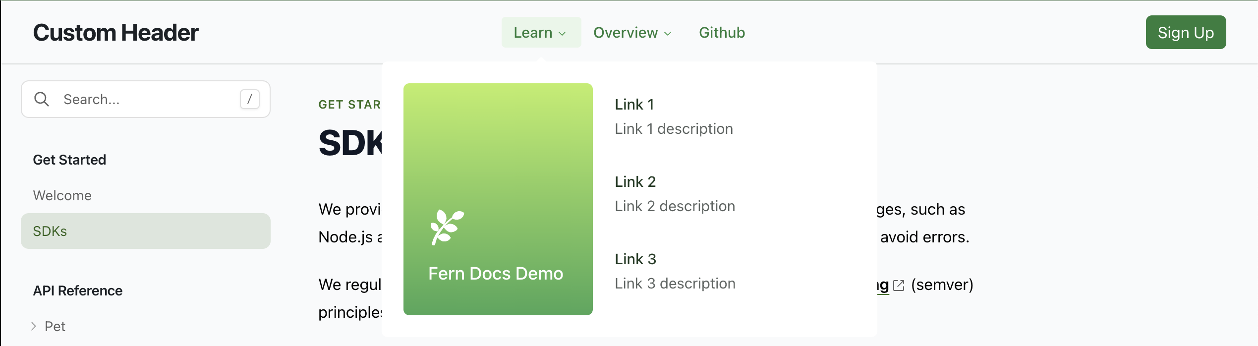
See this GitHub repo
and its generated docs page
for an example of how to replace the Fern header and footer with custom React components.

ReactDOM.render() may need to be called multiple times to prevent it from unmounting (this side-effect will be removed in the future).yarn build or npm build must generate files with deterministic names to be referenced in docs.yml. The above example uses a vite config to accomplish this.This approach is subject to change, with notice, as we make improvements to the plugin architecture.