TL;DR: Sarah is a frontend engineer at Fern who spent the past month polishing small but impactful UI transitions in Fern Docs — from smoother arrow animations and copy button feedback to server-side icon rendering that eliminates sidebar flickering. Learn about the six fixes she shipped and why sweating the small stuff leads to a better developer experience.
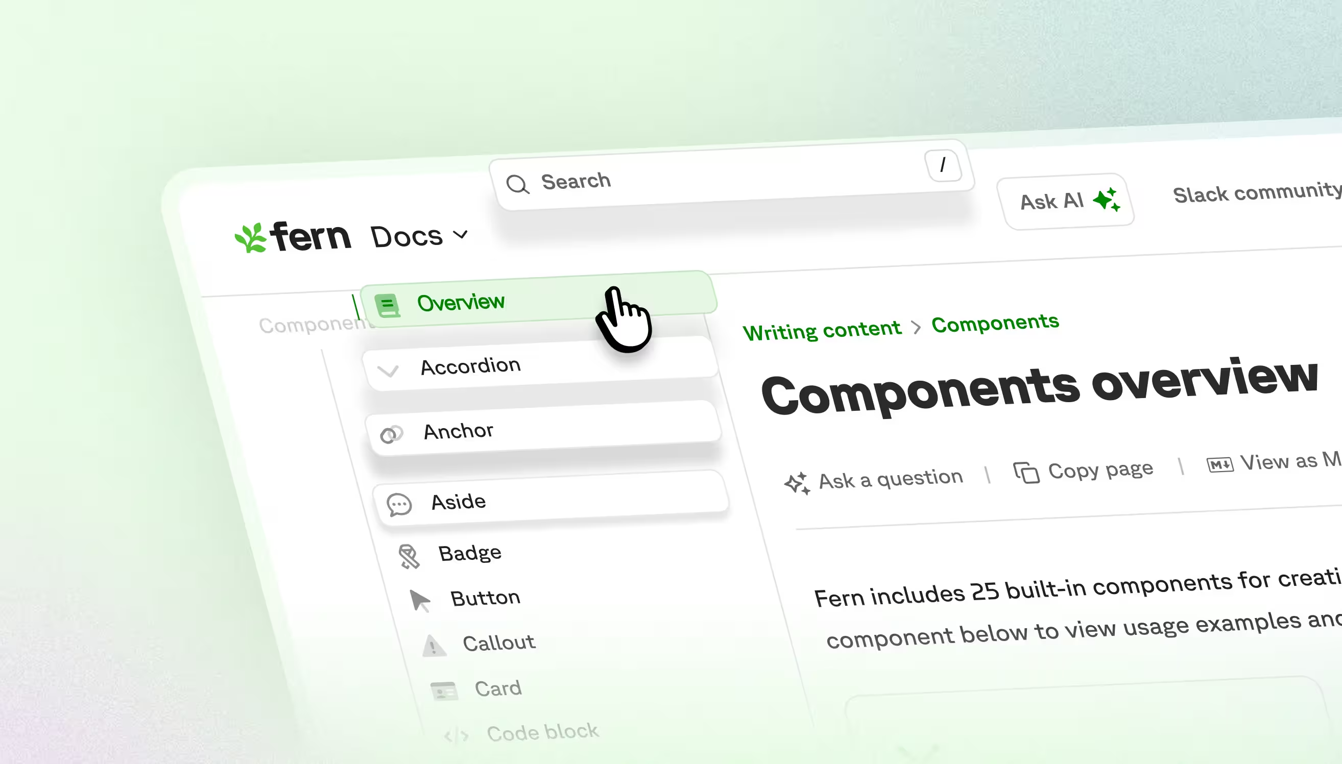
Great documentation should feel effortless to navigate. I'm a frontend engineer working on Fern Docs, and I use it every day while building for customers. I started noticing small things that got in the way of an optimal user experience: arrows snapped into place, sidebar icons flickered, a copy button showed two icons at once. None of these were bugs exactly, since everything still worked. But they were opportunities for polish.
These are all UI transitions—the visual changes when elements appear, disappear, or transform. Done well, they're invisible: they guide your eye and confirm your action worked. When they're slightly off, you feel it. Developers come to docs to implement something and move on. Smooth interactions keep them focused on the task, not the tool.
Here are six small improvements I shipped over the past month:
Arrow icon animations
Several Fern components expand and collapse: accordions, the page actions dropdown, and nested sidebar sections. In all of them, the arrow icon would snap into position instantly rather than animating. These are high-traffic interactions, so the jarring movement added up.
The solve: I added smooth rotation animations to all arrow indicators. Now when you expand an accordion or dropdown, the arrow rotates fluidly into position rather than snapping.
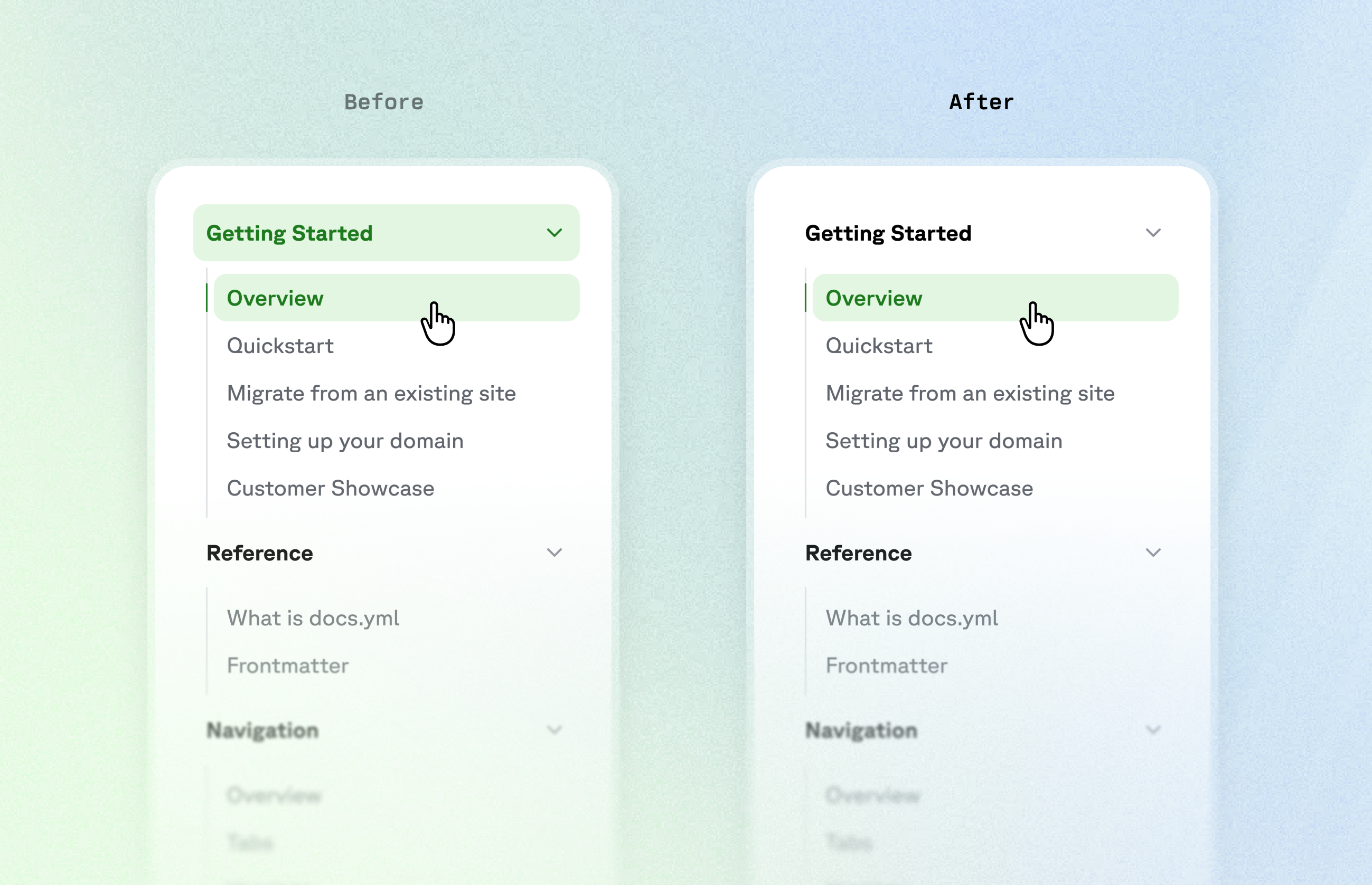
Sidebar active states
In the left sidebar, when viewing a nested page, both the parent section and the current page would display as active. With deeper hierarchies, multiple levels all light up at once, making it hard to tell where you actually are in the documentation site.
The solve: I separated the concept of "active section" from "active page." Now only the current page is highlighted, while parent sections show a subtler indicator. You can still see your location in the tree, but the parent no longer competes visually with where you actually are.
Copy button feedback
The copy button appears on every documentation page by default, and its success animation was broken: clicking it would show both the copy icon and checkmark simultaneously instead of transitioning between them.
The solve: I made the button stateful, so clicking it triggers a success state that updates both the icon and the text together. Now users get clear visual feedback that their action worked.
Search dialog animation
When users clicked on a site's search bar, the dialog would appear instantly. Search is a core interaction in documentation, and the sudden pop-up felt abrupt compared to other transitions in the interface.
The solve: I added a scale and fade animation to the dialog, plus a fade-in animation on the page overlay. Now the dialog eases open instead of flashing into place.
Text and sidebar width changes
Bold text is slightly wider than regular text, which caused some layout shifts in Fern Docs. This was most noticeable in header tabs: when switching tabs, the active tab's label would become bold and push neighboring tabs left or right. Similarly, top-level sidebar sections had no spacing between them, making them feel cramped.
The solve: I replaced the bold style with a subtle text stroke. It gives the same visual emphasis without changing the text width. Now tabs stay consistent regardless of active state, and sidebar sections keep their breathing room.
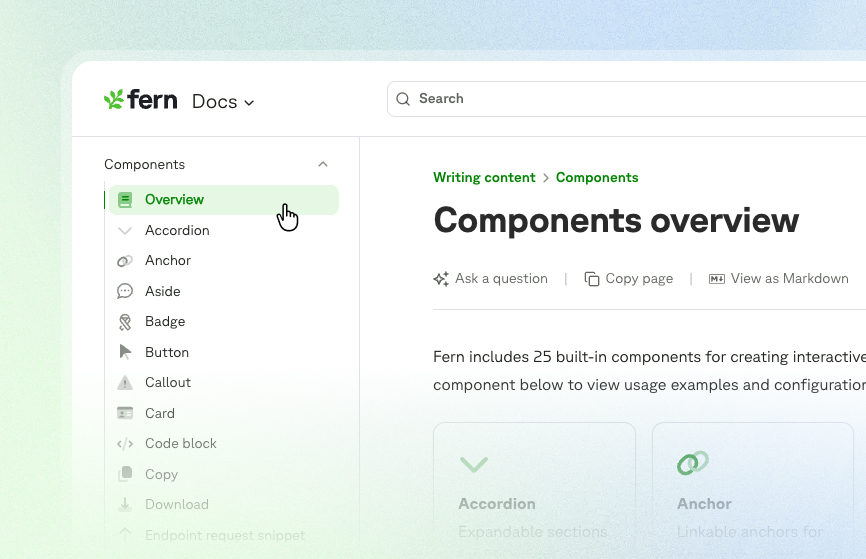
Flickering sidebar icons
The sidebar is the primary navigation tool in Fern Docs. Previously, icons were treated as images that loaded optimistically on the client—fine on fast connections, but on slower ones you'd see a brief flash on every page change. This didn’t impact functionality, but it created visual noise during navigation.
The solve: I moved icon rendering to the server, so icons load with the rest of the page content instead of after. Icons now persist smoothly during navigation, and there’s no more flash on slow connections.
Small things add up to big impressions
Most users won't notice these fixes, but that's the goal. Each jerky animation or laggy hover state is a tiny moment of friction: individually minor, but they add up! When you're working through complex API documentation, these small disruptions break your focus—your brain processes "why did that feel weird?" instead of staying engaged with the content.
When we get transitions right, the documentation fades into the background and developers can focus on what matters: understanding your API and building with confidence.
If you also obsess over 16-millisecond transitions, come build with us.