Mathieu Legault and I (Kapil Gowru) designed and shipped the new Fern site over five weeks as two product designers. This post walks through the process.
Throughout this article, we share links to code and template repos. Try them out and reach out if you want more details: @kapilgowru.
The TL;DR:
-
Two product designers with no frontend hire shipped the site in five weeks.
-
About $4,225 of Claude Code spend across both of us.
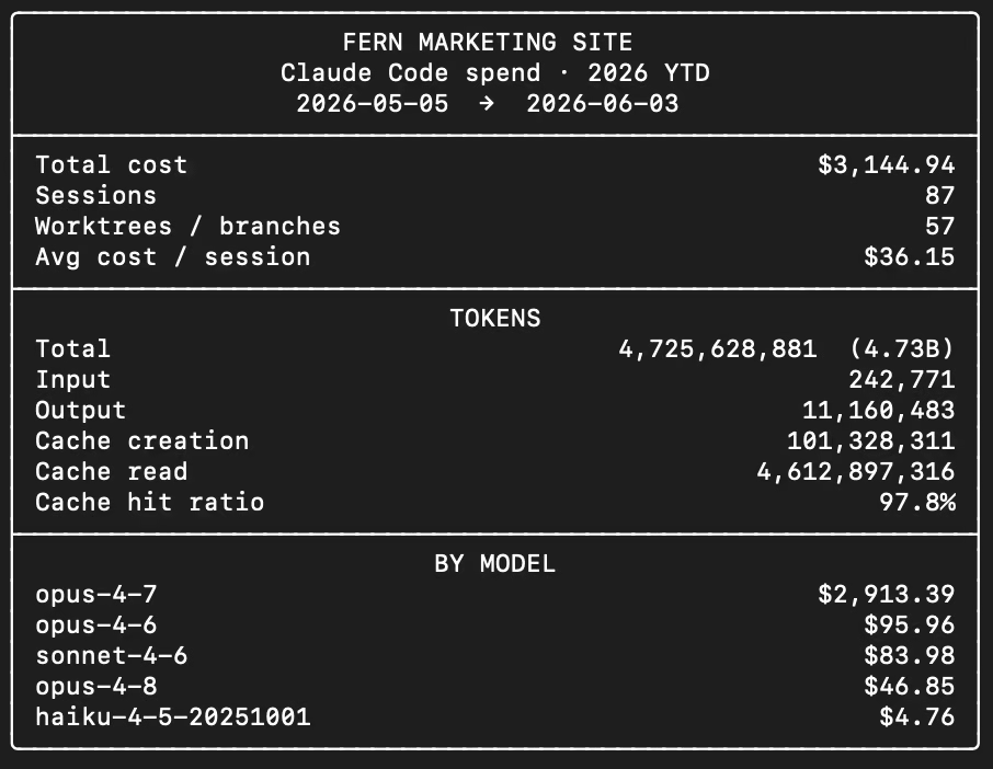
My spend: $3,144.94 across 87 sessions. 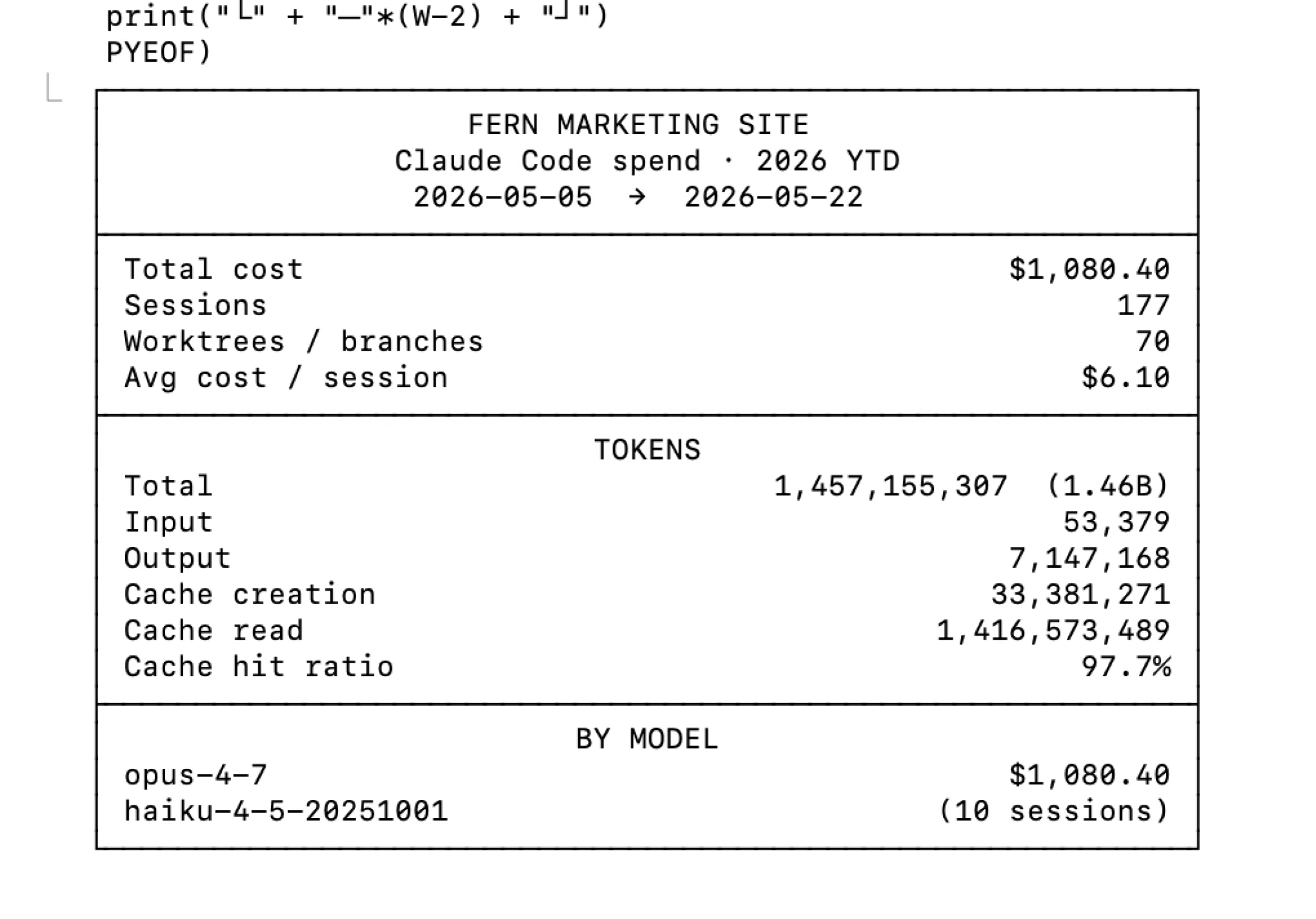
Mathieu's spend: $1,080.40 across 177 sessions. -
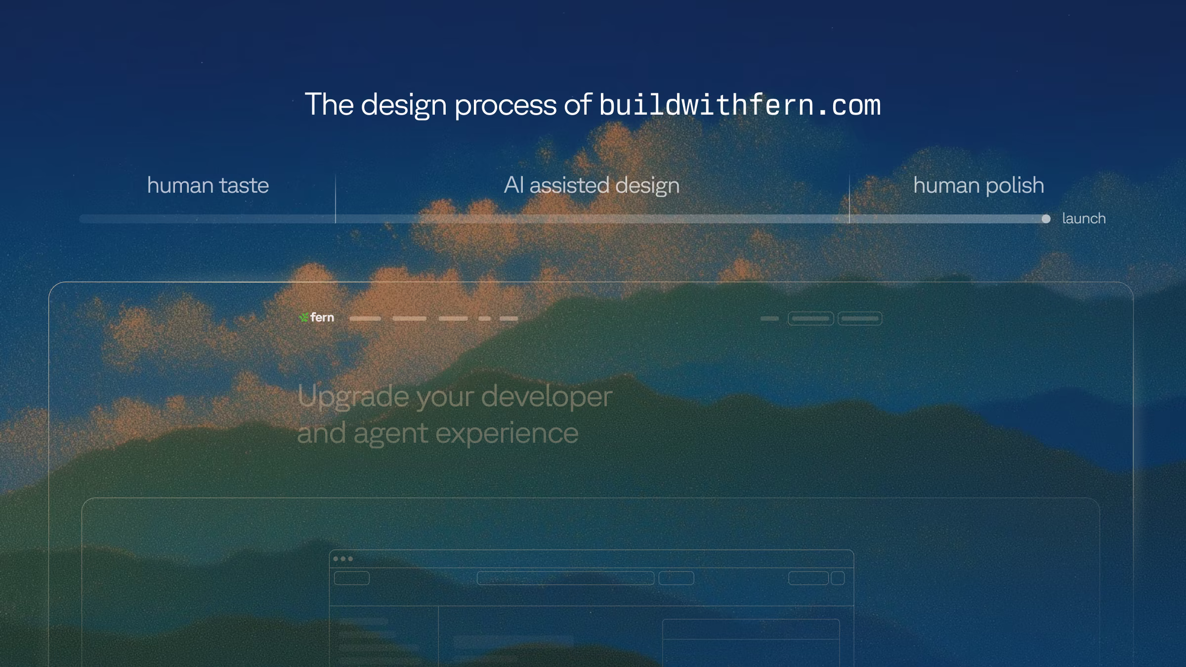
AI is best at the middle of the design process. The existing saying is that AI does 80% of the work and humans finish the last 20%. In practice, humans need to exist to align AI on taste at the beginning and polish at the end.
-
Our full marketing pipeline lives in this repo too, including ad and copy generation, performance tracking, and iterative improvements.
-
Our process: Ideate in Figma, use claude.ai/design for fast iteration, build in Claude Code, and treat the code, not Figma, as the source of truth.
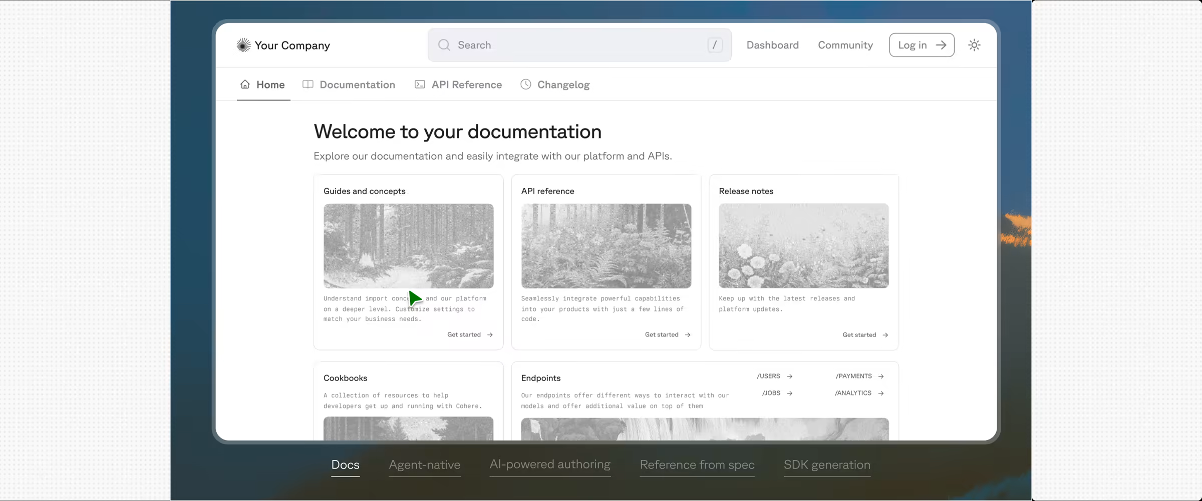
Exploration: Why we rebuilt
Before we touched the design, we wanted to know what customers actually needed. We asked Notion AI and Slack to pull together the consolidated findings from months of customer calls in our #meeting-reports channel.
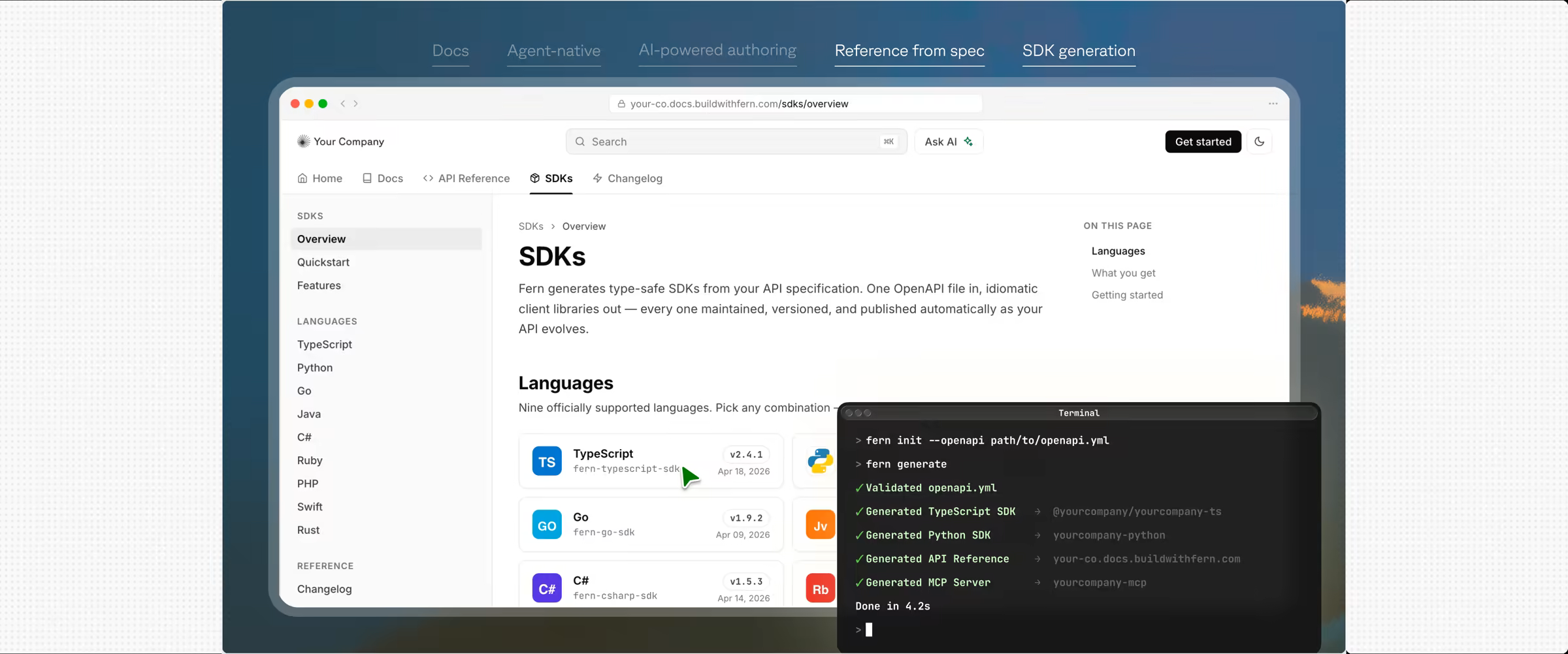
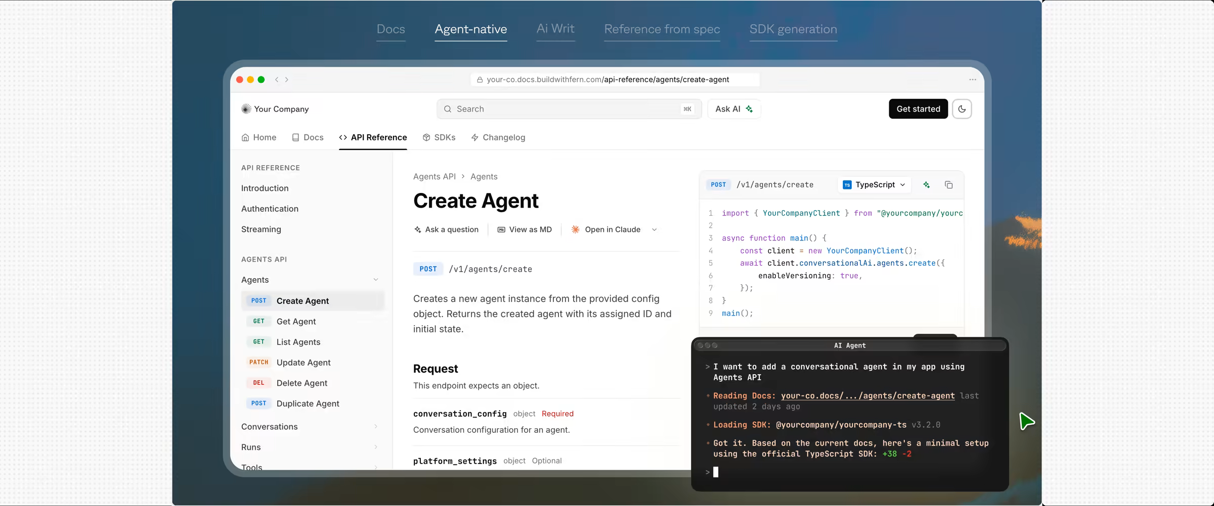
1. Unified docs and SDK generation from a single spec
Nearly every prospect wants one platform that handles both API documentation and SDK generation, replacing fragmented toolchains. "One vendor that can do both" is the differentiator, and Stripe-quality experiences are the benchmark.
2. Migration from existing platforms
Teams are moving off ReadMe, Redocly, Docusaurus, Mintlify, and Confluence, often with content split across systems and a hard launch deadline. Smooth migration is a real requirement and not a nice-to-have.
3. Enterprise readiness (security, compliance, procurement)
Security, legal, and procurement gate evaluations that run three to six months or longer. Buyers want self-hosting, SSO and RBAC, and clear answers on how Fern passes a security review.
4. AI quality and control
AI-powered search is a major evaluation criterion. Some teams want control over the backend or to run it entirely on their own infrastructure, and answer quality has to be consistent.
5. Scale of authorship and governance
Documentation comes from hundreds of contributors, so consistency, a CMS-like normalization layer, and audience segmentation (public versus internal APIs) all matter.
6. Docs UX polish and first impressions
Prospects compare our site directly against competitors. The landing page and demo need to feel enterprise-grade, not gimmicky: less decoration, a cleaner layout, and a crisp product story.
7. Technical gaps and blockers
Specific asks kept recurring: Go SDK generator fixes, GraphQL support, generics handling, server-side analytics, and localization across several languages.
We collapsed those findings into three goals that carried us the whole way through, the same three Danny's launch post lays out from the strategy side. The rest of the findings were addressed through subsections or feature-list grids.
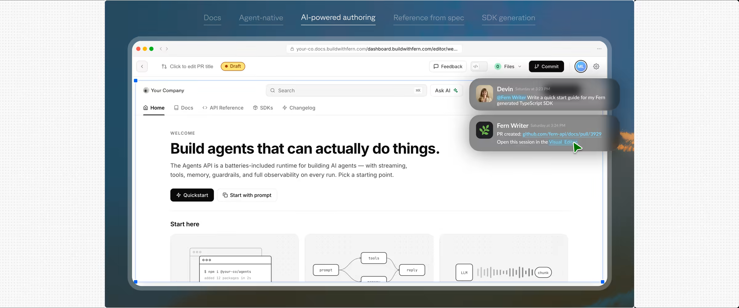
- Agent Experience (findings 1 and 4). APIs are increasingly consumed by AI agents, not just developers, and that requires a connected developer experience across Docs, SDKs, a CLI, and an MCP server.
- Enterprise (findings 2, 3, and 6). Customers like NVIDIA, Square, and Twilio want vendor consolidation: one source of truth and one vendor accountable for it, with self-hosting, SSO and RBAC, and localization.
- Show, don't tell. The old site explained how Fern works, the pipeline (OpenAPI →
fern generate→ output). The new site shows the outcome: a live, rendered docs site with your brand flowing through it.
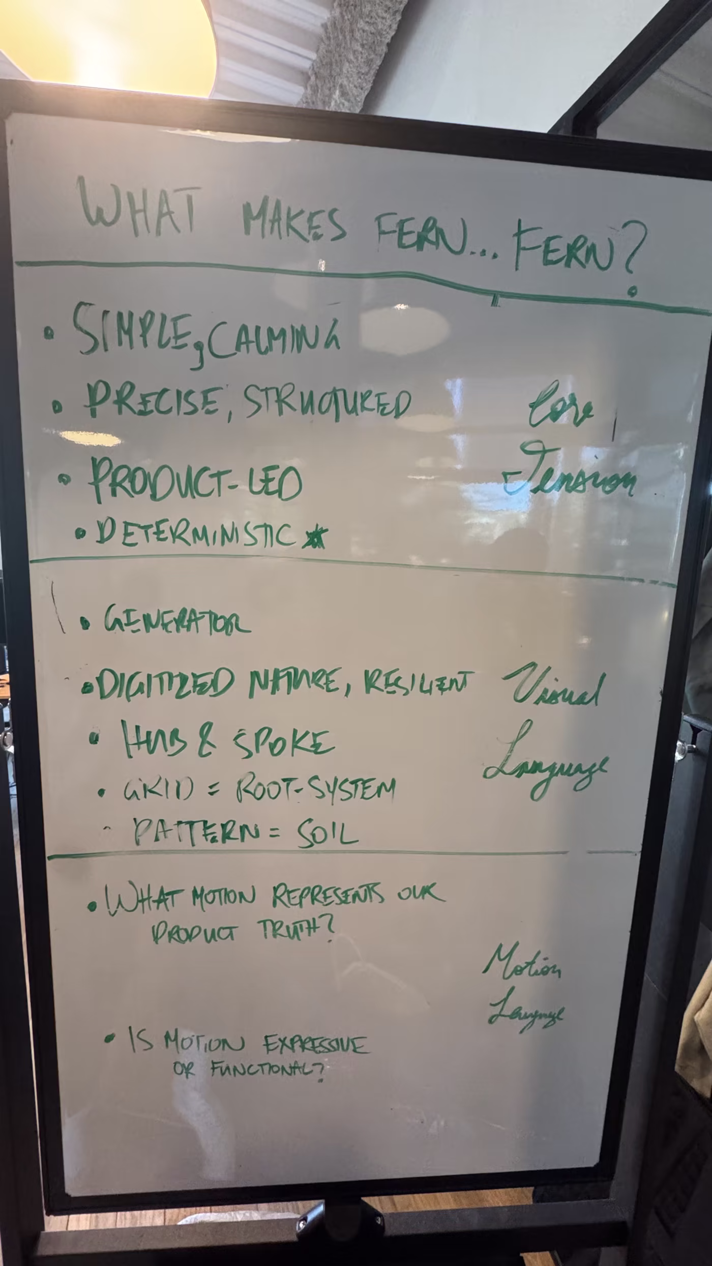
We also aligned on what makes Fern feel like Fern: simple and calming, precise and structured, product-led, deterministic. That gave us a visual language to design against, where the grid acts as a root system and the patterns become soil.
Build: Going code-native
Our previous sites ran on Webflow, and Framer before that. They served us well for years, letting a small team ship and maintain polished sites without writing a line of code, which was exactly the tradeoff we wanted at the time.
Since then, the ambition at Fern has changed. We use agents across our platform, and we wanted deeply bespoke, interactive product demos. This would only work when we own the codebase end to end. That is a different job than what visual builders are meant for. So the new stack is deliberate:
- Next.js with the App Router, React Server Components, and Turbopack
- Tailwind v4 with every color, radius, and type size resolving to a token defined once in
globals.css - shadcn primitives on Radix
- MDX for content, with no headless CMS
- Vercel for hosting, preview deploys, and forms
- Cloudflare Turnstile for spam
- Sentry for errors
The full dependency list is very close to the stack behind the Fern Docs platform itself (Next.js, Tailwind, and MDX), so building the site felt like working in our own product.
When we exported the site from Webflow, we pulled content through the Webflow API and kept its CSS as a starting point. Since the new design looked so different from the old one, we didn't end up needing much from Webflow. Mathieu owned the migration and stood up the scaffolding: the layout primitives, the interactive patterns, and the type scale. By the time I joined the codebase, the base structure of the site was already in place.
An added bonus was that hosting got cheaper along the way.
- $5,195.85
- Yearly hosting on Webflow
- $720–960
- Expected yearly hosting on Vercel Pro
- ~$4,300/yr
- Saved by leaving Webflow
The bigger win was the workflow. Publishing used to be its own separate process. Now a new page or post is a pull request: reviewed, preview-deployed, and merged like any code or docs change.
At a company our size everyone writes code, and now they can commit to the marketing site too.
Build: The design loop
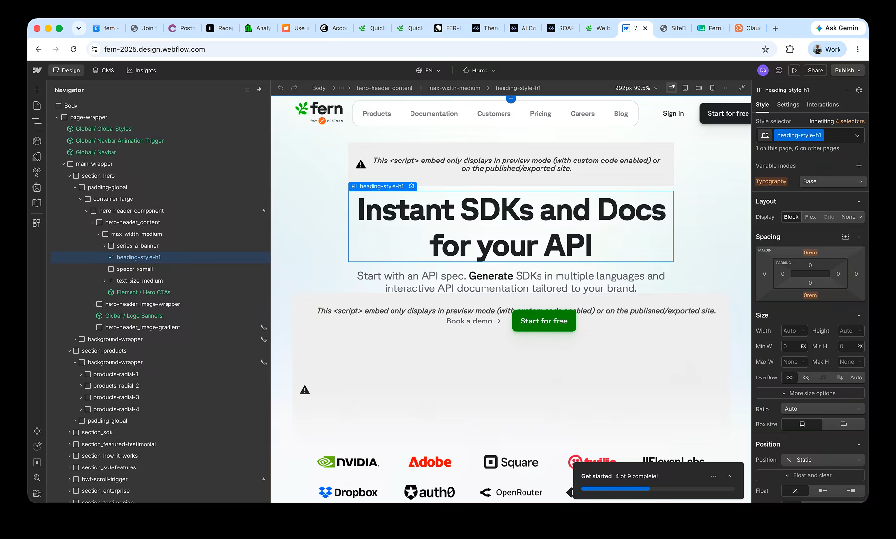
Here is the shift that mattered most: Figma is no longer our source of truth. The code is. The rendered site is the artifact we trust, and Figma now sits upstream of it instead of governing it.
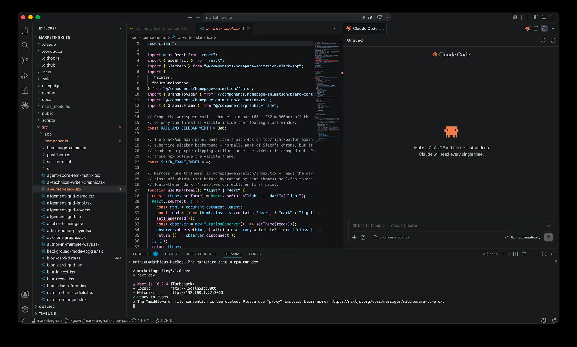
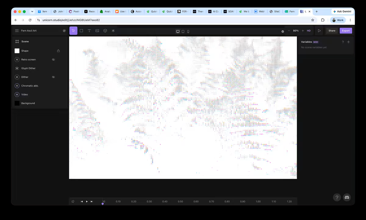
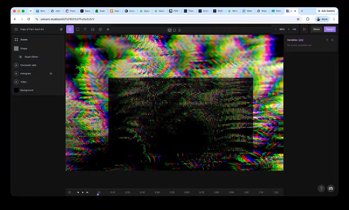
The loop runs in three moves. We ideate in Figma, roughing out layouts and theme directions. We refine in Claude, pulling designs in through the Figma MCP server or uploading the .fig file straight into claude.ai/design, with screenshots pasted in to push variations fast. Then we polish in code, by hand, in the running dev server.
We also started sharing claude.ai/design files the way we used to share Figma links, for internal review and even with customers. A clickable artifact settles a debate that a static mock cannot. Generate three versions, react, throw two away.
Two pages on the site keep the loop honest:
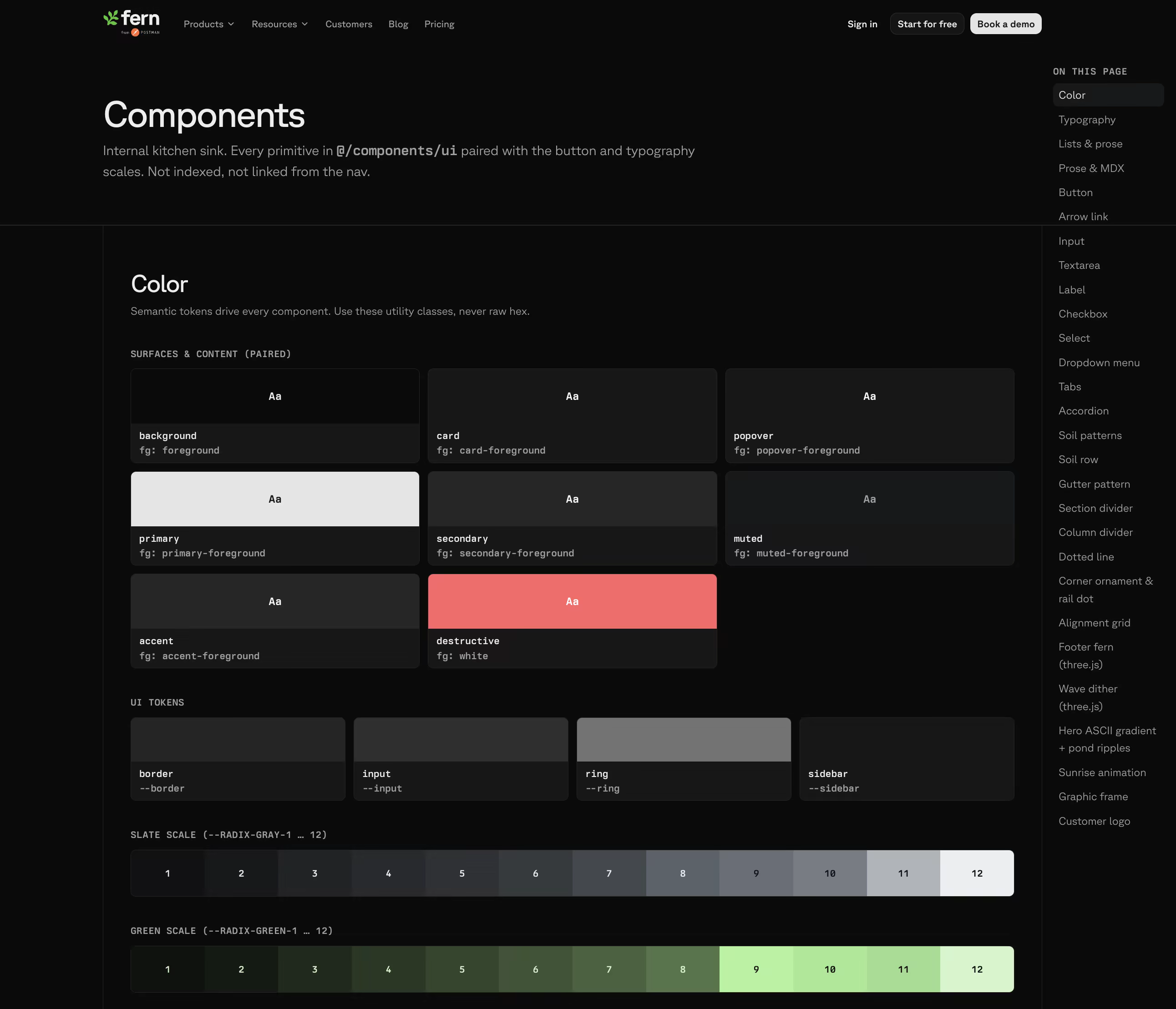
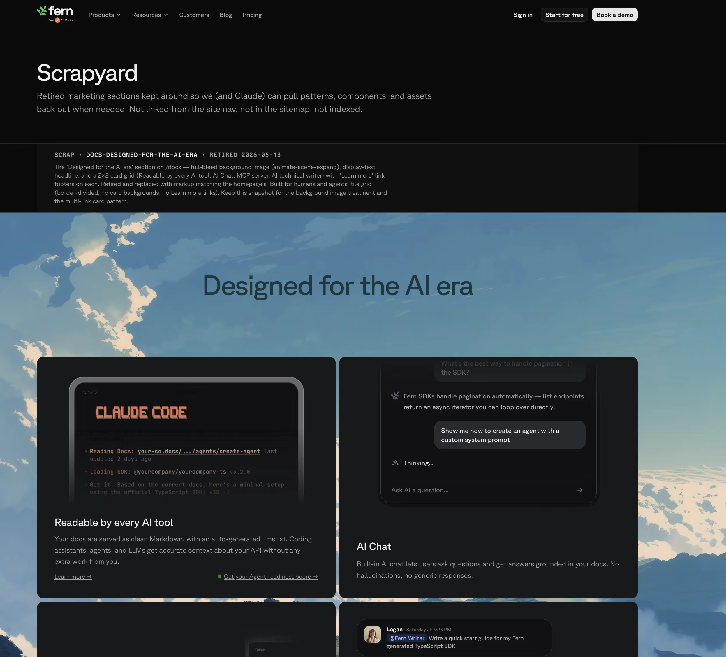
/components: where all of our typography, colors, and approved components live. Claude always refers to these when developing./scrapyard: where we dump assets we tried that didn't see the light of day.
Build: Hero animation
The hero was the single hardest piece of the site. 81 commits touched it, and we rebuilt it from scratch four times because it had to carry two product stories (Docs & SDKs) while showing their agent-friendliness.
You can explore the work yourself in the fern-product-demo-template repo, from a bare grid to the finished hero.
Version one
A tabbed product demo with frozen screenshots. It explained the system but did not show the value, so we cut it.
Version two
An auto-playing cursor walked through each tab, with real chrome for each context: a Mac terminal, a Slack window, a GitHub PR split view. It showed the system in motion, but it still felt like a slideshow.
Version three
This one made it interactive. Clicking takes over from the auto-play, and a brand picker powered by Brandfetch lets you plug in your own URL to retheme a live docs site with your logo and brand colors. This is the version that finally answered "what do I actually get?" before signup. Try it yourself on /docs and /sdks.
The brand picker is the piece I keep coming back to. The first time someone plugs in their own URL and watches the whole docs site retheme in about three seconds, the abstract pitch about developer experience becomes concrete.
Build: Iterating the patterns
Beyond pages, we used claude.ai/design to iterate on the system-level patterns that hold the whole site together.
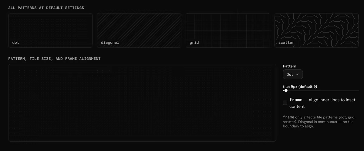
The frame system
The patterns that frame every section come down to three pieces:
- Frame rails: the vertical and horizontal lines that box each section.
- Corner accents: small decorative elements where rails intersect.
- Interactive grid: a dotted "grass" pattern that reacts on hover.
It took about a dozen passes to kill the seams. Here is a simplified version of the playground we tuned them in:
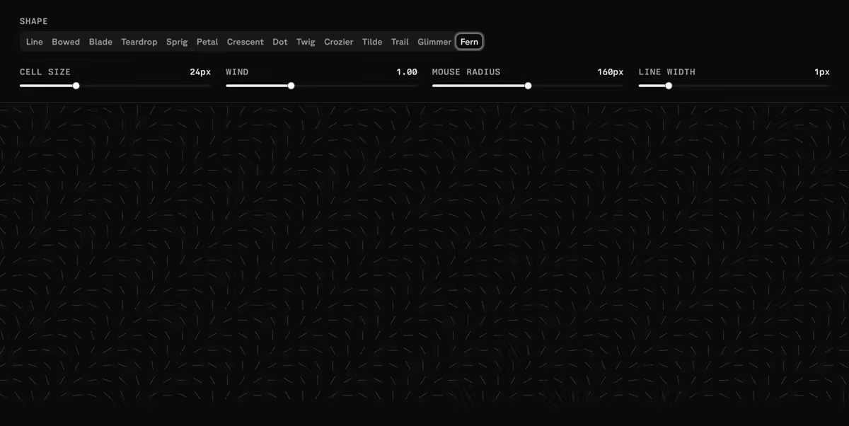
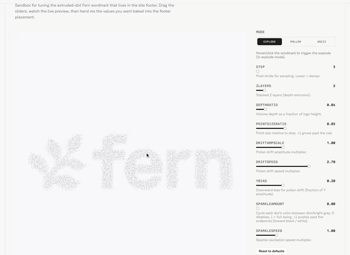
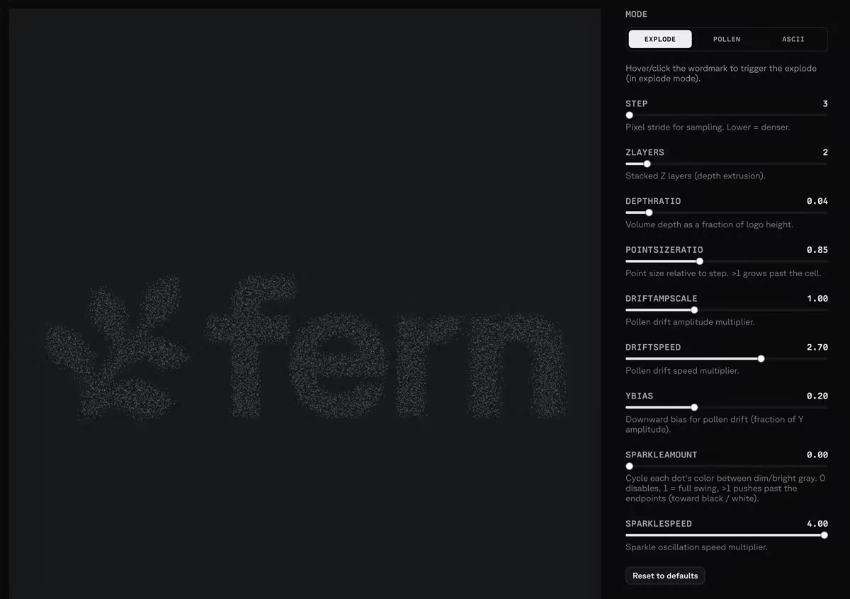
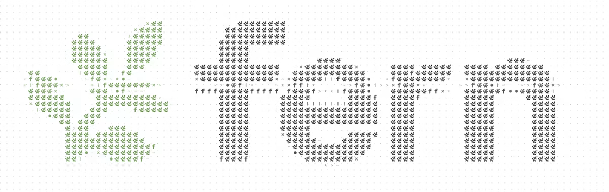
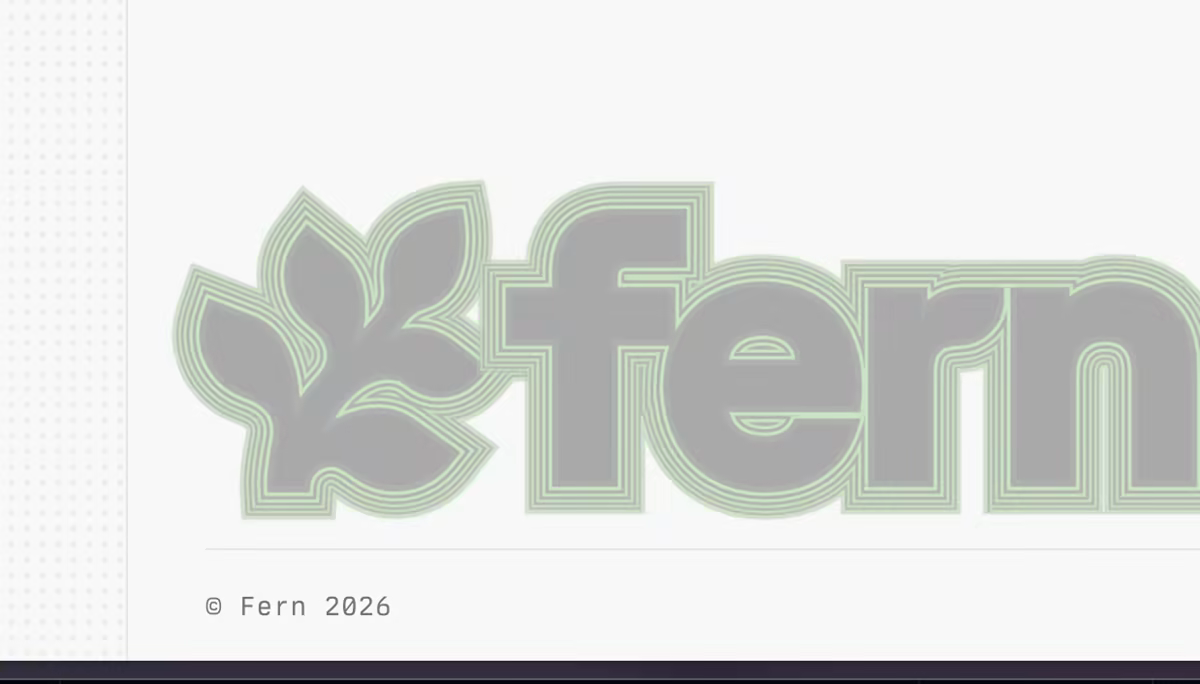
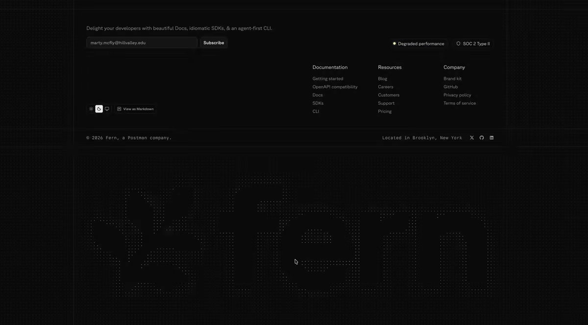
Footer fern
We rebuilt this more than a dozen times, including an ASCII-art version, a multi-stroke version, and a zen garden. Ultimately we landed here because it was the most elegant option that didn't intrude on the rest of the content. It represents blades of grass swaying in the wind, with a subtle hover effect that spreads them apart:

Why claude.ai/design for patterns
claude.ai/design gave us a great isolated interface to iterate on design ideas and share links to them, without the initial bloat. It lets you prompt directly on specific parts of the design, and offers a panel to change colors, font styles, and smaller design nits yourself without prompting.
Copy: Marketing skills
Skills for the work we repeat. We built reusable Claude skills for drafting posts, case studies, employee profiles, and full ad campaigns in our voice. Each skill is a folder of instructions and examples that Claude reads on every task and then outputs all necessary copy and assets.
Campaigns live in the repo. Running /launch-campaign scaffolds a folder per campaign. Claude creates the LinkedIn and Google copy, creative briefs in our house style, and a results scaffold to plug your data into.
Results feed back in. Performance numbers land in performance.csv and takeaways in learnings.md, and we feed both back into the next pass on the copy and the graphics.
It scales past the two of us. What started as a way to build a site turned into a repeatable way to run marketing. The complete knowledge base lives in the repo and is leveraged by the skills. Here is how it is set up, available as a template at fern-marketing-site-template:
- .claude/skillsreusable Claude skills, one folder per job
- SKILL.mdthe instructions Claude reads on every run
- voice-kapil.mdthe voice the drafts come out in
- campaignsone folder per paid campaign
- brief.mdaudience, positioning, competitor context
- copyLinkedIn and Google ad copy
- creativecreative briefs in the house style
- performance.csvcampaign numbers, fed back in
- learnings.mdwhat to change on the next pass
- contentevery post and case study, as MDX
- srcthe site itself
- AGENTS.mdvoice and rules every agent reads
Copy: Establishing the voice
For landing page and ad copy generated by agents, you need a clear writing guideline. We have a series of specs defined in AGENTS.md, and more rigidly in our Vale styles, to make sure nothing drifts. To get here we did a lot of the initial writing manually. The hero copy alone went through dozens of revisions before we found the rule that settled the arguments: lead with the outcome, and back it with a proof point.
AGENTS.mdholds the voice. Plain and direct, present tense, lead with the why, name every AI feature, and of course use an em-dash's in lightly.- Vale enforces the mechanical parts. A prose linter that runs on every pull request. For example: keeping "Docs" and "SDKs" capitalized as products instead of sliding into generic nouns.
- Marketing voice and docs voice are intentionally different. Writing both down is what keeps each one consistent.
Here are the parts of the file that do the most work, straight from the repo:
# Authoring rules

## 1. Design tokens, not raw values

Use the tokens defined in globals.css — semantic colors (`bg-background`,
`text-muted-foreground`), the type scale (`text-h2`, `text-p`), ...

## 3. Every page exports metadata; URL structure is sacred

URLs match the existing Webflow sitemap. Notably: blog posts live at
/post/[slug], **not** /blog/[slug]. Don't rename or restructure URLs
without explicit approval — they're indexed.

...

# Writing style

## Principles
1. Clear, developer-friendly language. Technical terms are fine (OpenAPI,
   MCP, llms.txt, idempotency). Plain framing around them.
2. Lead with why. Every section answers: what problem does this solve,
   or what outcome does it unlock?
3. Direct, confident, developer-oriented voice. A concrete behavior or
   proof point beats an empty adjective.
4. Limit your usage of em-dashes.

## Voice & tense
- Second-person to the reader, first-person plural for Fern, imperative
  for CTAs.
- Present indicative. No future hedging ("can", "may", "is designed to").

...

## Feature framing
- Pattern: **[verb] [object] so [outcome].** "SDKs stay fault-tolerant
  as your API evolves, so old clients keep working."
- If you can't write the "why" line, the feature isn't ready.

## Anti-patterns
- AI features are always named (Ask Fern, Fern Writer, MCP server,
  llms.txt), never abstracted as "AI-powered".
- No "10x faster" without a number, no "trusted by", no future hedging.
- Em-dashes anywhere.
Where AI struggled
The process with AI tooling has never been faster, but we see it break in two main places. Here's where we noticed them most and how to push through:
-
You can't trust the Figma-to-code handoff into Claude. The Figma MCP server brings structure, but it often drops illustrations, logos, and brand imagery, and sometimes omits entire sections.
The solve: augment the MCP output. Paste in screenshots and the rendered HTML alongside it, and split SVG illustrations into their own Figma file so Claude can focus on that one design in isolation. Uploading the .fig file to claude.ai/design works too, and behaves a lot like the Figma MCP server (we suspect they share the same underpinnings).
-
Less is more in your prompting. The instinct is to prescribe how to build something, step by step, and that produces worse, more brittle results.
The solve: index on the output, what you want to see on the screen, and let the model choose the implementation. For our footer fern animation, "blades of grass swaying in the wind that spread apart on hover" got us there; "vector lines of this width, curving up to these end points" never would have.
By the numbers
- 5 weeks from first commit to launch
- 640 commits to main, 519 of them ours (316 Kapil, 203 Mathieu)
- ~72,000 lines of TypeScript and CSS
- 80+ blog posts ported into MDX
- 6 case studies (Deepgram, ElevenLabs, Frame, OpenRouter, Payabli, Unleash)
- 5 paid campaigns run from the repo (agent-ready, consolidate-stack, enterprise, fern-vs-speakeasy, leave-stainless)
- 81 commits touching the hero animation alone
- ~$4,225 of Claude Code spend across the two of us
- ~$4,300/yr saved on hosting ($5,195.85/yr Webflow → $720–960/yr Vercel Pro)
The toolbox
AI and design
- Claude Code (wrote most of the components)
- claude.ai/design (fast layout and pattern exploration)
- Figma and its Dev Mode MCP server (ideation and design-to-code handoff)
- Anthropic SDK (build-time generation)
- Vale (prose linting in CI)
Framework and language
- Next.js (App Router, Server Components, Turbopack)
- React
- TypeScript
Styling and UI
- Tailwind CSS
- shadcn/ui
- Radix UI (primitives and Colors)
- Base UI
- lucide (icons)
- next-themes (dark mode)
- tw-animate-css
- cva, clsx, and tailwind-merge (the
cn()helper)
Content and MDX
- next-mdx-remote (MDX rendering)
- gray-matter (frontmatter)
- Shiki and rehype-pretty-code (code highlighting)
- remark-gfm
- medium-zoom (click-to-zoom images)
- Zod (frontmatter validation)
Hosting, infra, and services
- Vercel (hosting, preview deploys, Functions)
- Vercel Blob (post audio and video)
- Brandfetch (the hero brand picker)
- ElevenLabs (article audio)
- PostHog (analytics)
- Google Tag Manager
- Calendly (book a demo)
- Zapier (form routing)
- Cloudflare Turnstile (form spam protection)
- Sentry (error monitoring)
- Ashby (careers job sync)
What we're giving away
- The hero animation, as a GitHub template. fern-product-demo-template sets you up to build a cursor-driven product demo, with all the tweaks that took us four versions to learn. Fork it and swap in your own product.
- The repo structure for a marketing site like this. fern-marketing-site-template has the skills folder, the campaigns folder, the
AGENTS.mdvoice file, and general tooling required.
Try it
The site is at buildwithfern.com. Pull up the homepage, plug your URL into the hero, and tell us what you'd change at kapil@buildwithfern.com or @kapilgowru on X.