Header and footer

View as Markdown
Enterprise feature

This feature is available only for the Enterprise plan. To get started, reach out to support@buildwithfern.com.

Replace Fern’s default header or footer with your own React components. Components are server-side rendered for better SEO and performance, with no layout shifts.
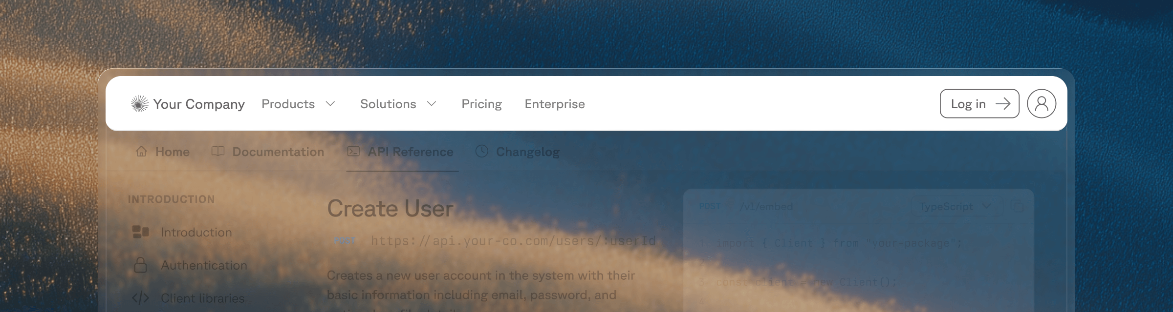
1

Create your component

Your component file must have a default export returning a React component. Tailwind CSS classes are available, including the dark: prefix for dark mode styles:

components/CustomHeader.tsx
1export default function CustomHeader() {
2 return (
3 <header className="w-full py-4 px-6 bg-white dark:bg-gray-900 border-b border-gray-200 dark:border-gray-800">
4 <div className="max-w-7xl mx-auto flex items-center justify-between">
5 <span className="font-semibold text-lg">Plant Store</span>
6 <nav className="flex gap-4">
7 <a href="/products">Products</a>
8 <a href="/solutions">Solutions</a>
9 <a href="/enterprise">Enterprise</a>
10 </nav>
11 </div>
12 </header>
13 );
14}
components/CustomFooter.tsx
1export default function CustomFooter() {
2 return (
3 <footer className="w-full py-8 px-6 bg-gray-100 dark:bg-gray-900">
4 <div className="max-w-7xl mx-auto text-sm text-gray-500">
5 © 2026 Plant Store. All rights reserved.
6 </div>
7 </footer>
8 );
9}
2

Add the component paths to docs.yml

docs.yml
1header: ./components/CustomHeader.tsx
2footer: ./components/CustomFooter.tsx
3

Specify your components directory in docs.yml

Add your components directory to docs.yml so that the Fern CLI can scan your components directory and upload them to the server.

docs.yml
1experimental:
2 mdx-components:
3 - ./components

Enhance your components

Your custom components can use Fern’s built-in UI primitives, React hooks, or both.

Instead of building every element from scratch, you can reuse Fern’s built-in primitives like search, navigation, and theme switching. Custom header and footer components receive a Fern prop containing these built-in UI components:

components/CustomHeader.tsx
1export default function CustomHeader({ Fern }) {
2 return (
3 <header className="w-full py-4 px-6 flex items-center justify-between">
4 <Fern.Logo />
5 <Fern.Search />
6 <nav className="flex items-center gap-4">
7 <Fern.NavbarLinks />
8 <Fern.ThemeSwitch />
9 </nav>
10 </header>
11 );
12}

The following components are available on the Fern prop:

ComponentDescription
<Fern.Logo />Your site logo as configured in docs.yml. Links to the homepage.
<Fern.Search />The search bar, including the AI search trigger if enabled.
<Fern.ProductSwitcher />Dropdown to switch between products.
<Fern.VersionSwitcher />Dropdown to switch between versions.
<Fern.LanguageSwitcher />Dropdown to switch the active SDK language.
<Fern.NavbarLinks />The navigation links configured under navbar-links in docs.yml.
<Fern.LoginButton />The login/signup button for authenticated docs.
<Fern.ThemeSwitch />Toggle between light and dark mode.
<Fern.HamburgerMenu />Fern’s built-in mobile sidebar toggle button. Shows a hamburger/close icon and opens the dismissible sidebar. Only visible on mobile viewports.

Whether you build from scratch or use built-in Fern components, your custom header and footer components support standard React hooks. For example, you can use useState to build a drop-down menu that opens on click:

components/CustomHeader.tsx
1import { useState } from "react";
2
3export default function CustomHeader() {
4 const [isOpen, setIsOpen] = useState(false);
5
6 return (
7 <header className="w-full py-4 px-6 bg-white dark:bg-gray-900 border-b border-gray-200 dark:border-gray-800">
8 <div className="max-w-7xl mx-auto flex items-center justify-between">
9 <span className="font-semibold text-lg">Plant Store</span>
10 <nav className="flex items-center gap-6">
11 <div className="relative">
12 <button
13 onClick={() => setIsOpen(!isOpen)}
14 className="flex items-center gap-1 hover:text-green-600 dark:hover:text-green-400"
15 >
16 Products
17 <svg
18 className={`w-4 h-4 transition-transform ${isOpen ? "rotate-180" : ""}`}
19 fill="none"
20 stroke="currentColor"
21 viewBox="0 0 24 24"
22 >
23 <path strokeLinecap="round" strokeLinejoin="round" strokeWidth={2} d="M19 9l-7 7-7-7" />
24 </svg>
25 </button>
26 {isOpen && (
27 <div className="absolute top-full left-0 mt-2 w-48 rounded-md shadow-lg bg-white dark:bg-gray-800 border border-gray-200 dark:border-gray-700">
28 <a href="/products/indoor" className="block px-4 py-2 hover:bg-gray-100 dark:hover:bg-gray-700">
29 Indoor Plants
30 </a>
31 <a href="/products/outdoor" className="block px-4 py-2 hover:bg-gray-100 dark:hover:bg-gray-700">
32 Outdoor Plants
33 </a>
34 <a href="/products/succulents" className="block px-4 py-2 hover:bg-gray-100 dark:hover:bg-gray-700">
35 Succulents
36 </a>
37 </div>
38 )}
39 </div>
40 <a href="/solutions" className="hover:text-green-600 dark:hover:text-green-400">Solutions</a>
41 <a href="/enterprise" className="hover:text-green-600 dark:hover:text-green-400">Enterprise</a>
42 </nav>
43 </div>
44 </header>
45 );
46}

Use <Fern.HamburgerMenu /> to render Fern’s built-in mobile sidebar toggle button in your custom header. This opens the same dismissible sidebar that the default header uses, including any navigation links, version/product switchers, and search.

components/CustomHeader.tsx
1export default function CustomHeader({ Fern }) {
2 return (
3 <header className="w-full py-4 px-6 bg-white dark:bg-gray-900 border-b border-gray-200 dark:border-gray-800">
4 <div className="max-w-7xl mx-auto flex items-center justify-between">
5 <Fern.Logo />
6
7 {/* Desktop navigation */}
8 <nav className="hidden lg:flex items-center gap-6">
9 <Fern.NavbarLinks />
10 <Fern.ThemeSwitch />
11 </nav>
12
13 {/* Mobile: Fern's built-in hamburger menu toggle */}
14 <Fern.HamburgerMenu />
15 </div>
16 </header>
17 );
18}

The button automatically shows a hamburger icon when the sidebar is closed and a close icon when open. It’s only visible on mobile viewports (< 1024px).

If you need a fully custom mobile navigation instead of Fern’s built-in sidebar, you can disable the default mobile sidebar and build your own panel using React state and Tailwind classes.

The example below demonstrates how to:

  1. Use a useEffect hook to inject a style that hides Fern’s default mobile swipe panel
  2. Render a hamburger button (visible only on mobile) that toggles a custom side panel
components/CustomHeader.tsx
1import { useEffect, useState } from "react";
2
3export default function CustomHeader({ Fern }) {
4 const [menuOpen, setMenuOpen] = useState(false);
5
6 // Hide Fern's default mobile swipe panel
7 useEffect(() => {
8 const style = document.createElement("style");
9 style.textContent = `
10 #fern-sidebar[data-viewport="mobile"],
11 #fern-sidebar-overlay {
12 display: none !important;
13 }
14 `;
15 document.head.appendChild(style);
16 return () => {
17 style.remove();
18 };
19 }, []);
20
21 return (
22 <header className="relative w-full py-4 px-6 bg-white dark:bg-gray-900 border-b border-gray-200 dark:border-gray-800">
23 <div className="max-w-7xl mx-auto flex items-center justify-between">
24 <Fern.Logo />
25
26 {/* Desktop navigation */}
27 <nav className="hidden lg:flex items-center gap-6">
28 <Fern.NavbarLinks />
29 <Fern.ThemeSwitch />
30 </nav>
31
32 {/* Mobile menu button - visible only on small screens */}
33 <button
34 className="lg:hidden p-2 rounded-md hover:bg-gray-100 dark:hover:bg-gray-800"
35 onClick={() => setMenuOpen(!menuOpen)}
36 aria-label="Toggle menu"
37 >
38 <svg className="w-6 h-6" fill="none" stroke="currentColor" viewBox="0 0 24 24">
39 {menuOpen ? (
40 <path strokeLinecap="round" strokeLinejoin="round" strokeWidth={2} d="M6 18L18 6M6 6l12 12" />
41 ) : (
42 <path strokeLinecap="round" strokeLinejoin="round" strokeWidth={2} d="M4 6h16M4 12h16M4 18h16" />
43 )}
44 </svg>
45 </button>
46 </div>
47
48 {/* Custom mobile side panel */}
49 <div
50 className={`
51 fixed top-[var(--header-height)] right-0 bottom-0 w-72
52 bg-white dark:bg-gray-900 border-l border-gray-200 dark:border-gray-800
53 transform transition-transform duration-300 ease-in-out z-50
54 ${menuOpen ? "translate-x-0" : "translate-x-full"}
55 lg:hidden
56 `}
57 >
58 <nav className="flex flex-col p-6 gap-4">
59 <Fern.NavbarLinks />
60 <div className="border-t border-gray-200 dark:border-gray-700 pt-4">
61 <Fern.ThemeSwitch />
62 </div>
63 </nav>
64 </div>
65
66 {/* Overlay when mobile menu is open */}
67 {menuOpen && (
68 <div
69 className="fixed inset-0 top-[var(--header-height)] bg-black/40 z-40 lg:hidden"
70 onClick={() => setMenuOpen(false)}
71 />
72 )}
73 </header>
74 );
75}

The useEffect hook injects a CSS rule targeting #fern-sidebar[data-viewport="mobile"] and #fern-sidebar-overlay to hide Fern’s default mobile sidebar. This prevents the built-in swipe-to-open gesture from displaying Fern’s sidebar, so your custom panel is the only mobile navigation.