

Sections, pages, and folders
Organize your sidebar navigation structure in docs.yml
A page points at a single Markdown file, a section groups entries and can nest more sections, and a folder pulls in every file in a directory.
Add a section
Sections organize your documentation in the left-side nav bar. Each section has a name and a list of contents, which can include pages, folders, or nested sections.
Sections can be nested to create multi-level navigation hierarchies.
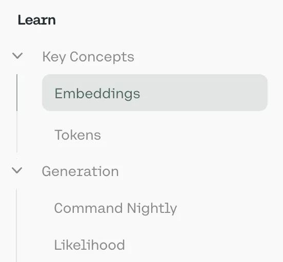
To add an overview page to a section, add a path property pointing to an .mdx file.
Sections also support slug and skip-slug to customize URL paths.
Add a page
Create an .md or .mdx file, then add a page entry to a section’s contents with the file path.
Add a folder
Add a folder entry pointing to a directory. Fern auto-discovers all .md and .mdx files and adds them to the navigation.
For the pages in a folder, Fern automatically:
- Derives titles and URL slugs from filenames
- Creates nested sections from subdirectories
- Sorts pages alphabetically
- Uses
index.mdxorindex.mdfiles as section overview pages (case-insensitive)
Folder configuration options
Customize folder behavior with these options:
title
The title to display for this folder section. If not provided, the folder name is used.
title-source
Determines how page and section titles within the folder are derived. By default (filename), titles are derived from file names. Set to frontmatter to use the title field from each file’s frontmatter instead (falls back to filename if not set). This per-folder setting overrides the global settings.folder-title-source value.
slug
Overrides the auto-generated URL slug for the folder.
skip-slug
Omits the folder from the URL path, so pages appear at the parent level.
position
Set in page frontmatter to control ordering within the folder. Pages with position appear first (sorted numerically), followed by the rest alphabetically.
Slugs and URL paths
Fern builds each page’s URL by combining slugs from every level of its navigation hierarchy — section, folder, tab, version, and product. Each level gets an auto-generated slug from its display name, or from the filename for folder-based navigation. You can rename a slug, skip a level, or override the path in a page’s frontmatter.
The Quickstart page is hosted at /start/quick. The renamed section and page slugs apply, and the skipped Guides slug drops out of the path.
Hiding content
To hide a page, folder, or section, add hidden: true. Hidden content (including all pages within a folder) is still accessible via direct URL but is excluded from search and won’t be indexed.
Availability
Set availability badges on pages, sections, or folders to indicate their lifecycle status. The badge is shown in the page header; the value controls the badge label and style:
To render availability badges in the sidebar navigation in addition to the page header, set layout.show-nav-availability-badges: true in docs.yml.
Pages inherit availability from their parent section or folder unless overridden by:
- A per-page
availabilitysetting indocs.yml(shown below) - Page frontmatter availability, which takes precedence over all
docs.ymlavailability
If you have different versions of your docs, section, folder, and page availability should be set in the .yml files that define the navigational structure for each version.
API Reference sections and endpoints render the same sidebar badges based on their availability.
Collapsed sections or folders
By default, sections and folders are expanded and not collapsible. Use the collapsed property to control how they appear in the sidebar when the page loads.
Sidebar icons
Add icons next to sections, pages, and folders using the icon key.
Icons can be in three formats:
- Font Awesome icons: Use icon names like
fa-solid fa-rocket. Pro and Brand Icons from Font Awesome are supported. - Custom image files: Use relative paths to image files (e.g.,
./assets/icons/my-icon.svgor../assets/icons/my-icon.png). Paths are relative to the YAML file where the icon is referenced (e.g.,docs.yml). For example, if you set an icon infern/products/my-product.yml, the path./assets/icon.svgresolves tofern/products/assets/icon.svg. If you set it infern/docs.yml, the same path resolves tofern/assets/icon.svg. - Inline SVG: Provide an SVG string wrapped in quotes (e.g.,
"<svg>...</svg>").
Links
You can add a link to an external page within your sidebar navigation with the following configuration:
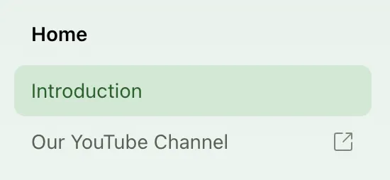
Link target
Control where links open with the target property. Available for product, tab, navbar, and page links. For typical documentation sites, links can open in the same tab (_self) or new tab (_blank). For documentation embedded in a dashboard or iframe, links can open in the parent frame (_parent) or topmost frame (_top).