选项卡和选项卡变体
选项卡和选项卡变体
将内容组织到可切换的选项卡中,支持可选变体
选项卡让您可以将文档的各个部分组织在一起,而选项卡变体允许您在单个选项卡中显示不同的内容视角。
选项卡
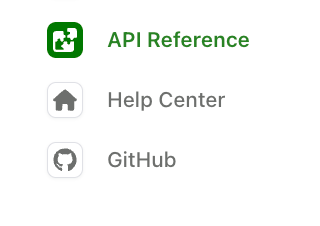
添加 tabs 来将部分组织在一起。下面的示例显示了 Help Center、API Reference 和指向 Github 的外部链接的选项卡。每个选项卡都有一个 display-name 和 icon。
在 navigation 部分中,每个选项卡引用必须包含 layout(用于内容)或 variants(用于选项卡变体)。带有 href 属性的选项卡是外部链接,不能包含 layout 或 variants。
选项卡图标
Icons can be in three formats:
- Font Awesome icons: Use icon names like
fa-solid fa-rocket. Pro and Brand Icons from Font Awesome are supported. - Custom image files: Use relative paths to image files (e.g.,
./assets/icons/my-icon.svgor../assets/icons/my-icon.png). Paths are relative to the YAML file where the icon is referenced (e.g.,docs.yml). For example, if you set an icon infern/products/my-product.yml, the path./assets/icon.svgresolves tofern/products/assets/icon.svg. If you set it infern/docs.yml, the same path resolves tofern/assets/icon.svg. - Inline SVG: Provide an SVG string wrapped in quotes (e.g.,
"<svg>...</svg>").
以下是选项卡实现渲染效果的示例:
选项卡位置和样式
选项卡默认显示在左侧边栏中。使用 theme.tabs 来控制位置、样式和对齐方式。
选项卡属性
display-name
在选项卡标题中显示的名称
icon
Icons can be in three formats:
- Font Awesome icons: Use icon names like
fa-solid fa-rocket. Pro and Brand Icons from Font Awesome are supported. - Custom image files: Use relative paths to image files (e.g.,
./assets/icons/my-icon.svgor../assets/icons/my-icon.png). Paths are relative to the YAML file where the icon is referenced (e.g.,docs.yml). For example, if you set an icon infern/products/my-product.yml, the path./assets/icon.svgresolves tofern/products/assets/icon.svg. If you set it infern/docs.yml, the same path resolves tofern/assets/icon.svg. - Inline SVG: Provide an SVG string wrapped in quotes (e.g.,
"<svg>...</svg>").
slug
选项卡的自定义 URL slug
skip-slug
从 URL 中排除选项卡 slug
hidden
从导航中隐藏选项卡。详情请参见隐藏内容。
layout
选项卡内容的导航结构。除非选项卡使用 variants 或 href,否则为必需。
variants
用于显示不同内容视角的选项卡变体列表。用于替代 layout。
href
外部 URL。设置后,单击选项卡会重定向到此 URL。带有 href 的选项卡不能包含 layout 或 variants。
target
链接打开的位置。可选值为 _blank、_self、_parent 或 _top。
changelog
更新日志文件夹的路径,相对于设置它的 YAML 文件(例如 docs.yml)
viewers
选项卡的基于角色的访问控制
orphaned
当为 true 时,角色不从父元素继承
feature-flag
条件显示配置
选项卡变体
选项卡变体让您可以在单个选项卡中显示不同的内容变化,并支持 RBAC。这对于显示不同用户类型、实现方法或体验级别而不创建单独的选项卡非常有用。
何时使用变体与选项卡
对同一内容区域的不同视角使用变体(REST vs. GraphQL,初级 vs. 高级)。对完全不同的文档部分使用选项卡(指南 vs. API Reference)。
基本用法
定义一个带有 variants 属性而不是 layout 属性的选项卡。每个变体都有自己的标题和布局。下面的示例显示了 Help Center 选项卡的两个变体。
变体属性
title
变体的显示名称
layout
使用与常规选项卡布局相同格式的导航结构
subtitle
显示在变体标题下方的文本
icon
Icons can be in three formats:
- Font Awesome icons: Use icon names like
fa-solid fa-rocket. Pro and Brand Icons from Font Awesome are supported. - Custom image files: Use relative paths to image files (e.g.,
./assets/icons/my-icon.svgor../assets/icons/my-icon.png). Paths are relative to the YAML file where the icon is referenced (e.g.,docs.yml). For example, if you set an icon infern/products/my-product.yml, the path./assets/icon.svgresolves tofern/products/assets/icon.svg. If you set it infern/docs.yml, the same path resolves tofern/assets/icon.svg. - Inline SVG: Provide an SVG string wrapped in quotes (e.g.,
"<svg>...</svg>").
slug
变体的自定义 URL slug
skip-slug
从 URL 中排除变体 slug
hidden
从导航中隐藏变体。详情请参见隐藏内容。
default
当为 true 时,此变体默认显示。如果未指定,则使用列表中的第一个变体。
viewers
变体的基于角色的访问控制
orphaned
当为 true 时,角色不从父元素继承
feature-flag
条件显示配置